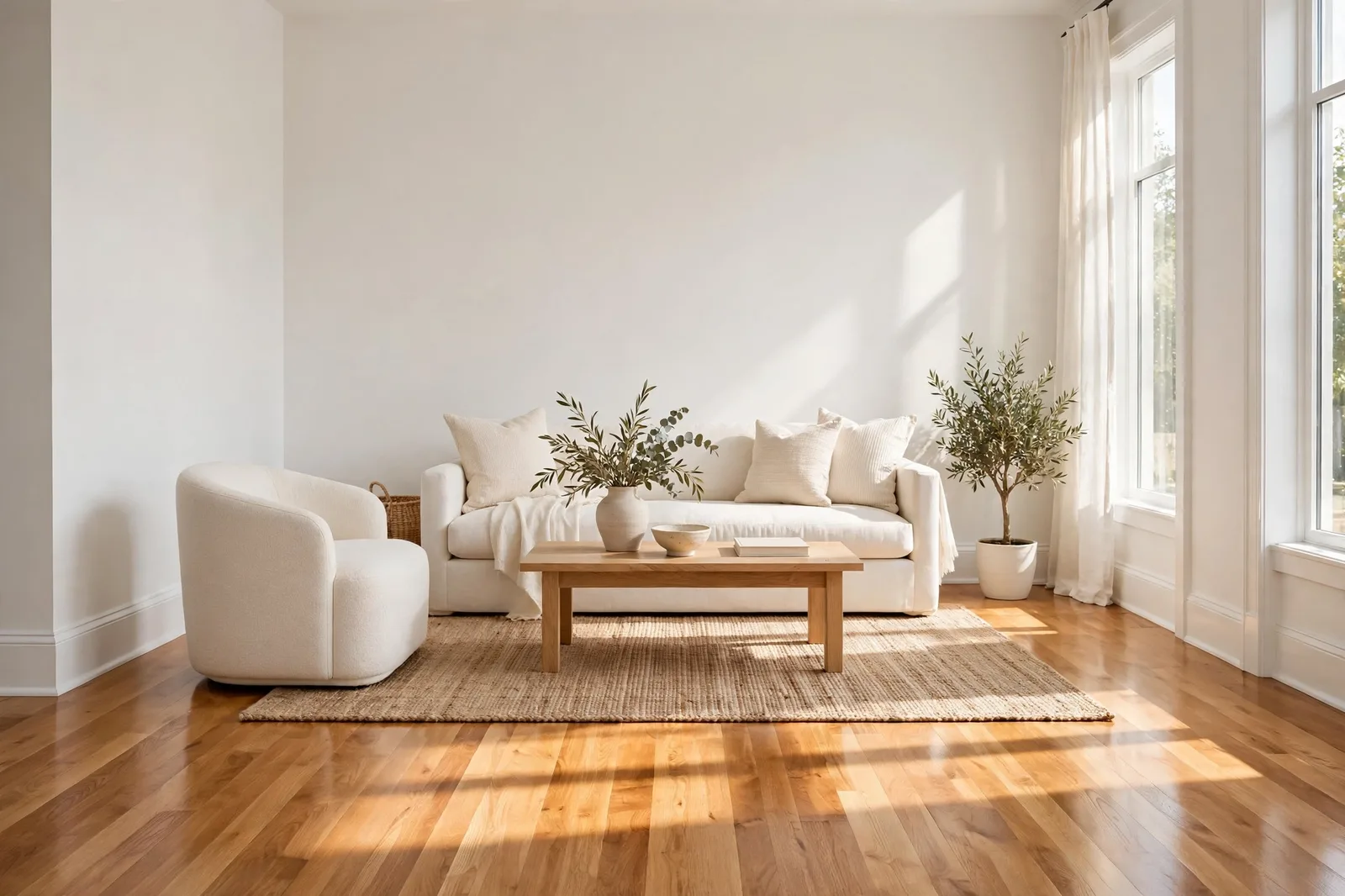
White is not a color you choose. It’s a color your house chooses, and your floors cast the biggest vote. The same white can look creamy and calm against warm oak, stark and icy against the same floor under different light, or faintly dingy next to gray-washed planks. That’s not because white is unpredictable. It’s because white is a mirror: it reflects the undertones of everything around it. Here’s how to pick the white your floors are asking for.
Why the floor decides the white
Here’s the uncomfortable truth about white paint: there is no universally flattering white. A white that glows in one house turns cold or dingy in another, and the difference is almost never the paint formula. It’s the floor.
White has almost no pigment of its own, so it does something colored paints can’t: it borrows. It borrows warmth from oak, redness from cherry, coolness from gray-washed planks, and darkness from espresso floors. Stand in a room with honey-oak floors and white walls, and what you’re actually seeing is a very pale warm color, because the white is reflecting gold back at you. Put the identical white in a room with cool gray floors, and it reads as a very pale cool color instead.
This is why “which white is best?” is the wrong question. The right question is “which white agrees with my floor?” And floors outrank everything else in this decision for a simple reason: they’re the largest undertone-carrying surface in the room, they’re permanent, and your walls sit directly next to them at the baseboard line, where the relationship is most visible.
The framework below organizes white into families by the floors they belong to. Read your floor first (Section 2), find your family, and the field of 2,000 whites collapses to a shortlist of a dozen.
The white-paper test: read your floor in two minutes
Before you shortlist anything, you need to know what undertone family your floor actually lives in. Your eye has adapted to it over the years, it’s become invisible to you, so use the test that breaks that adaptation:
1. Lay a sheet of pure white paper flat on the floor in natural daylight, away from colored rugs or furniture.
2. Look at the wood next to the paper. The white gives your eye a neutral anchor. The undertone becomes visible by comparison.
3. Read the result: the floor looks yellow, honey, or golden (warm family, oak, maple, pine), red, pink, or burgundy (red family, cherry, mahogany, red oak), gray, ashy, or weathered (cool family, gray-washed, white oak with gray stain), or dark brown with no strong lean (deep neutral, walnut, espresso).
4. Check twice. Floors can vary room to room, and finish matters as much as species, the same oak reads very differently with a honey stain versus a natural finish. Test the room you’re actually painting.
Now use the quick-decision table to aim your shortlist:
| If your floor is… | Undertone family | Lean your white toward… | Avoid |
|---|---|---|---|
| Honey oak / golden / yellow floors | Warm (yellow/gold) | Warm whites, soft cream, gentle warm white | Icy blue-whites, they make the floor look more orange by contrast |
| Natural light oak / pale maple | Warm-light | Warm whites with gray softness, off-whites with warm lean | Yellow-beige whites that stack warmth until the room looks sallow |
| Gray-washed / weathered floors | Cool (gray/ashy) | Clean whites with green-gray or soft blue lean | Creamy whites, they can look dingy against cool wood |
| Dark walnut / espresso | Deep neutral | Warm whites with real softness (contrast whites) | Stark bright-cool whites, jarring next to dark floors |
| Cherry / mahogany / red tones | Warm (red/pink) | Neutral-warm whites, warm pale neutrals (cream-linen range) | Pink-beige whites, they amplify the floor’s rosy cast |
Treat this as a starting direction, not a verdict, your light and your eye still get the final say. But notice what it eliminates: roughly 80% of the white section before you’ve opened a single fan deck. For the full method behind matching paint to fixed finishes, our undertone-matching framework walks through the same logic room by room.
Honey oak and golden floors: lean warm
Honey oak is the most common floor in American homes, and the one that causes the most white-paint heartbreak. It’s a loud presence: yellow-orange, bold grain, a lot of visual temperature. The temptation is to “cool it down” with a crisp white. Resist that instinct.
Here’s why: an icy blue-white next to honey oak makes the oak look more orange, not less. It’s simultaneous contrast, the coolest thing in the room exaggerates the warmest thing. The floor becomes the loud thing you were trying to quiet. What honey oak actually wants is a white in its own family: a soft cream or gentle warm white that doesn’t fight the gold. Designer favorites in this role include the Alabaster / White Dove family, warm enough to feel related to the floor, restrained enough to read as white on the wall.
The failure mode to watch for is the opposite one: going too warm. A yellow-beige white stacked on top of honey oak stacks warmth twice, and the room can turn sallow, like the whole space has been tinted with weak tea. The sweet spot is a white with a warm lean and a gray softness: warmth for harmony, gray for restraint.
Gray-washed and cool floors: keep it clean
Cool floors are the mirror image of the oak problem. Gray-washed, weathered, and cool-toned floors carry a gray or blue lean, and the mistake here is reaching for a creamy white, because cream is the “safe” white everyone knows.
Against cool wood, creamy whites with yellow undertones can look dingy, like the white is slightly dirty rather than intentionally warm. The floor is telling you it wants a clean white with a green-gray or soft blue lean, something that feels related to the ashiness underfoot. In designer-reported shortlists, this is where colors like Pure White and Snowbound sit, whites with just enough gray to stay crisp without going stark.
One nuance: “cool white” doesn’t mean “bright white.” A blinding, clinical white next to gray floors can feel institutional. You’re after the same temperature as the floor, not the maximum brightness. Hold finalists against the floor itself, not against the paint store’s white card, and look for the one that makes the floor look intentional rather than faded.
Dark walnut and espresso floors: use contrast
Dark floors are the easiest case, and the one where white’s job is most obvious. Walnut and espresso absorb light, so the white is doing two jobs: brightening the room and providing contrast that lets the floor’s richness read. Nearly any white works here if you avoid one thing.
The thing to avoid is a bright, cool white. Designers flag this pairing repeatedly: a stark white next to dark espresso floors can feel jarring, too much temperature contrast, like the room is two unrelated decisions. What dark floors want is a warm white with real softness: Alabaster, White Dove, Greek Villa, or their equivalents. The warmth creates a bridge between the wall and the wood; the softness keeps the contrast from feeling harsh. The result reads classic and library-like instead of clinical.
If you want the modern, high-contrast look instead, crisp white, black windows, minimal furniture, that’s a legitimate aesthetic. Just know you’re choosing the starkness on purpose, and soften it with texture (linen, wool, wood) so the room doesn’t feel hard.
Cherry and red-toned floors: calm, don’t fight
Cherry, mahogany, and red oak floors are the ones most people want to tone down, and the instinct is almost always wrong. The instinct is to go cool: fight the red with a blue-white or a gray. Here’s what actually happens, the contrast makes the red look redder. A cool white next to cherry turns the floor into the loudest thing in the room, because contrast increases saturation.
If what you want is for the floor to look quieter, do the opposite: lower the contrast with warm pale neutrals, creams, warm linens, soft warm taupes in the near-white range. When the wall is in the floor’s own temperature family, the red-brown reads as brown rather than red, and the whole room settles. Designers who work with cherry floors report success with warm pale tans and linen creams in this role, colors that sit low in saturation and high in lightness, quieting the floor instead of arguing with it.
The one white family to genuinely avoid with red-toned floors: pink-beige whites. They share the floor’s rosy lean and amplify it, the room goes from warm to blushing. And when it comes to trim in a cherry-floored house, keep the millwork in a warm linen cream rather than a bright white so it doesn’t glare against the warm wood.
A final honest note: if you like the redness, you don’t have to quiet it. A cleaner white that lets the cherry be dramatic is a valid choice, drama is only a problem when it’s accidental. Decide which floor you want, quiet or bold, then choose the white that serves that decision.
Match your white to more than the floor
Floors are the largest fixed finish, but cabinets, countertops, and tile all vote too. The Paint Color Workbook walks you through the full matching process, finish inventory, white-paper testing, side-by-side shortlists, so every white in your home agrees with everything it sits next to.
Frequently asked questions
Keep one white on all trim, doors, and ceilings throughout the house, consistency there is what ties rooms together. The walls can be the same white or one step deeper or warmer within the same family. What you don’t want is two whites in different undertone families touching each other, because the trim becomes the reference your eye judges the wall against. Also note: identical paint can read differently on wall versus trim because of sheen, eggshell on walls and semi-gloss on trim will naturally show a slight variation even from the same can.
Choosing a stark, blue-leaning white against warm wood floors. The contrast exaggerates the floor’s orange or red cast instead of calming it, and the white itself can read dingy under warm lamplight. Match the white’s temperature to the floor’s temperature, warm with warm, cool with cool.
Often, yes, if the difference is moderate. A neutral-warm white with a soft lean can bridge honey oak in the living room and slightly cooler wood upstairs. But if one floor is genuinely cool (gray-washed) and another genuinely warm (honey oak), a single white will fight one of them. In that case, let each floor zone keep its own white and unify the house with one consistent trim white instead.
Paint large poster boards with two coats, and lean them against the wall right above the baseboard, that’s where the floor-wall relationship is most visible. Check them in morning daylight and evening lamplight, because white shifts more than any other color between light sources. Our guide to testing paint samples covers the full 48-hour method.
Your bulbs, not your paint. Warm 2700K lighting deepens every warm undertone in a white, and white, having nothing of its own, shows the shift more than any color. If a white looks right by day but yellow at night, try a 3000K high-CRI bulb before you blame the color. Our guide to paint undertones explains how light wakes undertones up.
North light is cool and indirect, so it pushes every white cooler and flatter, a white that’s perfect in a south-facing room can read dingy or icy facing north. Lean your white slightly warmer in north rooms than the floor alone would suggest, and judge it in the room’s actual light. The floor sets the direction; the light fine-tunes it.

