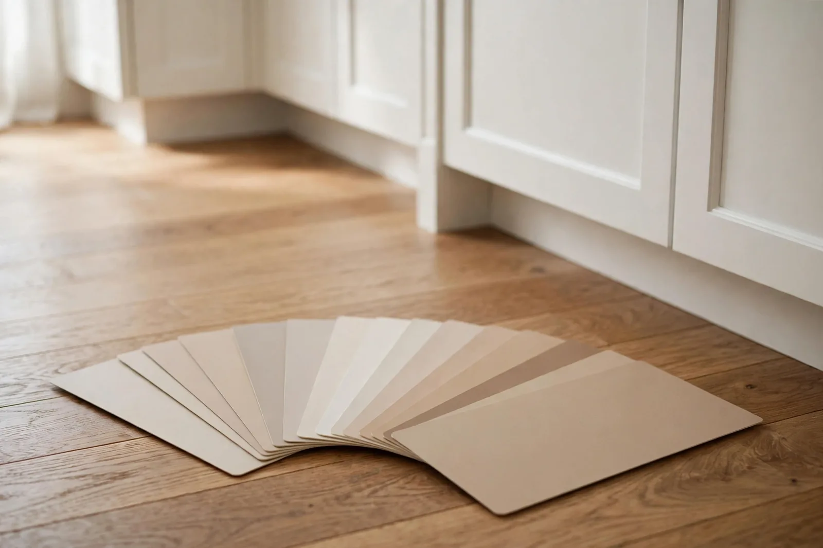
Your floors aren’t moving. Your cabinets aren’t moving. Your countertops, your tile, your brick fireplace, none of them are moving. Your paint, on the other hand, can be anything. So why do so many people choose the paint first and hope the finishes agree? This framework reverses that: read the undertones of everything you can’t change, then let them choose your paint.
Why fixed finishes rule every paint decision
Think about what paint actually sits next to in a room. Not other paint, wood floors, cabinets, countertops, tile, stone, brick. These are the fixed finishes: the surfaces chosen years ago (or by a previous owner), expensive or impractical to replace, and carrying strong undertones of their own. Oak floors lean warm and golden. Carrara marble leans cool and gray. Cherry cabinets carry red. Travertine carries yellow-pink. None of this is subtle once you know to look, and all of it outranks your paint preference, because the paint is the one thing that can change.
Here’s the mistake in its most common form: someone falls in love with a cool blue-gray paint, paints the living room, and then can’t understand why the room feels wrong. The answer is on the floor, warm honey oak, pulling golden, fighting the cool walls at every glance. Neither the paint nor the floor is “wrong.” They’re just in different undertone families, and the eye registers the disagreement even when the brain can’t name it.
The professional habit is simple and almost boring: decide nothing about paint until you’ve read the undertones of everything you can’t change. The finishes get the first vote, the second vote, and the tiebreaker. Your paint preference gets a vote too, but it votes last. This isn’t a limitation; it’s a relief. Instead of choosing from 2,000 colors, you’re choosing from the few dozen that agree with your house. The framework below makes that narrowing systematic.
Step 1, Inventory the immovable, find the dominant undertone
Walk your house room by room with a notepad, or your phone, and list every fixed finish: flooring, cabinets, countertops, backsplash tile, bathroom tile, brick, stone, fireplace surrounds. For each one, note two things: its surface color (light, medium, dark) and its undertone lean (warm, cool, or neutral). Don’t overthink the first pass; “warm,” “cool,” or “not sure” is enough.
Now rank them by two factors: size (how much visual area they cover) and permanence (how hard they’d be to change). Flooring almost always wins on both, it’s the largest surface in the house and the most expensive to replace. After floors, the usual order is countertops and tile, then cabinets, then brick or stone features. The finish at the top of that ranking is your dominant undertone: the home base your entire paint palette must agree with.
This is the step most people skip, and it’s why their paint “looks different than expected.” They chose a color in isolation, at the store, against other chips, instead of choosing it against the golden oak that covers 1,500 square feet of their home. The dominant undertone isn’t a suggestion. It’s the room’s largest color fact, and every paint decision either harmonizes with it or fights it.
Step 2, The white-paper test
You now know which finishes matter. Step 2 is reading their undertones precisely, and the most reliable method is also the simplest. It’s the same test professional painters and designers use on real projects:
1. Get a sheet of pure white paper, not cream, not off-white, not printer paper with a warm cast. A true white reference is the whole trick.
2. Lay it flat on your wood floor (or hold it against your countertop, cabinet door, or tile) in natural daylight.
3. Look at the finish next to the white. The white gives your eye a neutral anchor, and the undertone jumps out by comparison. You’ll see it clearly: the floor looks yellow, orange, or pinkish next to the white (warm family), or gray, blue, or violet (cool family), or neither strongly (neutral).
4. Repeat for every major fixed finish, floors in each room (they may differ), kitchen counters, bathroom tile, the fireplace brick. Note each result.
Why this works when just “looking” doesn’t: your eye adapts to the dominant color in a room and stops noticing its lean. The white paper breaks that adaptation, it forces a comparison your brain can’t smooth over. Undertones that were invisible for years become obvious in seconds.
A few things the test will teach you about common finishes. Oak floors, by far the most common, almost always read warm: golden, honey, or amber. Gray-washed or weathered wood reads cool. Cherry and mahogany carry strong red undertones. White marble (Carrara, Calacatta) reads cool gray. Granite varies wildly, hold the paper against your slab, because one granite runs warm gold and the next runs cool silver. Travertine and limestone lean warm, often yellow-pink. Brick is usually warm (red-orange) but can run surprisingly cool in gray or whitewashed varieties. Trust the paper, not your memory of what the finish “should” be.
Step 3, The 3-swatch shortlist (and the decision table)
With your dominant undertone identified, you can now shortlist paint with a rule instead of a feeling. The framework’s core principle, the one that settles the endless “match or contrast?” debate, is this:
Match the undertone family. Contrast the depth.
Your wall color should live in the same undertone family as your dominant finish (warm with warm, cool with cool), but sit at a different depth, usually lighter. This gives you both harmony and definition: the room feels cohesive because the undertones agree, and the finishes still stand out because the depths differ. The most cited practical version of this: keep walls at least three shades lighter than your floors. Dark floors with light walls is the classic pairing for a reason, it lets the floor be the star.
Now the shortlist method: pull exactly three swatches, no more, that satisfy two conditions. First, each one is in your dominant undertone family (verify with the white-paper test from our undertones guide). Second, each one is meaningfully lighter than your dominant finish. Three swatches is deliberate: two feels like a coin flip, five restarts the overwhelm. Three is a decision.
Use this table to aim your shortlist:
| If your dominant finish is… | Its undertone family | Lean your paint toward… | Avoid |
|---|---|---|---|
| Warm oak / honey floors | Warm (yellow/gold) | Warm whites, warm greiges, soft creams, lighter than the floor | Cool blue-grays; they’ll fight the gold all day |
| Gray-washed / cool wood floors | Cool (gray/blue) | Cool whites, soft blue-grays, light cool greiges | Yellow-beiges; they’ll look dingy against cool wood |
| Cherry / mahogany (red tones) | Warm (red/pink) | Warm neutrals in the red-pink family, warm whites, soft taupes | Cool grays and green-leaning colors; red vs. green is the harshest clash |
| Dark walnut / espresso floors | Warm-neutral, deep | Light warm neutrals with real contrast, go light, not mid-tone | Mid-tone browns and beiges that sit too close to the floor’s depth |
| White marble counters / cool stone | Cool (gray/blue) | Cool whites, pale blue-grays | Creamy yellow whites; the marble will make them look dirty |
| Warm granite / travertine | Warm (gold/pink) | Warm beiges, creams, warm whites | Crisp cool whites; they’ll look stark and disconnected |
| Red / orange brick | Warm (red/orange) | Warm neutrals, soft whites with warm lean | Cool grays directly against the brick, bridge with trim instead |
Treat the table as a starting direction, not a verdict, your specific slab, your specific light, your specific eye all get a say in Step 4. But notice what the table is really doing: it’s eliminating roughly 80% of the paint wall before you start. That’s the framework working. Decision fatigue comes from too many options; the undertone rule is how you earn the right to ignore most of them.
Step 4, The 48-hour live-with-it test
Three swatches, one winner, but not yet. Undertones shift with light, and your dominant finish looks different at 9am than at 9pm. The final step is the only one that can’t be shortcut:
1. Buy sample pots of your three finalists, never decide from the chip alone.
2. Paint large white poster boards, two coats, fully dry, not the wall. Boards move; walls don’t.
3. Prop each board against the wall, next to the dominant finish. For floors, lean the board low so it sits beside the baseboard. For counters, stand it on the counter. You’re judging the relationship, not the color alone.
4. Live with all three for 48 hours. Check them in morning daylight, afternoon sun, and evening lamplight. Undertones reveal themselves slowly, a pink flash you miss at noon shows up at sunset; a gray that looked neutral at noon goes blue under cool LEDs.
5. Eliminate, don’t choose. At the end of 48 hours, remove the worst performer first, the one that clashed with the floor in at least one light. Then pick between the remaining two by asking: “Which one looks best in this room’s worst light?” A color that survives dim evening light will thrive everywhere else.
When your fixed finishes clash with each other
Sometimes the framework hits a real problem: your finishes don’t agree with each other. Warm honey-oak floors meet cool gray kitchen counters. A red-brick fireplace sits in a room with gray-washed floors. The white-paper test gives you two different answers, and now what?
First, don’t panic, this is common, especially in renovated homes where one element was updated without regard for the others. The framework still works; you just apply the dominance rule from Step 1: the larger, more permanent finish wins. Flooring beats countertops (more area, harder to change). Countertops beat the backsplash. The fireplace loses to the floors that surround it. Your paint follows the winner.
Second, use the paint as a bridge, not a side-taker. When floors are warm and counters are cool, don’t paint warm (abandoning the counters) or cool (abandoning the floors). Choose a neutral-leaning color, a true greige, a soft warm gray, that sits between the two families without strongly belonging to either. Neutrals are diplomats: they don’t resolve the disagreement, but they stop it from shouting.
Third, recruit the trim white as peacemaker. A consistent trim and ceiling white running through the whole house creates a continuous thread that visually connects rooms even when their fixed finishes differ. It’s the cheapest unity you can buy, one color, every room, no exceptions.
And the honest last resort: if one finish is small, replaceable, and the sole source of conflict, a dated backsplash, a single bathroom’s tile, changing it is sometimes cheaper than living with a compromised palette for a decade. The framework tells you which finish is the problem; whether to solve it with paint or with a sledgehammer is a budget question, not a color question.
If working through all of this by hand feels like a lot, that’s because it is, which is exactly why a structured workbook exists.
Want the framework as a worksheet?
The Paint Color Workbook turns these four steps into guided worksheets, finish inventory, undertone testing, side-by-side shortlists, so you work through your actual rooms methodically instead of holding it all in your head.
Frequently asked questions
Lay a sheet of pure white paper flat on the floor in natural daylight and look at the wood next to it. The white gives your eye a neutral reference, and the undertone becomes visible by comparison, yellow, orange, or pinkish means warm; gray, blue, or violet means cool. This is the same test designers use, and it works on countertops, tile, and cabinets too.
Both, in different dimensions. Match the undertone family (warm paint with warm floors, cool with cool) and contrast the depth (walls lighter than floors, ideally several shades). This gives you harmony without the room feeling flat or the finishes disappearing into the walls.
Follow the larger, more permanent one, usually the countertop, since it’s harder to change than cabinet paint and covers significant visual area. Then bridge: choose a neutral-leaning wall color that sits between the two families rather than siding strongly with either. And remember the trim white, one consistent white through the kitchen visually ties competing finishes together.
A neutral-leaning greige, not strongly warm, not strongly cool. It won’t perfectly match either finish, and that’s the point: it acts as a diplomat between them. Test your finalists against both finishes during the 48-hour test, and eliminate any swatch that clashes hard with either one. The winner is the color that offends nobody.
Yes, brick is one of the most undertone-heavy finishes in a home, and it’s not moving. Most brick leans warm (red-orange), so warm-leaning neutrals on the surrounding walls keep the room cohesive. If you want the brick to be a feature, give it contrast in depth (lighter walls around dark brick) rather than fighting it in temperature.
Sometimes, and it’s often the smartest move. If the cabinets are the only finish fighting everything else, repainting them in a color that agrees with your floors and counters can solve the whole room at once. But repaint the cabinets to match the dominant undertone, not to match the wall paint you already picked. The finishes still vote first; the cabinets just become a vote you get to cast.

