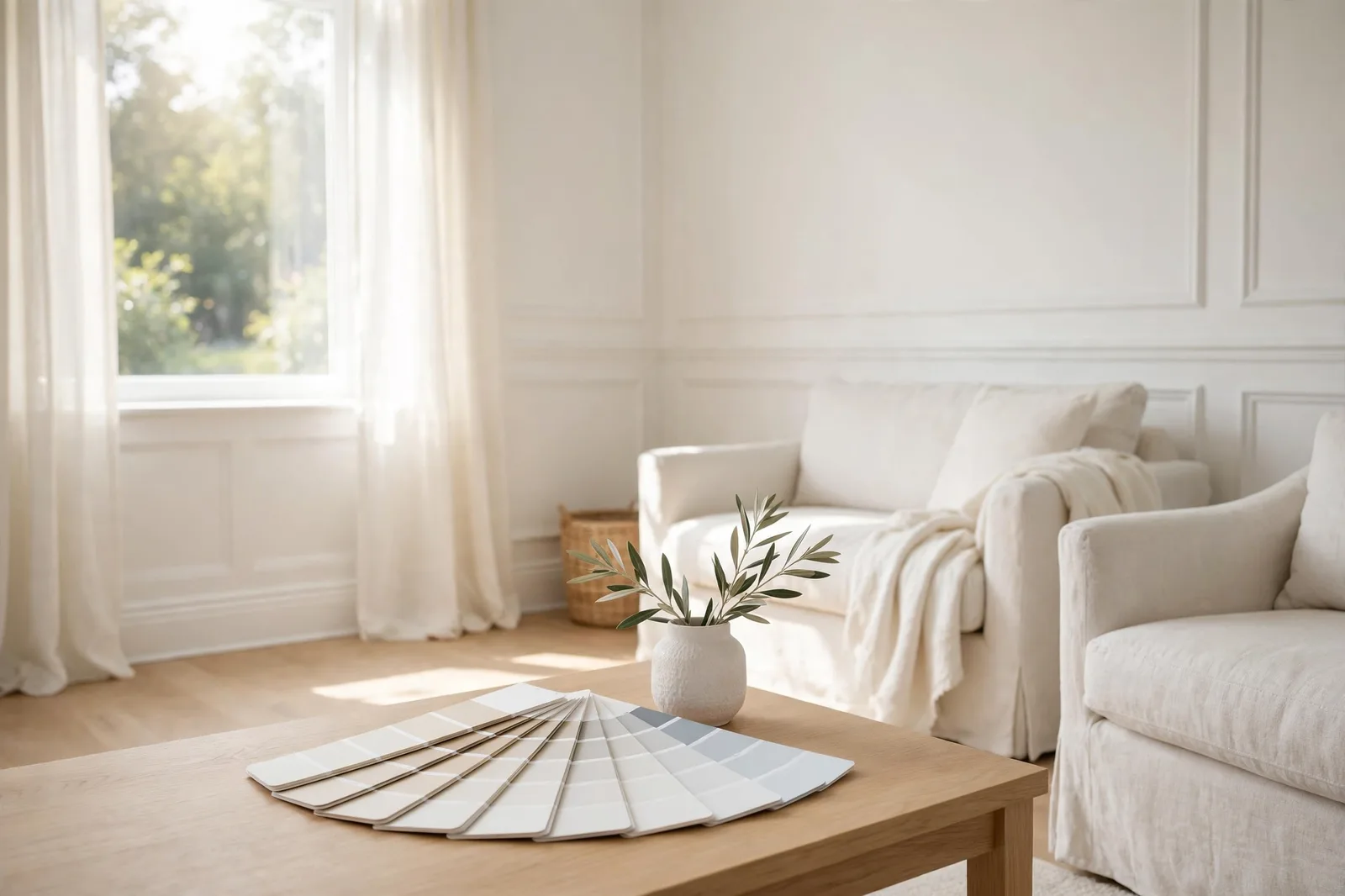
White should be the easy choice. No bold color to commit to, no pattern to tire of, nothing to clash with. And yet designers report that white is the color their clients regret most, a cool white that reads crisp on the chip and icy on the walls, a warm white that turns yellow by afternoon, a “clean” white that makes the trim look dingy by comparison. White isn’t simple. It’s the color where every small decision shows.
Why white is the hardest “simple” color
Every other color announces its personality on the chip. Blue is blue; green is green. White hides. A two-inch white chip shows almost nothing, the undertone is a whisper, the depth barely registers, and your brain fills in “clean” because that’s what white is supposed to be. Then it goes on four walls, in your light, next to your floors, and the whisper becomes a shout.
Designers consistently report the same pattern: the most regretted white is the icy one. Crisp in theory, as one designer put it, sterile and flat once it’s on the walls. It looked modern and gallery-like on the chip; in the living room it feels like a dentist’s office. The second most common regret runs the opposite direction: a warm white chosen for coziness that reads as buttercream frosting across every wall, as another designer described waking up to.
Both failures come from the same root: white amplifies context. A beige has enough pigment to hold its own against oak floors and 2700K bulbs. A white doesn’t, it borrows its character from everything around it. That’s what makes white powerful in the right setup and merciless in the wrong one. The seven mistakes below are the seven ways it goes wrong.
Mistakes 1 & 2, Choosing at the store, ignoring undertones
Mistake 1: Choosing under store fluorescents
Why it happens: You’re standing in the paint aisle, the chips all look lovely under the bright even lighting, and one of them just feels right. It feels efficient, you’re already there, you could buy the gallons today.
The regret: Paint stores are lit around 4,000–5,000K, cooler, brighter, and more even than any home light. A white that looked balanced there can shift dramatically under your 2700K living-room lamps or your north-facing window. This is metamerism at its most punishing, because whites carry so little pigment that light becomes most of what you see.
The fix: Treat the store as a shortlist, never a decision. Bring a sheet of white printer paper with you, hold it next to any finalist chip and the undertone jumps out by comparison (a trick designers use routinely at the store). Take home three chips, buy sample pots, and make every decision in the room itself. The store tells you which whites to try; your room tells you which one works.
Mistake 2: Assuming all whites are “just white”
Why it happens: “White is white” feels like common sense. The chip names don’t help, everything sounds like a shade of clean.
The regret: Every white carries an undertone family: yellow, pink, green, blue, brown, or (rarely) truly neutral. Put a blue-leaning white wall next to warm oak floors and the clash is constant, the wall reads icy, the floor reads orange, and neither looks the way you planned. Put two whites with different undertones next to each other (warm wall, cool trim) and each makes the other look wrong.
The fix: Learn the four undertone families with the white-paper test, full details in our guide to paint undertones, then commit to one undertone family for the whole room. Warm walls want warm trim. Cool walls want cool trim. The single most common white-on-white failure is accidental mixing: a warm wall against a cool trim white that turns the wall yellow-pink by comparison.
Mistakes 3 & 7, Testing too small, deciding too fast
Mistake 3: Testing with a postage stamp
Why it happens: A 4-inch swatch feels like enough. You can see the color, can’t you? Plus painting big samples feels like work before the “real” work.
The regret: Whites are the worst color for small-sample testing because they show the least on a chip and the most on a wall. A subtle undertone invisible at 4 inches becomes the room’s defining character at 400 square feet. People choose a white that looked “clean” in miniature and end up with walls that read pink, green, or gray at full scale.
The fix: Sample pots, minimum 2×2 feet, two coats, on poster boards or primed wall patches, and test on multiple walls, because a north wall and a sunlit wall can make the same white look like two different paints. If your current walls are dark, prime the test area white first; the old color underneath distorts every reading, and whites distort more than anything.
Mistake 7: Skipping the 48-hour test
Why it happens: The painter is coming Monday. The room needs to be done. The white looks fine at noon on Saturday.
The regret: White’s personality is entirely about light, and light is entirely about time. A white that looks perfect at noon can turn icy under evening lamplight or yellow in late-afternoon sun. Deciding same-day means deciding on one light condition out of the dozens the white will live in.
The fix: Live with three large samples for 48 hours: morning, midday, evening, and lamplight. Judge by the worst light, not the best, the white that still looks right in a gray afternoon or under 2700K bulbs will thrive everywhere else. Our full protocol is in the guide to testing paint samples; whites are the color family where it matters most.
| Mistake | Why it happens | The regret | The fix |
|---|---|---|---|
| Choosing at the store | Efficiency, you’re already there | White shifts under home lighting | Store = shortlist only; decide in the room |
| Ignoring undertones | “White is white” | Walls fight floors and trim | One undertone family per room, always |
| Testing too small | A 4-inch swatch feels like enough | Undertone explodes at wall scale | 2×2 feet minimum, two coats, multiple walls |
| One white everywhere | Simplicity | Trim disappears or clashes; ceiling goes gray | Graduate the whites: walls, trim, ceiling |
| Wrong temperature for the light | Choosing for the chip, not the room | Icy north rooms; yellow south rooms | Warm whites north, restraint with warmth south |
| Forgetting fixed finishes | The paint store has no floors | White borrows the wrong character | Test every finalist against floors and counters |
| Skipping the 48-hour test | The painter comes Monday | Judged on one light out of dozens | 48 hours, four light checks, worst-light rule |
Mistake 4, One white for walls, trim, and ceiling
Why it happens: One can of white for everything sounds clean, simple, and economical. And many designers do use a single white through a house, but they use it deliberately, not by default.
The regret, part one, the trim disappears: Trim exists to be seen, baseboards, casing, crown molding. Paint it the identical white as the walls in the identical sheen and it vanishes; you paid for millwork that now reads as flat wall. The fix most painters recommend: same white, but step up the sheen on trim (satin or semi-gloss against eggshell walls). The sheen difference alone creates the definition.
The regret, part two, the trim clashes: This is the one that hurts. Your “white” trim isn’t actually neutral, existing trim yellows with age, sunlight, and old oil-based paint. Against your new wall white, it suddenly reads dingy or gray. Before choosing, hold white printer paper against your trim at floor level, at windows, and at the ceiling. If the trim leans yellow or gray, your wall white must coordinate with that, not with a theoretical white.
The regret, part three, the ceiling goes wrong: Here’s a fact most people learn the hard way: the same white looks darker on a ceiling than on walls, because ceilings get less light. Paint the identical wall white on the ceiling and it reads as gray. The standard fix is to use a white one category lighter than the trim white on the ceiling, which reads as “the same white” to the eye once it’s overhead.
Mistake 5, The wrong temperature for your light
Why it happens: You fell for a white, its name, its chip, its reputation, and never asked what your room’s light would do to it.
The regret: This is where the two classic white failures are born. In north-facing rooms with cool, indirect light, a cool white turns icy and flat, the most regretted white of all, according to designer surveys. The room feels like it’s holding its breath. In south- and west-facing rooms with strong warm sun, a warm white’s yellow undertone gets turbocharged, the “buttercream frosting” regret. Same mistake in both cases: the white’s temperature fights the light’s temperature instead of balancing it.
The fix: Match temperature against the light, not with it. Cool, dim north light wants a warm-leaning white to compensate. Intense warm south light wants restraint, either a true neutral white or a cool-leaning one, tested at midday when the sun is harshest. East and west rooms shift through the day, so test at both ends of it. And the dark-room trap: don’t reach for the brightest, starkest white to “brighten” a dim room, without enough light to reflect, stark white reads cold and dingy. A soft, warm white with some body to it feels brighter because it feels intentional. Full orientation-by-orientation guidance is in our natural light guide.
Mistake 6, Forgetting your fixed finishes + the final checklist
Why it happens: At the store, there are no floors. No cherry cabinets, no travertine counters, no brick fireplace. It’s just you and the chip wall, which is exactly when white looks most innocent.
The regret: White borrows character from its neighbors more than any other color. Warm honey-oak floors will pull a neutral white warm, sometimes past warm into yellow. Cool gray tile will pull the same white cool, sometimes into icy. A white chosen in isolation gets its personality assigned by your finishes, and you don’t get a vote after the fact.
The fix: Every finalist gets tested against the fixed finishes, hold the sample board next to the flooring, the countertop, the cabinet door, in the room’s actual light. The framework for this is our undertone guide’s core rule: match the undertone family of your dominant finish, then choose your depth. Warm floors, warm white. Cool stone, cool or neutral white. It really is that direct, and white is where skipping it costs the most.
The final selection checklist
Run every white through this before you buy gallons:
1. Undertone identified with the white-paper test, and it matches your fixed finishes’ family.
2. Temperature chosen against your light: warm-leaning for cool north rooms, restrained for hot south rooms.
3. Trim checked with white paper, your wall white coordinates with the trim you actually have.
4. Three roles assigned: wall white, trim white (crisper or glossier), ceiling white (a step lighter).
5. Bulbs decided, Kelvin and CRI known, tested under the lamps you’ll live with.
6. Three finalists, large samples, 48 hours, four light checks, judged in the worst light.
7. Screen swatches treated as what they are: approximate. The physical sample in your room is the decision.
Choosing white is easier with a system
The Paint Color Workbook walks you through white selection step by step, undertone testing worksheets, side-by-side comparison grids, and a room-by-room sampling checklist, so the white you choose is the white you keep.
Frequently asked questions
Choosing a cool, icy white that looks crisp on the chip but sterile on the walls. Designers report it as the top white regret, what seems modern and gallery-like in theory reads as cold and flat in a real room, especially in north-facing light. A warm-leaning or true-neutral white is the safer default.
They can be, but graduate them: use the same undertone family, then vary depth and sheen. Keep the wall white as your base, use a crisper or glossier white on trim so the millwork reads, and go one step lighter on the ceiling (the same white looks darker overhead). Identical white in identical sheen everywhere makes trim disappear.
Warm undertones amplified by warm light. South- and west-facing sun, 2700K bulbs, and warm oak floors all push a white’s yellow undertone harder, what was subtle on the chip becomes obvious across a wall. Test warm whites at midday and under your evening lamps before committing.
Hold the swatch against a sheet of pure white printer paper in daylight. The comparison reveals the lean instantly, yellow, pink, green, blue, or brown. Bring the paper to the paint store too; it works on chips just as well as on samples.
A soft, warm-leaning white, not the brightest stark white you can find. Dim rooms don’t have enough light to make stark white feel bright, so it reads cold and dingy. A warm white with some body compensates for the cool light and feels intentionally cozy rather than accidentally gray.
It’s the most common white-on-white failure. Mixed undertone families make each white look wrong, the wall reads yellow-pink, the trim reads harsh. Keep walls and trim in the same undertone family and create contrast with sheen or a slight depth step instead.

