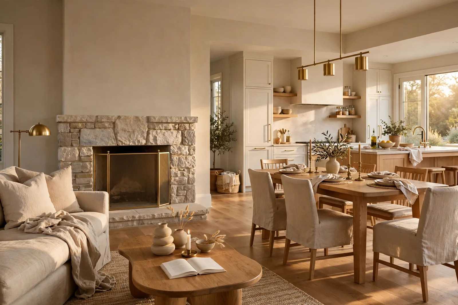
Choose the living room wall color in isolation and it will fight with the hallway, the kitchen sightline, and every adjacent room, because the living room is the hinge room of the house. It is the room most seen from other rooms: the entry opens onto it, the kitchen looks into it, the hallway borrows its light. That makes its paint color a whole-house decision wearing a room-sized disguise. This guide treats it that way: the five color families designers reach for in living rooms, warm whites, greiges, sage greens, soft blues, and warm beiges, each judged not just on its own beauty but on how it behaves with the rest of the home. Colors shift with lighting, surface, and sheen, so always test a large physical sample in your own space before committing. Sherwin-Williams and Benjamin Moore color names appear as widely-known designer references only; The Global Abode is an independent brand, not affiliated with or endorsed by either company.
Why the Living Room Is the Hinge Room
Every house has a hinge room, the one the rest of the home turns on. It is rarely the bedroom or the laundry room. In most homes it is the living room, because the living room is the most seen room in the house. Stand in your entryway: what do you see? Stand in your kitchen: what do you see over the island? Stand in the hallway: where does the light come from? In most floor plans, the answer to all three is the living room. Its walls are the backdrop of your daily life and the first impression of every guest.
That visibility is what makes the living room color a whole-house decision. Paint the bedroom a bold color and the risk is contained, the door closes. Paint the living room a color that fights your hallway, your kitchen sightline, and your entry, and there is nowhere to hide. The color will be in every sightline, in every photograph, in every evening. Which means the question isn’t really “what living room color do I like?” It’s “what living room color lets the whole house make sense?”
Designers answer that question with a concept the rest of this guide follows: the living room leads the palette. As stylists and color experts widely advise, let one room set the direction, usually the entryway or the living room, and let the other rooms branch off as variations. That doesn’t mean every room matches. It means every room relates: same undertone temperature, shared trim white, accents that repeat. The living room is where the palette’s thesis gets stated. Choose it well and the rest of the house writes itself.
There’s a practical reason this matters more now than it used to. Open-plan living has blurred the boundaries between kitchen, dining, and living areas in a huge share of homes. When three rooms share one sightline, a living room color that clashes with the kitchen’s finishes isn’t a room problem, it’s a house problem. The flow test in section 4 is the tool that catches this before the gallons are opened.
The Five Color Families That Work
Designers don’t choose living room colors from the whole fan deck. They work from five families that have proven themselves in the hinge room, colors with enough flexibility to live alongside hallways, kitchen sightlines, and changing furniture. Each family below is judged on two things: how it behaves as a living room color, and how it behaves as a neighbor.
| Family | Best colors | The mood | Watch out for |
|---|---|---|---|
| Warm whites | White Dove OC-17 (BM), Alabaster SW 7008 (SW) | Bright, calm, timeless, the walls disappear and the room glows | Can glare in very bright south rooms; needs warm trim to avoid sterility |
| Greiges | Agreeable Gray SW 7029 (SW), Edgecomb Gray HC-173 (BM), Revere Pewter HC-172 (BM) | Soft presence, the walls have substance without demanding attention | Go heavy and flat in dim north rooms; Revere Pewter can flash mauve in evening light |
| Sage greens | Evergreen Fog SW 9130 (SW), October Mist 1495 (BM), Clary Sage SW 6178 (SW) | Quiet color, the room feels alive but never loud | Shift with their neighbors: greener next to warm woods, grayer next to cool finishes |
| Soft blues | Sea Salt SW 6204 (SW), Rainwashed SW 6211 (SW) | Serene and airy, the classic calm-living-room read | Can read chilly in north light; the chameleon shift (green one hour, blue the next) isn’t for everyone |
| Warm beiges | Accessible Beige SW 7036 (SW) | Enveloping and cozy, the traditional warm hug | Can read as “tan” rather than “neutral” in strong sun; the faint green thread surfaces in dim rooms |
A few notes on each family’s personality in the hinge room:
Warm whites are the safest hinge-room choice and the most common one, and for structural reasons, not just taste. A warm white living room connects effortlessly to every adjacent space: hallways, entries, kitchens. It never argues with the trim, it flatters every furniture style, and it makes the room feel larger. The 2026 trend conversation keeps circling back to warm off-whites for exactly this reason: designers describe them as providing “a sweeping wash that embraces the space in warmth”, inviting, timeless, and impossible to fight with. The trade: white walls put all the visual weight on your furnishings, so the room needs enough texture and contrast (wood, textiles, art) to avoid feeling blank.
Greiges are the hinge-room workhorse for homes that want walls with presence. Agreeable Gray is the most consistent and forgiving; Edgecomb Gray is its softer, warmer cousin; Revere Pewter brings more depth and character, with the famous caveat that it can flash faintly mauve in evening light. Greiges are what designers reach for when white feels too stark but color feels like too much. They’re also the family most aligned with 2026’s leading neutral: warm greige, praised for its adaptability across architectural styles and its staying power. The trade: greiges need decent light. In a dim north-facing living room, a mid-tone greige can read heavy where a warm white would have glowed.
Sage greens are the gentle color commitment, actual, recognizable color that behaves like a neutral. Evergreen Fog brings the most depth (use it where the living room can take a moodier read); October Mist is the lightest and most approachable; Clary Sage is the warmest, flattering wood floors and warm finishes. Sages are having a sustained moment as the “first color” for homeowners moving away from all-neutral schemes. The trade: sage is the most neighbor-sensitive family. It reads greener next to warm woods and grayer next to cool stone, so its relationship with your fixed finishes decides everything.
Soft blues are the serenity pick. Sea Salt and Rainwashed are coastal-adjacent but read as classic calm in a living room, not beach-themed, muted blue-greens that recede gracefully. They pair beautifully with warm whites, natural wood, and brass. The trade: blue undertones are the most light-reactive. In north light or under cool bulbs, soft blues can turn chilly; they want warm lighting (2700K–3000K) and warm companions to stay friendly.
Warm beiges, really one color doing the work: Accessible Beige, are the cozy-traditional answer. Warmer and more enveloping than any greige, with a gray-green grounding that keeps it from going dated. It’s the choice for the living room that should feel like a hug: traditional furnishings, warm woods, evening lamp-light. The trade: it’s the deepest of the hinge-room neutrals, so it asks the most of your light.
Light and Orientation: North vs. South Living Rooms
The living room’s exposure is a genuine decision input, the same color can read as “soft and glowing” in one orientation and “flat and heavy” in another. Here’s what the direction means for your shortlist.
North-facing living rooms (cool, indirect light). This is the hardest exposure for a hinge room, because cool light flattens warm colors and chills cool ones. The winners: warm whites (White Dove, Alabaster) absorb the cool cast and stay clean; Accessible Beige holds its warmth well if the room has decent supplemental lighting. The caution list: mid-tone greiges (Revere Pewter, Agreeable Gray) can go flat and heavy without strong light, if you want greige in a north living room, choose the lightest member (Edgecomb Gray) and warm your bulbs to 2700–3000K. Soft blues are the riskiest north-room choice; Sea Salt in weak north light can read more gray-blue than intended.
South-facing living rooms (bright, warm light). The sun does the warming work for you, so this is the most forgiving exposure, and the one where you should be most careful about over-warming. Warm whites are superb here: bright, glowing, the version from the brochure. Greiges show their best selves in southern light, Agreeable Gray practically glows. The caution: the warmest colors (Accessible Beige, Alabaster) go more golden in strong southern sun and can read as tan or cream rather than neutral. If your south living room already has warm oak floors and warm sun, consider stepping one notch cooler on your shortlist to balance.
East and west living rooms. East rooms swing from warm morning to cool afternoon, most hinge-room colors handle the swing, with greiges and warm whites the most stable. West rooms get the golden evening push, which is exactly when living rooms get used most. Test your finalist at 6pm, not at noon: west sun amplifies every warm undertone, and a color you loved at midday can feel unexpectedly golden at dinner time.
The artificial-light reality. Living rooms live under lamplight more than any other room. Warm 2700K bulbs flatter every family here, they activate the warmth in whites and greiges, calm the cool edge of soft blues, and make sages glow. Cool daylight-balanced bulbs (4000K+) flatten warm neutrals and expose undertones you’d rather not see. Before you judge any sample, put your intended bulbs in the room, the bulb is part of the color decision.
The Flow Test: Sightlines, Open Plans, and the One-Neutral Rule
This is the section that makes the guide a hinge-room guide rather than a living-room guide. The flow test is how you choose a color that works with the rest of the home, three checks, run before you buy the gallons.
Check 1: The doorway stand. Stand in every doorway that opens onto the living room, the entry, the kitchen, the hallway, and look at the living room walls against the adjacent room’s walls. The question isn’t whether they match; it’s whether they relate. Same undertone temperature (all warm-leaning or all cool-leaning), visible but calm transitions. A warm greige living room next to a cool gray hallway will look like a mistake even if both colors are beautiful alone. The eye reads undertones comparatively, and doorways are where the comparison happens.
Check 2: The open-plan rule. If your living room opens directly into the kitchen or dining area with no wall between them, the professional consensus is clear: carry one color across the open space. Sharp color contrasts next to each other feel harsh and abrupt when there’s no boundary to contain them, and accent walls in open plans, as designer Nate Berkus has argued, read as a lack of commitment because there’s no natural place for the color to start and stop. One neutral across the open area, with variation coming from furnishings, rugs, and art, not from the walls. If you need zone definition, use area rugs and furniture placement, which designers widely recommend over paint lines.
Check 3: The one-neutral rule. Connected spaces should share one main neutral, not two near-neighbors. A living room in Agreeable Gray opening onto a hallway in Repose Gray looks like a matching error, the colors are close enough that the eye reads them as “almost the same” and then punishes the difference. If you want variation between the living room and adjacent spaces, change depth by two full steps (a genuinely lighter or deeper color), or change family entirely (greige living room, warm white hallway, sage study). Near-neighbors clash; true contrasts work.
Beyond the three checks, two structural decisions make flow nearly automatic:
Keep connecting spaces neutral. Hallways, landings, and entries in warm white, greige, or beige give the eye a place to rest between rooms of stronger color, and they make the living room’s color read as intentional rather than loud. This is the classic whole-house architecture: the quiet connectors make the confident rooms work.
Repeat accents, don’t scatter them. If your living room has a sage accent, repeat sage in one other place, a bedroom, the dining room, a powder room. If the living room leans blue, let blue appear in the kitchen textiles. Repeated accents are what make a house feel designed rather than decorated room-by-room. The living room states the accent; the rest of the house echoes it.
Fireplaces, Built-Ins, and Architectural Features
Living rooms have more architecture than most rooms, fireplaces, built-ins, wainscoting, beams, big windows, and every feature is a color decision. The principle: let the architecture set the color strategy, not the other way around.
Fireplaces. A fireplace is the living room’s natural focal point, and its material votes on the wall color. Stone fireplaces with warm movement (gold, rust, cream) want warm-leaning walls, warm whites, Accessible Beige, warm greiges. Cool marble or gray stone wants cooler companions, soft blues, Repose Gray, Snowbound-leaning whites. The common mistake is painting the wall to match the fireplace’s lightest tone, which washes everything out; instead, choose a wall color one to two steps deeper than the stone’s lightest tone so the fireplace has something to stand against. For painted brick fireplaces, the wall and the brick in the same color family (different depths) reads as architecture; a contrasting brick color reads as a feature, both work, but the contrasting route needs the undertone temperature to agree.
Built-ins and wainscoting. Painted built-ins are where the two-tone living room earns its keep: walls in one color, built-ins in a deeper or contrasting tone. The classic executions: warm white walls with greige built-ins (Edgecomb Gray walls, White Dove built-ins, or the reverse); greige walls with a deep accent on the built-ins (Agreeable Gray walls, Evergreen Fog or Hale Navy built-ins). The rule that keeps it intentional: the built-in color should be at least two full steps deeper than the wall, or a genuine accent color, near-neighbors read as a mistake. And keep the undertone family consistent between the two, or the room will feel assembled rather than designed.
Accent walls in the living room. The honest guidance: an accent wall works when the room has a natural focal wall, the fireplace wall, the wall behind the sofa in a clearly defined seating area. It fails when it’s arbitrary (one random wall, no architectural reason). And in open-plan living rooms, skip the accent wall entirely, with no boundary to contain it, the “accent” reads as an unfinished thought. If the living room is a distinct, enclosed room, one deep accent wall (Evergreen Fog, a warm charcoal, a deep sage) with the other three walls in your hinge neutral is the highest-impact, lowest-risk move in the book.
Beams, trim details, and big windows. Dark wood beams want walls that don’t compete: warm whites and light greiges let the beams be the architecture. Lots of windows mean lots of light, which means you can go one step deeper on the walls than you otherwise would, light is the budget that deeper colors spend. And remember the trim: whatever the walls do, the trim stays consistent (section 6), because consistent trim is what makes varied wall colors read as a system.
The Finish Layer: Trim, Ceilings, and Sheen
Wall color gets the attention; the finish layer does the quiet work of making it look intentional. Three decisions, all structural.
Trim: one white, everywhere. The single highest-leverage flow decision in the house is running one consistent trim white through every room, living room included. White Dove is the designer default against the warm families in this guide; Simply White or Pure White suit cooler-leaning schemes. The trim is the frame every wall color is judged against, and when the frame is consistent, the walls can vary without the house feeling chaotic. Changing trim whites room to room is one of the fastest ways to make a cohesive palette feel accidental.
Ceilings: lift or envelop. In most living rooms, the ceiling takes the trim white (or the wall color in flat), bright, lifting, done. In living rooms with tall ceilings (9 feet and up) and a cozy brief, carrying the wall color onto the ceiling in flat finish creates the enveloping “tent” feeling that makes big rooms feel intimate. In standard 8-foot living rooms, keep the ceiling bright, a darker ceiling lowers the visual height, and the room will feel it.
Sheen: the three-tier system. Walls in eggshell or matte (eggshell for most living rooms, wipeable without glare; matte for formal rooms where you want zero reflection), trim in semi-gloss, ceilings in flat. Sheen shifts color slightly, glossier reads a touch deeper, so test your finalist in the actual sheen you plan to buy, not just the color. And on the walls, remember that flat and matte finishes hide imperfections while eggshell shows a little more; in a hinge room with big, sunlit walls, the flatter the sheen, the more forgiving the surface.
The sample-before-gallons protocol, hinge-room edition: paint large boards (2×2 feet, two coats, your actual sheen), prop them on the living room’s brightest and darkest walls, and run the three flow checks from section 4 with the boards in place, doorway stands, open-plan sightline, adjacent-room comparison. Judge at four moments (morning, midday, late afternoon, 8pm lamplight). Photograph from the entryway, because that’s the view that matters most. Then commit.
Choosing the hinge-room color is step one, building the whole palette is the project.
The Whole Home Paint Guide is a complete, ready-to-use color system, anchor neutrals, accent colors, trim and ceiling pairings, all with undertones already coordinated, so your living room color lands in a house designed around it. And the Paint Color Workbook includes room-by-room sampling checklists and sightline worksheets for the flow test.
Frequently asked questions
For most homes, a warm white (White Dove) or a consistent greige (Agreeable Gray, Edgecomb Gray), chosen by your light and finishes, not by popularity. Warm whites win in dim or north-facing rooms and anywhere you want brightness; greiges win when you want the walls to have soft presence. The “best” neutral is the one that passes the flow test: it relates to your hallway, your kitchen sightline, and your fixed finishes. Our 48-hour sampling method is how you confirm it.
Yes, with the right room and the right plan. Dark living rooms work when the room has generous natural light or a serious lighting plan (warm 2700K–3000K bulbs, layered lamps), and when the dark is a deliberate moment rather than a default. The hinge-room caution: a dark living room sets a moody thesis for the whole house, so the adjacent spaces need to relate to it, carry the trim white through, and echo the dark as an accent elsewhere. In open plans, keep the dark to a defined zone (a fireplace wall, built-ins) rather than all walls.
Warm whites, White Dove or Alabaster, bounce the most light and keep edges soft, which is what makes a small room feel larger. Keep the trim the same white (different sheen) so there are no visual stops, and keep the ceiling bright. Avoid mid-tone greiges in small, dim living rooms: they absorb light and the room closes in. See how light changes paint color for the orientation rules.
Yes, carry one neutral across the open space. Without walls to contain them, separate colors feel harsh and arbitrary, and accent walls read as unfinished. One color on all the open-plan walls, with variation coming from rugs, furniture, and art. If the kitchen has different fixed finishes (cool quartz, stainless) than the living area, choose the neutral that flatters both, usually a balanced greige or a warm white, and test it in both zones before committing.
An accent wall works in a distinct, enclosed living room with a natural focal wall (fireplace wall, sofa wall), one deep color, three walls in your hinge neutral. Skip it in open-plan spaces, where there’s no boundary to contain the accent. And never do an accent wall in a near-neighbor of the main color: the accent should be two full steps deeper or a genuine accent color, or it reads as a mistake.
Warm whites (White Dove, Alabaster), they absorb the cool, indirect light and stay clean where mid-tones go flat. If you want more presence than white, Accessible Beige holds its warmth in north light with good supplemental lighting, or choose the lightest greige (Edgecomb Gray) with warm 2700–3000K bulbs. Avoid soft blues and mid-tone greiges in north living rooms unless you’ve tested them there on a large board at 8pm.

