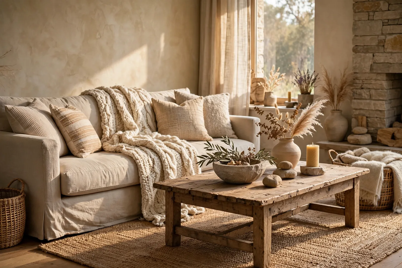
Neutrals have a reputation problem, and it isn’t their fault. The beige-on-beige rooms that feel sterile and flat failed because every surface had the same visual texture, not because the palette was quiet. A room done in warm whites, greiges, and taupes can feel rich, warm, and deeply inviting when three things show up: texture that catches light differently on every surface, wood tones that add organic warmth no paint can imitate, and layering that gives the eye a range of depths to travel. This guide shows you how to build that kind of neutral room, the one people describe as calm and cozy rather than bland. One practical note before we begin: paint colors shift with lighting, surface, and sheen, so test a large physical sample in your own space before committing to anything on these pages. The Global Abode is an independent publication, not affiliated with or endorsed by Sherwin-Williams or Benjamin Moore; color names and codes are referenced as widely-known designer examples.
Key takeaway: Neutrals fail when every surface feels the same, they succeed when texture, wood, and layered tones do the talking. Build a temperature-consistent neutral base (warm whites, greiges, taupes), then add at least four contrasting textures, let wood tones be the room’s warmth anchor, and finish with small dark accents for contrast. Depth comes from material variation, not from more color.
Why Neutral Rooms Fail: Flat vs Layered
Walk into a neutral room that feels boring and look past the colors, you’ll find the real problem. Every surface reflects light the same way. The walls are flat, the sofa is smooth microfiber, the rug is a low-pile synthetic in the same beige family, the curtains are a flat-weave polyester. Nothing for light to catch on, nothing for the eye to travel across. The room isn’t boring because it’s neutral; it’s boring because it’s flat.
Now picture the neutral rooms you’ve actually loved, the ones in design magazines, the friend’s living room you couldn’t stop photographing. They were neutral too. The difference was dimensionality. A nubby wool throw over a smooth linen sofa. A jute rug under a soft wool one. A weathered oak coffee table against creamy plaster walls. Light hitting each surface differently, creating shadow, depth, and movement. Your eye reads all of that variation as richness, even though the actual color palette might span only three or four quiet tones.
This is the single most important idea in this guide: texture is a second palette. When you remove bold color from a room, texture takes over the job that color used to do, it creates contrast, draws the eye, and keeps the space from going visually quiet. Designers consistently describe this as the fix for “boring beige”: add depth before adding color. Bring in grainy wood, matte finishes, natural fabrics, or one brick or plaster moment. Character comes from material variation, not from chaos, and not from more stuff.
And here’s the part that saves you money: texture is usually cheaper than color to fix. Repainting a room costs hundreds and a weekend. Draping a chunky knit throw over the sofa, swapping in a woven basket, adding a linen curtain panel, or styling one matte ceramic vase costs almost nothing by comparison, and often does more for the room’s feeling than a new wall color would. When a neutral room feels lifeless, reach for texture first and paint second.
The Neutral Families: Warm Whites, Greiges, Taupes
Before layering anything, the base palette needs to be right, because a neutral scheme with a temperature clash underneath will fight every texture you add on top. The warm neutral families that work together all share one trait: they lean warm, with yellow, red, or pink undertones rather than blue or green ones. Widely-reported designer observations consistently point to these families as the ones that read as inviting rather than clinical.
Warm whites are the foundation: whites with a soft creamy or ivory cast rather than a stark blue-white one. They read as clean without reading as cold, and they bounce light in a way that feels sunny rather than surgical. Use them on walls, trim, ceilings, and large upholstery pieces where you want airiness. Greiges, the gray-beige hybrids, are the bridge neutrals: sophisticated, modern-feeling, and more forgiving of mixed undertones than either pure gray or pure beige. Taupes go deeper and warmer, with a brown-gray richness that adds instant coziness; they work beautifully on accent walls, upholstery, and bedding where you want a little more weight.
The discipline that holds them together is temperature consistency. A warm white wall next to a cool gray sofa creates the same uneasy friction as any other warm-cool clash, the eye reads the shift before the mind names it, and the room feels “off” in a way no throw pillow can fix. When you’re layering neutrals, check every new piece against the family: hold it next to your wall color in daylight and ask whether it leans the same direction. If it fights, swap it.
Depth matters as much as temperature. The classic failure of beige-on-beige rooms is that everything sits at the same depth, walls, sofa, rug, and curtains all hovering in one mid-tone band, which is why they blur into a single flat read. The fix is a deliberate value range: light walls, a mid-tone sofa, a deeper rug, and a few dark accents (more on those in section 5). Give the eye light, medium, and dark to travel between, and even the quietest palette feels composed. If you’re working out which neutrals belong where in your whole home, our guide to coordinating paint with fixed finishes walks through reading undertones in your existing surfaces first.
Texture as Color: Linen, Wool, Jute, Stone, Plaster
Here’s where neutral rooms come alive. Think of each texture as a different “color” in your quiet palette, not because it changes the hue, but because it changes how light behaves, which is what your eye actually reads as depth. The goal: at least four contrasting textures in every room, deliberately mixed.
Linen is the workhorse. Its slubby, imperfect weave catches light unevenly, which means a linen curtain or sofa slipcover reads as alive even in a single cream tone. Linen wrinkles, and that’s the point. The wrinkles are the texture. Choose linen for the largest soft surfaces: curtains, sofa covers, duvet covers. Wool brings the opposite energy: dense, matte, and substantial. A chunky wool throw or a nubby wool rug grounds a room the way a rug in a flat weave never can, it absorbs light and sound, making the space feel quieter and more settled. Jute and sisal are the earthy bottom layer: coarse, fibrous, and honest. A jute rug under a softer wool rug is one of the most reliable designer layering moves, the coarse natural fiber contrasts with everything soft above it, and the combination reads as collected rather than decorated.
Then the hard textures. Stone, a travertine coffee table, a slate hearth, a marble side table, adds cool, smooth weight that balances all the softness. In a neutral room, one stone moment keeps things from going too soft. Plaster and limewash on walls add the subtlest texture of all: a hand-troweled movement that reads as depth in raking light and disappears in flat light. If your walls feel flat even in the right color, a limewash finish or a textured wallpaper in the same tone adds dimension without changing the palette at all.
The mixing rule is simple: pair opposites. Smooth with rough, matte with a touch of sheen, soft with hard, fine with coarse. A silk pillow needs a nubby wool throw nearby. A sleek leather chair wants a woven basket beside it. A polished stone table asks for a raw linen runner. When textures contrast, each one reads more clearly, and the room feels intentional rather than accidental. What fails is the middle ground: everything medium-soft, medium-smooth, medium-textured. That’s the texture equivalent of everything sitting at the same color depth.
Designer trick: Photograph your room in black and white. With color removed, all that’s left is texture, shape, and light, and you’ll instantly see whether the room has enough textural contrast. If the black-and-white photo looks flat, you need more texture variation, not more color. Aim for the photo to still look interesting; that’s your depth check.
Wood Tones: The Warm Anchor of Every Neutral Room
If texture is the second palette, wood is the warmth that no paint can imitate. Natural wood carries grain, variation, and an organic irregularity that reads as alive in a way manufactured finishes never do. In a neutral room, wood does the emotional heavy lifting: it’s what makes the space feel warm, grounded, and human rather than staged.
The question everyone asks, can I mix wood tones?, has a clear designer answer: yes, and you should. A room with one wood tone throughout can feel matchy and flat; a room with two or three related wood tones feels collected and rich. The method: choose one dominant wood tone (your floors, or your largest wood furniture piece), then add one or two secondary tones that relate to it. A medium walnut coffee table can sit beautifully alongside lighter oak picture frames and darker espresso accents, as long as the overall undertones relate, warm woods with warm woods, not warm walnut fighting cool gray-washed ash.
Wood also solves the “sterile neutral” problem at the architectural level. Exposed ceiling beams, a wood mantel, wood shelving, or even a single reclaimed-wood accent piece introduces organic character that paint alone can’t deliver. And wood’s warmth is functional, not just visual: it absorbs sound, adds tactile variety, and ages with character. A neutral room with generous wood always feels more expensive than one without, not because wood is costly, but because it signals craft.
When your paint needs to agree with the wood, and it does, because wood is a fixed finish, the rule is the same one that governs every fixed surface: read the wood’s undertone first, then choose paint in the same temperature family. Warm oak and honey-toned woods ask for warm whites, creams, and warm greiges; cooler ash or gray-washed woods sit more comfortably with neutral-to-cool whites. Our fixed-finishes guide covers the full method for reading wood, brick, carpet, and stone before choosing paint, it’s the step that prevents the most common neutral-room mistake: a wall color that quietly fights the floor.
| If you have this | Add this texture | Add this wood | Why it works |
|---|---|---|---|
| Smooth linen sofa | Chunky wool throw, nubby pillows | Weathered oak coffee table | Dense wool contrasts smooth linen; oak grain adds organic movement |
| Flat painted walls | Limewash finish or grasscloth | Walnut floating shelves | Wall texture catches raking light; dark walnut adds depth against light walls |
| Low-pile neutral rug | Layered jute rug underneath | Oak or maple side table | Coarse jute grounds the soft rug; light wood keeps the floor area airy |
| Sleek modern furniture | Woven baskets, raw ceramics | Reclaimed wood accent piece | Handmade textures soften modern lines; aged wood adds history |
| All-soft bedroom | Linen curtains, quilted coverlet | Walnut nightstands, oak frame | Varied soft textures avoid flatness; mixed woods feel collected |
The Layering Formula, Room by Room
With the base palette set and the texture library understood, here’s the practical formula: every room gets layers in a specific order, and each layer adds either texture, warmth, or contrast. Work through it and the room builds itself.
Layer 1: The foundation. Walls in your warm neutral, flooring as it is, the largest upholstery piece (sofa, bed) in a mid-tone neutral. This layer should be calm and quiet, it’s the canvas. If the canvas has a temperature clash (cool gray sofa against warm beige walls), nothing layered on top will fully fix it, so get this right first.
Layer 2: The soft goods. Curtains, rugs, bedding, throws, pillows. This is where texture does its heaviest work, because soft goods are the easiest surfaces to vary. The rule: no two large soft surfaces should share the same texture. If the curtains are linen, the rug should be wool or jute, the throw should be knit or faux fur, and the pillows should mix at least two weaves. A mix of linen, velvet, and knit pillows in whites, creams, and warm taupes creates instant coziness that a matched pillow set never will.
Layer 3: The wood and hard surfaces. Coffee table, side tables, shelving, frames, trays, bowls. This is the warmth layer. Aim for the dominant-plus-secondary wood mix from section 4, and include at least one piece with visible grain or an aged patina, the imperfection is what makes it feel human.
Layer 4: The contrast points. This is the layer most neutral rooms skip, and it’s why they feel washed out. A neutral room still needs somewhere for the eye to land. Add a few darker elements: a black or charcoal vase, dark picture frames, deep brown books, black metal hardware, a darker lamp base. You don’t need much, even a small amount of dark contrast keeps a soft neutral room from dissolving into itself. The same logic applies to metals: brushed brass or bronze accents add warm shine that neutrals absorb beautifully. Our guide to mixing metal finishes shows how to layer those metallic accents without the matchy-set look.
Layer 5: The living layer. Plants, branches, stone, something handmade. Greenery is the classic neutral-room rescue, the green contrasts with every warm neutral without leaving the palette’s calm mood, and the organic shapes break up all the rectangles. A single olive branch in a ceramic vase, a bowl of stones, a handmade ceramic piece: these add the “lived-in” quality that separates a designed room from a decorated one.
Watch out: The most common layering mistake is stopping at Layer 2. Curtains, rug, and pillows in matching neutrals with no wood, no contrast points, and no living layer is exactly the flat beige room everyone wants to avoid. If your neutral room feels unfinished, don’t buy more pillows, add wood, add something dark, add something alive. The missing layers are almost always 3, 4, and 5, not more of 2.
The Sheen and Finish Layer
There’s one more dimension of texture that most people never think about: sheen. Every surface in your room reflects light at a certain level, from dead-flat to high-gloss, and varying those levels is one of the subtlest ways to add depth to a neutral palette. Two objects in the exact same beige can read as completely different tones if one is matte and the other has a soft glow.
Start with the walls. In a neutral room, flat or matte wall paint is almost always the right call: it absorbs light evenly, hides imperfections, and lets the textures layered on top do the talking. A higher sheen on neutral walls can read as shiny and cheap, and it competes with your textiles for attention. The exception is trim and woodwork, where a satin finish adds a quiet glow that defines the architecture, the sheen difference between matte walls and satin trim is itself a textural contrast. Our paint sheen decision guide maps exactly where each sheen belongs, room by room.
Then vary sheen deliberately across the decor. Matte ceramics against a lacquered tray. A honed stone table with a polished brass lamp. Raw linen next to a velvet pillow with a soft glow. Each contrast reads as depth, even when every color in the room sits in the same neutral family. Designers often describe this as the “opposing sheens” trick: if your fabrics are smooth and shiny, build up nubby and matte layers around them, and vice versa. The eye registers the difference unconsciously, and the room feels richer for it.
Lighting is the final multiplier. Warm light (around the warm end of the spectrum, the way candlelight and late-afternoon sun feel) makes every neutral in the room read warmer and every texture read deeper, shadows lengthen, grain shows, weave casts tiny patterns. Cool, flat overhead lighting does the opposite: it flattens texture and cools every warm neutral toward gray. In a neutral room, lighting isn’t just illumination; it’s the finish on every surface. Choose warm bulbs, layer your light sources (overhead, task, accent), and let the textures you worked so hard to layer actually show themselves.
Want the whole neutral system, room by room?
The Whole Home Paint Guide is a complete, ready-to-use color system, warm anchor neutrals, trim and ceiling pairings, and accent colors, all with undertones already coordinated, so every room’s neutrals, textures, and wood tones belong to one warm story. And the Paint Color Workbook includes texture-and-finish checklists for layering each room without the guesswork.
Frequently asked questions
Layer texture instead of adding color. Mix at least four contrasting textures (linen, wool, jute, stone, wood), vary your neutral depths from light to dark, add wood tones for organic warmth, and include a few dark accents for contrast. Neutral rooms fail when every surface feels the same, they succeed when material variation does the talking.
Linen, wool, jute, and natural stone are the core four: linen for large soft surfaces (curtains, slipcovers), wool for grounding (rugs, throws), jute or sisal for earthy base layers, and stone or plaster for hard-surface contrast. Add ceramics, woven baskets, and raw wood for the handmade layer. The rule is pairing opposites, smooth with rough, matte with a touch of sheen, soft with hard.
Yes, designers consistently recommend it. Choose one dominant wood tone (your floors or largest wood piece), then add one or two secondary tones that share its undertone family: warm woods with warm woods, not warm walnut against cool gray-washed ash. A medium walnut table alongside lighter oak frames and darker espresso accents feels collected; a single wood tone throughout can feel flat and matchy.
Three moves: choose warm-leaning neutrals (warm whites, creams, warm greiges, not cool blue-grays), add generous wood tones with visible grain, and use warm lighting. Then layer soft textiles, a chunky knit throw, linen pillows, a wool rug, and add one living element like greenery or branches. Warmth in a neutral room comes from materials and light, not from adding color.
Stay in the warm family: creams, warm whites, taupes, soft browns, muted olive, and warm wood tones all agree with beige. Add depth with darker warm accents, charcoal, espresso, deep bronze, rather than jumping to cool grays or bright colors. The key is matching the beige’s undertone: a yellow-beige wall wants warm companions, and our fixed-finishes guide shows how to read undertones before choosing.
No, matching is what makes neutral rooms feel flat. No two large soft surfaces should share the same texture: if the curtains are linen, make the rug wool or jute, the throw knit, and the pillows a mix of at least two weaves. Keep the colors in the same temperature family so the variety reads as layered rather than chaotic. Texture contrast is the whole point.

