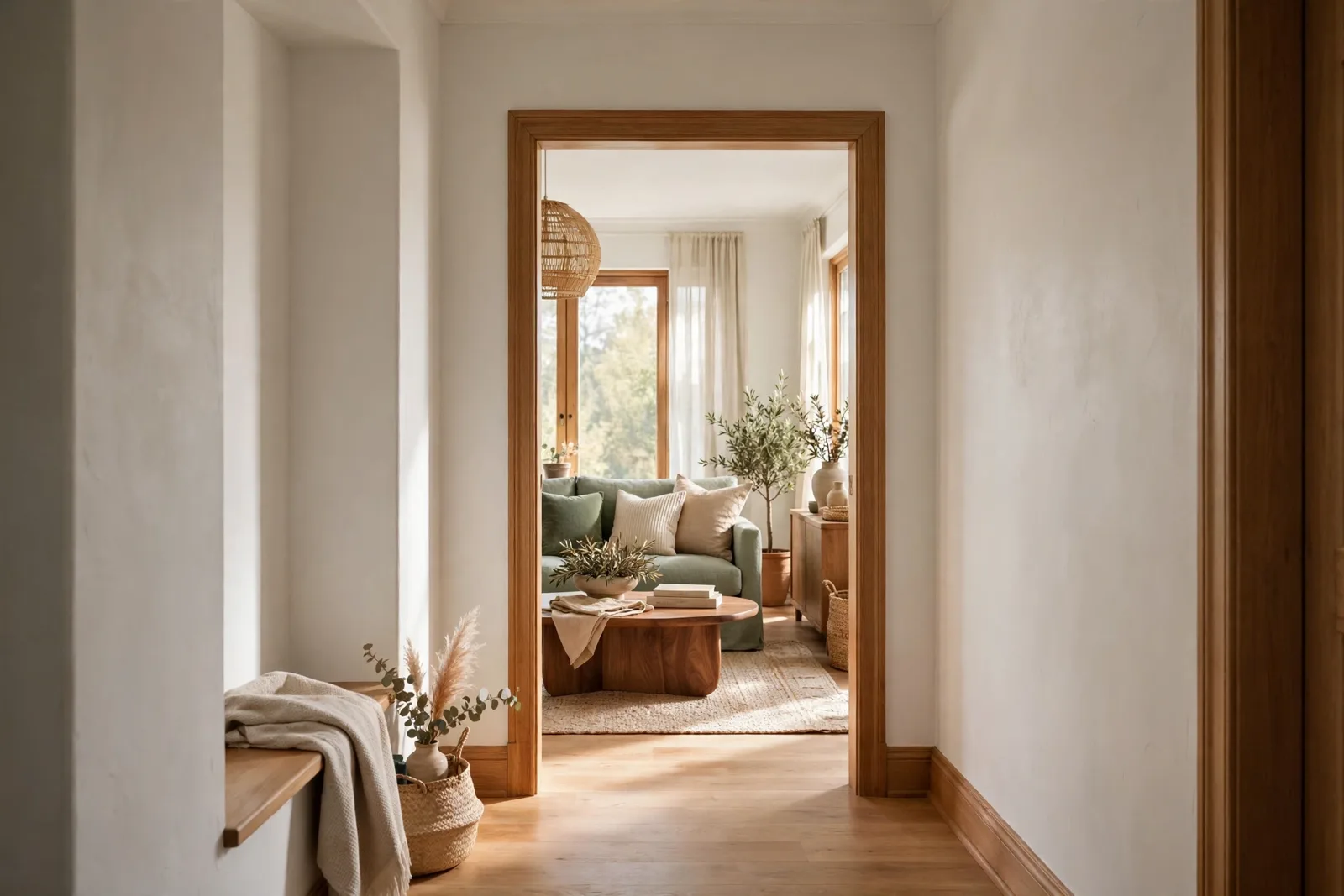
A cohesive home is not one color painted everywhere. It is a system, a quiet set of decisions that lets each room have its own personality while still belonging to the same house. When guests say a home “just feels right” but can’t explain why, this system is usually what they are sensing. It rests on three moves: an anchor that appears everywhere, transitions that bridge rooms, and a repetition rule that ties every color to the whole. Paint colors shift with lighting, surface, and sheen, so test a large physical sample in your own space before committing to anything on these pages. The Global Abode is an independent publication, not affiliated with or endorsed by Sherwin-Williams or Benjamin Moore; color names and codes are referenced as widely-known designer examples.
Key takeaway: Cohesion comes from repetition, not sameness. Pick one whole-home anchor color, bridge rooms with deliberate transitions, repeat every accent at least twice across the house, and keep temperatures consistent, then let individual rooms differ within that framework.
Cohesion Isn’t Sameness: The Difference Between Cohesive and Boring
There is a persistent misunderstanding about what a cohesive interior color scheme actually is. Many people hear “cohesive” and picture every wall the same shade of greige, every room a variation on beige, the kind of house that feels less designed and more unfinished. But sameness is not cohesion; sameness is just repetition without intention. Real cohesion is closer to music than to paint. Think of your rooms as tracks on the same album: each one has its own rhythm and mood, but they share instrumentation, key, and tempo. Nobody confuses the songs, yet nobody doubts they belong together.
The difference shows up the moment you walk through a house. In a house with sameness, your eye relaxes because there is nothing to look at. In a house with cohesion, your eye relaxes because everything it sees already makes sense. The colors are in conversation with each other. The deep green in the den echoes the pillow in the living room. The warm white on the hallway ceiling feels like the walls in the kitchen, just lighter. Your brain registers these relationships unconsciously, and the result is that settled, pulled-together feeling people describe as “flow.”
This is genuinely good news, because it means you do not have to flatten your taste to get the calm you want. You can have the moody library, the fresh kitchen, the soft bedroom, and the charcoal powder room, as long as the relationships between them are deliberate. Cohesion is not a palette; it is a set of relationships between palettes. The rest of this guide gives you the framework for building those relationships, one decision at a time.
It also helps to know what cohesion is not. It is not matching furniture sets. It is not buying everything from one store’s collection. It is not keeping every finish identical. All of those are shortcuts people take when they don’t have a color system, and all of them produce the stiff, showroom feel that makes a house look impressive in photos and vaguely unwelcoming in person. A real home has variety. The system exists to make that variety feel intentional.
The Anchor: The Whole-Home Neutral That Appears Everywhere
Every cohesive home has an anchor: one neutral that shows up in nearly every room, tying the whole composition together the way a chorus ties a song together. It does not have to be on every wall. It can be your trim and ceilings, your main living-area walls, your largest rugs, the dominant color of your bedding. What matters is that it repeats so consistently that the eye accepts it as the home’s signature, the constant against which every other color is read.
Choosing the anchor is the highest-leverage decision in this entire system, because everything else is judged against it. Start with your fixed elements, the things you are not repainting: the flooring, the cabinetry, the stone or tile you are living with. A warm white oak floor and honey-toned cabinets ask for a warm-leaning anchor; a gray tile floor and cool-toned counters ask for a cooler one. This is not about rules, it is about honesty. The anchor has to get along with the things that are not changing.
Where the anchor appears matters almost as much as which one you choose. The most reliable placement: all trim and ceilings in the same white or off-white, plus the walls of your most connected spaces, the hallways, the entry, and whichever living space opens onto the rest of the house. These are the rooms the eye passes through constantly. When they share a color, the brain files that color as “home base,” and every room that departs from it feels like a deliberate variation rather than a random choice.
A common worry: won’t this get boring? It gets boring only if the anchor is doing all the work alone. The anchor is the quiet background player; the interest comes from everything layered on top of it. Think of a white shirt worn under different jackets all week, the shirt is the same, the outfits are not. Your anchor is the white shirt. The rooms get to be the jackets.
One practical note: commit to your anchor for a long time. Changing accent colors is easy, pillows, art, even a room’s walls. Changing the anchor means repainting trim, rethinking ceilings, and retouching everything it touches. So choose it slowly, test it in large samples in at least two rooms, and then trust it. The homes that feel most cohesive are the ones where the anchor was decided once and never second-guessed.
The Transitions: Hallways, Sightlines, and Thresholds as Bridges
Rooms do not exist in isolation. They are connected by hallways, doorways, and open sightlines, and those in-between spaces are where cohesion is won or lost. Designers call them transitions, and they do the quiet work of carrying your eye from one room to the next without a jolt. When a house feels choppy, the rooms are rarely the problem; the transitions are.
Start with sightlines. Stand in your most central spot, the place where you naturally pause, and look through every doorway you can see. Every room visible from that spot is having a conversation with the room you are standing in, whether you planned it or not. The wall color on the far side of the hallway, the sofa beyond the cased opening, the art visible through the kitchen doorway: these are all part of one composition from that vantage point. If those visible pieces share undertones or repeat each other’s colors, the view feels composed. If they clash, the whole house feels off, even when each room looks fine on its own.
This is why hallways deserve more thought than they usually get. A hallway painted in your anchor color does double duty: it calms the transition and it lets the rooms branching off it feel like intentional departures rather than accidents. If your hallway is long, consider it a gallery, one continuous, quiet surface that shows off the art or the console table rather than competing with them. The art provides the color; the hallway provides the calm.
Doorways and thresholds are the other underused tool. A cased opening between two rooms is a natural place to pause a color, paint stops at the casing, and the eye accepts the change because the architecture told it to. Use this. When two rooms want different moods, let the doorway be the boundary. And keep the casing itself in your anchor trim color so the boundary reads as architecture, not as a mistake.
For open-plan spaces, transitions need to be even more deliberate because there is no doorway to do the work. Here, the floor becomes the transition: a continuous floor finish across zones tells the eye that the kitchen, dining, and living areas are one family, even when each zone has its own wall color or accent palette. Rugs can then define zones without breaking the flow, just keep their tones in the same family so the zones feel related rather than competing.
If you take one exercise from this section, make it this: walk your home slowly, room to room, and notice where your eye snags. The snag is almost always at a transition, a hallway wall that fights the room beyond it, a doorway where warm meets cool without a buffer, a sightline where two unrelated colors collide. Fix the transition, and the rooms on either side will suddenly feel like they belong together. That is the bridge doing its job.
The Repetition Rule: Every Color Appears at Least Twice
This is the workhorse of the whole system, and it is beautifully simple: no color gets to appear in only one room. Every accent color in your home, the sage in the kitchen, the navy in the bedroom, the terracotta in the entry, must show up at least twice across the house. Twice is the minimum; three times is better. One appearance is decoration. Two appearances is a system. Your eye registers the repeat unconsciously, and that registration is what creates flow.
The beauty of the rule is that the repeats do not have to be equal in weight. The deep green can be a full accent wall in the study and a single vase on the living room shelf. The navy can be the bedroom headboard wall and the throw pillow in the family room. A large dose in one room and a small echo in another is enough, the eye only needs the reminder. This is also what keeps the system from feeling forced: nobody walks through and thinks “green, green, green.” They just feel that the rooms agree with each other.
Start by listing every color currently in play across your home, room by room. For each one, ask: where else does this appear? Colors with only one appearance are your orphans, and orphans are what make a house feel disconnected. You have two fixes: give the orphan a sibling (find it a second home in an adjacent room) or let it go (swap it for a color that already exists elsewhere). Neither is hard. A cushion, a piece of art, a throw, a lamp base, small, movable things are the easiest way to place repeats, because you can test and rearrange without commitment.
The repetition rule applies to materials and finishes as well as paint. The same wood tone on your kitchen shelves and your bedroom dresser. The same black finish on the kitchen hardware and the hallway light fixture. The same brass appearing in the bathroom taps and the living room picture light. These repeats work below the level of conscious notice, nobody inventories your hardware, but they add enormously to the feeling that one person with one point of view made every decision in the house.
| Color or element | Primary appearance | Required repeat |
|---|---|---|
| Anchor neutral | Trim, ceilings, and hallway walls | Appears in every room as background, no second placement needed, it is the system itself |
| Sage green accent | Kitchen backsplash area / painted cabinetry | Throw pillows in the family room, a stem in the entry vase, art in the dining room |
| Warm brass finish | Kitchen cabinet hardware | Bathroom mirror frame, living room floor lamp base |
| Deep navy accent | Bedroom headboard wall | Reading chair cushion in the study, linen napkins in the dining room |
| Natural oak tone | Living room flooring | Bedroom dresser, dining room open shelving |
| Charcoal accent | Powder room walls | Entry console table, picture frames in the hallway |
Notice that every row has a home in at least two rooms, and notice how many of the repeats are small, movable objects. That is the system working as intended: the big commitments (walls, cabinetry) happen once, and the repeats travel light. If your taste evolves, you move the pillows and the art, not the paint.
There is also a quiet discipline hidden in this rule: it limits your palette naturally. When every new color has to earn a second appearance, you stop accumulating random shades. Most cohesive homes land somewhere between four and six total colors, counting the anchor. Fewer than four and the house feels flat; more than six and the repetition breaks down, because there are too many threads for the eye to track. The repetition rule is what keeps the count honest.
Designer trick: Photograph each room from its doorway, then scroll through the photos in order, room by room. Colors that appear only once will jump out immediately on a small screen, they look like strangers at a family photo. Give each stranger a companion somewhere nearby, and the whole sequence will feel like one story.
Temperature Discipline: The One Rule That Can’t Break
Of everything in this system, one rule matters more than all the others, and it is this: keep your temperatures consistent. A cohesive home can survive a bold accent, a dark room, even an unusual color choice, but it cannot survive warm and cool fighting each other across open sightlines. Temperature clashes are the single most common reason a house feels “off” when every individual room looks fine.
Temperature, in paint terms, is about undertones. A white with a warm yellow undertone and a gray with a cool blue undertone are both “neutrals,” but put them in rooms that face each other across a hallway and the hallway will feel like a border crossing. The eye reads the shift before the mind names it. This is why the anchor decision matters so much: your anchor sets the temperature for the whole house, and everything else should stay within that family or be clearly, deliberately separated by a closed door.
Discipline does not mean everything must be warm or everything must be cool. It means the temperatures in conversation with each other must agree. A warm white trim next to a cool gray wall is a clash, even though both are “neutral.” A warm beige wall with warm brass hardware and warm wood floors is harmony, even though the colors are different. Work in temperature families: if your anchor leans warm, your grays should be warm grays, your whites warm whites, your greens olive-leaning rather than mint-leaning. The specific colors can vary widely; the temperature should not.
Watch out: The sneakiest temperature break is the trim. Many homes have warm-toned flooring and cabinetry but cool, stark-white trim from a previous paint job, and the owners never connect that trim to the uneasy feeling in every room. If your house feels disjointed and you cannot name why, check whether your trim temperature agrees with your floors before you repaint a single wall.
Lighting complicates temperature, which is worth knowing before you commit. Bulbs with a warm color temperature make cool paints look warmer and warm paints look warmer still; daylight from a north-facing window cools everything it touches. This is not a reason to panic, it is a reason to test. The same physical sample checked in morning, afternoon, and evening light will show you exactly how your chosen colors behave in your rooms, which is information no screen and no store lighting can give you.
There is exactly one sanctioned exception to temperature discipline, and you will find it in the next section: the contained room behind a closed door. A powder room or a study that shuts off from the rest of the house can run a different temperature, because it is never in open conversation with the rooms around it. The closed door is the buffer. But the moment a door stays open, and doors do stay open, the room rejoins the system, and the temperature rule rejoins it too.
When Rooms Can Differ: Doors, Destinations, and the Contained Room
Here is the permission slip you have been waiting for: not every room has to participate equally in the system. Some rooms are allowed, encouraged, even, to be different. The trick is knowing which rooms, and why, so the difference reads as intention rather than accident.
Start with the contained room. A powder room, a laundry room, a small study, a walk-in pantry, rooms with a door that closes and no sightline to the rest of the house, can take risks the open living areas cannot. This is where the dramatic color lives: the deep green powder room, the charcoal laundry, the inky study. Because the room is experienced as a self-contained moment, it reads as a jewel box rather than a rebellion. The rest of the house stays calm, and the contained room becomes the surprise guests remember. Just keep the repetition rule honest: pick up that dramatic color in at least one small echo elsewhere, even if it is only a candle or a hand towel in the neighboring bath.
Then there are the destination rooms, primarily bedrooms and bathrooms. These are private, and privacy earns latitude. A bedroom can run deeper, softer, or moodier than the public spaces, because it is not in constant conversation with them. The system still holds at the doorway: the trim matches the house, the hallway outside is the anchor, and the transition is clean. Inside, the room can breathe. This is also why bedrooms are the natural home of your boldest wall color experiments, if it does not work, it is contained, and if it works, it feels like a retreat.
Kids’ rooms and guest rooms deserve a special mention: they can step further outside the system than any other space, because everyone intuitively understands that a child’s room belongs to the child. A playful color that would feel random in the living room feels exactly right behind a kid’s door. The only ask is the doorway transition, keep the hall side of the door and the trim in the system, and let the inside be theirs.
What about open-plan rooms that want to differ? They can, but they have to do it through the system, not around it. A dining area within an open living space can take a deeper wall color on its far wall, because that wall functions as a destination within the larger room. The anchor still appears on the ceiling and trim, the repetition rule still applies to the accents, and the temperature still holds. Difference inside the framework is design. Difference outside the framework is noise.
The underlying principle is simple enough to carry in your head: the more open a room is to the rest of the house, the more strictly it follows the system; the more contained it is, the more freedom it gets. Entry, living room, kitchen, hallways, full system. Bedrooms, baths, system with latitude. Powder rooms, laundries, studies behind closed doors, near-total freedom, with one small echo back to the family. Learn to sort your rooms this way, and you will never again wonder whether a bold choice “goes with” the house. You will know exactly where it is allowed to live.
Build your whole-home palette with confidence
Choosing an anchor, setting temperatures, and mapping repeats is much easier with a finished system to follow. Our whole-home paint guide walks you through the entire process, palette, undertones, and room-by-room application, so your home flows without the guesswork.
Frequently asked questions
No, sameness is not cohesion. A cohesive home shares an anchor color, repeats its accents across rooms, and keeps temperatures consistent, but individual rooms can and should have their own character. Designers consistently recommend 3–5 colors used in different amounts around the house rather than one color everywhere. For the step-by-step process of choosing that shared palette, see our whole-home paint palette guide.
Use the repetition rule: every color appears in at least two rooms. Carry one accent from the living room into the dining room in a smaller dose, a pillow, a piece of art, a vase, and the rooms will feel connected without matching. Paint hallways and thresholds in your anchor color so transitions stay calm, and check sightlines from your central spots so visible rooms agree with each other. Our color flow framework maps this room by room.
Your anchor neutral, the same color as your trim and ceilings or your main living-area walls. Hallways are transitions, not destinations, so they should calm the eye rather than compete with the rooms they connect. A continuous quiet surface lets the rooms branching off it feel like intentional variations. Keep the temperature of the hallway paint in the same family as the floors and rooms it touches.
You can, but not in open conversation with each other. Temperature discipline is the one rule that cannot break across sightlines: warm-toned rooms should not face cool-toned rooms across an open hallway. A contained room behind a closed door, a powder room, a study, is the exception, because the door acts as a buffer. Within one temperature family, you can vary colors widely and the house will still feel harmonious.
Most cohesive homes land on four to six colors total, including the anchor neutral. Designers who work on color flow recommend three to four paint colors at most for the interior, with the rest of the variety coming from furnishings and decor. The repetition rule enforces this naturally: when every new color has to earn a second appearance somewhere else, random shades stop accumulating.
Yes, if the room is contained. A powder room, laundry, or study behind a closed door can take a dramatic color the open living areas could not, it reads as a jewel box, not a rebellion. Keep the trim and the hallway side of the door in your system, and echo the dramatic color once elsewhere in a small dose. For bold, fully saturated rooms, our color drenching guide shows how to commit without regret.

