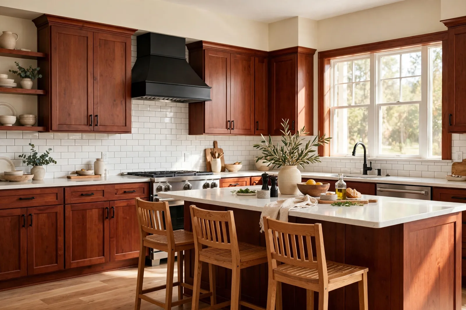
Cherry cabinets are the strongest personality in any kitchen, rich, warm, reddish-brown wood with a glow that no wall color can ignore and no white box cabinet can imitate. The trouble is that cherry is also the wood homeowners get wrong most often: the red undertone that makes it gorgeous also makes it bossy, and the wrong wall color, a cool gray, a stark white, a competing red, turns that richness into a fight. The right wall color does the opposite: it calms the red, lets the grain be the star, and makes the whole kitchen feel intentional instead of dated. This guide walks through how to read your cherry cabinets, the warm neutrals that flatter them, the green connection most homeowners miss, what to avoid, and how to modernize cherry without ever touching the cabinets with a paintbrush. Paint colors shift with lighting, surface, and sheen, so always test a large physical sample in your own space, in your own light, before committing, screen swatches are approximations. The Global Abode is an independent publication, not affiliated with or endorsed by Sherwin-Williams or Benjamin Moore; all color names and codes are referenced as widely-known designer examples.
Key takeaway: Cherry cabinets dominate with their red-brown warmth, so the wall color’s job is to support, not compete. Warm neutrals, warm greiges, soft taupes, creamy whites, flatter cherry by agreeing with its temperature. Muted sage and olive greens complement it (green sits opposite red on the color wheel). Cool grays, stark whites, and red-adjacent colors fight it. And the fastest modernization isn’t new paint on the cabinets, it’s lighter counters, a light backsplash, updated hardware, and a warm-neutral wall. Undertone notes below are widely-reported designer observations, not exact manufacturer specifications.
Reading Cherry Wood: Why It Dominates the Palette
Every paint decision in a cherry kitchen starts the same way: with the cabinets, because the cabinets have already made the biggest color decision in the room. Cherry wood is defined by its red undertone, a deep, reddish-brown warmth that reads as rich and glowing in good light and heavy and dated in bad light. That red thread is not subtle. It shows up against every wall color, every countertop, every floor, and it is the reason cherry kitchens feel so much harder to decorate around than oak or maple kitchens. Oak is forgiving; cherry has opinions.
But not all cherry reads the same, and this is the first thing to get right. Designers consistently note that cherry’s warmth varies: some cherry cabinetry leans toward a brighter, more orange-red glow (often the lighter, newer finishes), while traditional cherry leans toward a deeper, browner, more mahogany-adjacent red. The stain depth matters too, a medium cherry and a dark, nearly espresso-stained cherry are different color partners. Before choosing a single wall color, look at your cabinets in daylight and name what you see: how red is it, really? How dark? The answer calibrates everything below. A bright reddish cherry needs more calming around it; a deep brownish cherry is already half-neutral and more forgiving.
The second thing to understand: cherry is a warm wood, full stop. This is the fact that governs the whole guide. Warm woods want warm or complementing partners, colors that agree with their temperature or balance it deliberately. Cool colors fight warm woods unless chosen with real intention. This is the same finishes-first discipline that governs every wood in the house: the paint is the guest, the wood is the host. Our guide to matching paint with wood floors covers the same read-the-wood-first method for floors; cabinets follow identical logic, only more intensely, because cabinetry covers far more visual real estate.
One more piece of honesty about cherry: it darkens. Cherry wood is famous for deepening in color with light exposure and age, the reddish-brown glow intensifies over the years. A kitchen that felt balanced a decade ago can start feeling heavy as the cherry deepens. This is why the lightening strategies in section six matter so much for older cherry kitchens: the wood changed, so the room’s balance has to change with it. The wall color that worked when the cabinets were installed may not be the wall color that works now.
Tip: Photograph your cabinets in daylight and compare the photo to what you see in the evening. The red undertone usually reads stronger in warm evening lamplight and deeper in daylight, and your wall color has to live with both versions. Sample wall colors next to the actual cabinet door, not against a blank wall, and check the pairing at noon and at 8pm.
Warm Neutrals That Flatter Cherry
The safest, most forgiving family for cherry cabinets is the one that agrees with them: warm neutrals. These are the colors that let cherry be the star without competition, the warm backdrop that makes the red wood glow instead of argue. Designers consistently return to the same palette for cherry kitchens, and it is worth understanding why each one works.
Warm greiges. The single most-referenced choice for cherry cabinets. A warm greige, the beige-gray family leaning warm, sits in the same temperature neighborhood as cherry without repeating its red. It reads as calm, collected, and current, and it has enough body to hold its own against the strong wood without going muddy. Designers widely describe warm greige as the “peace treaty” color for red woods: warm enough to agree, neutral enough to recede. Against cherry, it makes the cabinets look richer and the kitchen look more expensive, which is exactly the job.
Soft taupes. One step warmer and browner than greige, taupe is the color that echoes cherry’s brown without echoing its red. A soft, warm taupe on the walls creates a tonal, enveloping kitchen, the cabinets and walls in conversation rather than contrast. This is the coziest direction for a cherry kitchen, and it works especially well in traditional and transitional homes where the goal is warmth rather than modernity. The caution is depth: keep the taupe light to mid-tone. A dark taupe plus dark cherry is a heavy room; the walls need to give the cabinets breathing room.
Creamy whites. Not stark white, creamy white. A warm white with a soft yellow or beige thread brightens a cherry kitchen beautifully, reflecting light into what is often a dark cabinetry situation while agreeing with the wood’s warmth. Designers consistently favor warm whites over bright whites here: the cream flatters the red undertone, where a stark white can make cherry look harshly orange by contrast. A creamy white wall with cherry cabinets and light counters is the classic refresh formula, the combination that makes a 2005 cherry kitchen read as timeless rather than dated.
Warm beiges and soft tans. The straightforward, unfussy choice: a light warm beige that stays out of the way. Beige with cherry is a warm-on-warm composition, and it works because beige is the quietest member of the warm family, it agrees with the cabinets’ temperature while adding lightness the wood cannot provide on its own. This is the choice for homeowners who want the kitchen to feel calm and don’t need the walls to make a statement. The walls support; the cherry performs.
The thread connecting all four: warmth plus lightness. Cherry is dark and warm; the walls should be lighter and equally warm. That pairing, dark warm wood, light warm walls, is the fundamental balance of every successful cherry kitchen. Our honey oak guide covers the same warm-wood logic for oak’s golden tones; cherry follows the same temperature rules with a stronger red to manage.
The Green Connection: Cherry’s Natural Complement
Here is the color relationship most cherry-kitchen owners never consider, and it is the one designers mention most often as the pleasant surprise: green. Green sits opposite red on the color wheel, which makes muted greens the true complement to cherry’s red undertones. Where warm neutrals agree with cherry, greens balance it, the cool green thread quiets the warm red thread, and both colors look better for the pairing.
Muted sage. The most widely-referenced green partner for cherry. A soft, grayed sage, green with enough gray to stay quiet, calms the red of cherry cabinets without going cold. Designers consistently describe sage as the color that makes cherry look like an intentional design choice rather than a leftover: the green neutralizes the red’s intensity, the kitchen reads as fresh and organic, and the whole composition feels collected. Sage works on walls, and it works beautifully as an accent, a sage island against cherry perimeter cabinets is a two-tone kitchen with real personality.
Olive and deeper earthy greens. For homeowners who want more presence than sage, olive and muted deep greens give the kitchen weight without heaviness. An olive or deep botanical green holds its own against dark cherry, neither color backs down, and the contrast reads as rich and deliberate. This is the direction for traditional and moody kitchens: deep green walls or a deep green island with cherry cabinetry, brass hardware, and warm lighting is a combination that reads as classic, not trendy. The key is muting: the greens that work with cherry are grayed, earthy, natural greens, never bright, never neon, never minty.
Why green works when other cools don’t. The color-wheel logic is the whole explanation. Red and green are complements: each makes the other look more like itself while calming the overall composition. A soft blue can do similar work (and designers do use blue-gray with cherry as a deliberate contrast), but green has the advantage of feeling natural and organic next to wood, it reads as the forest to cherry’s earth. Our kitchen wall colors guide covers the broader cabinet-and-countertop coordination method; the green-cherry pairing is one of its strongest examples of complementary color at work.
Watch out: The green must be muted, this is where the pairing fails. A bright, saturated, or yellow-green next to cherry reads as Christmas, not design. Stick to grayed, earthy, dusty greens: sage, olive, eucalyptus, deep botanical tones. If the green looks vivid on the chip, it will look louder next to red wood. Sample the green next to the actual cabinet door, and if the combination makes you think of the holidays, go grayer.
What to Avoid: The Colors That Fight Cherry
Knowing what to avoid with cherry is as valuable as knowing what to choose, because the wrong wall color doesn’t just miss, it actively makes the cabinets look worse. These are the mismatches designers flag most consistently.
Cool, flat grays. The most common cherry mistake. A cool gray, especially a flat, blue-leaning gray, sits in the opposite temperature family from cherry, and the two don’t complement each other the way green does; they argue. The gray makes the cherry look more orange and dated by contrast, and the cherry makes the gray look cold and lifeless. The kitchen ends up feeling like two different decades. Note the nuance: a warm gray (greige) is one of cherry’s best partners, and a deliberate blue-gray can work as a high-contrast modern choice, but the default flat cool gray, the one that looks “safe” on the chip, is cherry’s enemy. Temperature disagreement without a plan is just disagreement.
Stark, bright whites. A crisp, blue-white wall next to cherry cabinets creates the harshest possible contrast: the white’s coolness throws the cherry’s redness into overdrive, and the cabinets can read as glaringly orange. Stark white works with white oak, with maple, with painted cabinets, woods and finishes that don’t bring their own strong color. Cherry brings plenty of color on its own; it needs a white with warmth in it. If the kitchen needs brightness, choose a creamy, warm white, the light without the fight.
Reds, oranges, and warm colors that compete. Terracotta, brick red, burnt orange, warm gold, these sit in cherry’s own color family, and putting them on the walls creates a room with no neutral ground. The red of the walls and the red of the cabinets amplify each other instead of balancing, and the kitchen reads as heavy, hot, and overwhelming. The rule: the walls should never repeat the cabinets’ dominant color. Cherry already supplies all the red the room needs; the walls supply everything else.
Very dark colors without a lightening plan. Deep navy and charcoal can be stunning with cherry, designers do use them as deliberate high-contrast choices, but they are advanced moves, not defaults. A dark wall color plus dark cherry cabinets is a dark room, and without light counters, a light backsplash, and generous lighting to balance it, the kitchen closes in. If you love the moody direction, commit fully: dark walls, light stone, bright backsplash, layered lighting. Half-measures, dark walls with dark counters and dim lighting, just make the cherry feel heavier.
| Color direction | Examples | Why it works (or doesn’t) |
|---|---|---|
| Warm greige | Warm greiges, warm-leaning neutrals | Agrees with cherry’s warmth while staying neutral, the “peace treaty” choice |
| Soft taupe | Light warm taupes | Echoes cherry’s brown without echoing its red, tonal and cozy |
| Creamy white | Warm whites with soft yellow or beige threads | Brightens while flattering the red undertone, the classic refresh |
| Muted sage / olive | Grayed sages, olives, eucalyptus tones | True complement (opposite red on the wheel), calms and balances the red |
| Warm beige / tan | Light warm beiges | Quiet warm backdrop, agrees without competing |
| Cool flat gray | Blue-leaning grays | Fights cherry’s warmth, makes cabinets look orange, walls look cold |
| Stark white | Crisp blue-whites | Harshest contrast, throws cherry’s red into overdrive |
| Competing reds | Terracotta, brick red, burnt orange | Repeats the cabinets’ color, no neutral ground, room feels heavy |
Countertops and Backsplash with Cherry
The walls are only half the story. In a cherry kitchen, the countertops and backsplash do as much color work as the paint, and they are the surfaces the eye reads against the cabinets at closest range. Getting them right is what separates a cherry kitchen that feels current from one that feels stuck.
The lightening rule. Cherry cabinets are dark; the counters and backsplash are the opportunity to bring light into the composition. Designers consistently recommend light countertops with cherry, white, cream, light beige, soft gray-veined quartz or marble, because the light stone against the dark warm wood is the contrast that makes both look better. A light countertop reflects light up into the room, breaks up the visual weight of the cabinetry, and gives the eye a resting place. Dark counters with dark cherry is the combination that makes kitchens feel like caves; it is the single fastest way to date a cherry kitchen, and the single most impactful thing to change.
Reading the stone’s temperature. The same finishes-first discipline applies: the countertop has undertones, and they must agree with the cherry. Warm stones, creamy marbles, warm quartzites, beige granites, butcher block, are the natural partners; they extend the kitchen’s warm story from the cabinets through the work surfaces. Cool gray stones can work, but they need the same deliberate-contrast thinking as cool wall colors, a crisp white quartz with gray veining against cherry is a modern, intentional pairing, while a flat gray laminate just reads as a mismatch. Our kitchen colors around cabinets and countertops guide walks through the stone-reading method in full.
The backsplash decision. The backsplash is the bridge between the cabinets and the counters, and with cherry it should almost always be light. A white or cream subway tile, a soft handmade-look tile, a light natural stone, the backsplash is where the kitchen gets its brightness and its texture. Designers widely favor simple, light backsplashes with cherry: the cabinets are already the visual event, so the backsplash should be the calm. A busy, dark, or highly patterned backsplash competes with the wood grain for attention, and the grain always loses, or rather, the whole wall loses. Keep it light, keep it simple, let the cherry be the pattern.
Matching backsplash to countertop. One of the most-referenced designer tips for cherry kitchens: let the backsplash relate to the countertop rather than introducing a third material story. A backsplash that picks up the countertop’s tone, the same white family, the same warm thread, unifies the horizontal surfaces into one calm band, which makes the cherry cabinetry read as the deliberate vertical statement. Three competing surfaces (busy counters, busy backsplash, strong cabinets) is a crowd; two calm surfaces and one strong one is a composition.
Modernizing Cherry Without Painting It
Here is the question behind most cherry-cabinet searches: my cherry kitchen feels dated, do I have to paint the cabinets? Usually not. Cherry is real wood with real richness; the dated feeling almost always comes from the surroundings, not the wood itself. These are the updates designers reach for first, in order of impact.
1. The wall color. The highest-impact, lowest-cost move. If the walls are currently a flat cool gray, a dark beige from 2005, or a competing warm color, repainting in a warm greige, creamy white, or muted sage transforms the kitchen’s entire temperature story in a weekend. The cabinets didn’t change; the light they live in did. This guide exists because the wall color is the lever, pull it first.
2. The backsplash. The second-highest impact. A dated backsplash, the busy tumbled stone, the dark glass mosaic, the themed mural tile of the 2000s, timestamps a cherry kitchen more than the cabinets do. Replacing it with a simple light tile (white or cream subway, soft handmade-look) brightens the whole wall and lets the cherry breathe. It is a bigger project than paint, but a smaller one than new cabinets, and the visual return is enormous.
3. The hardware. The jewelry of the kitchen, and the fastest swap of all. Dated hardware, the shiny brass knobs, the ornate pulls of the Tuscan era, drags cherry backward in time. Designers consistently recommend dark, simple hardware for cherry’s refresh: matte black, oil-rubbed bronze, or dark bronze pulls and knobs. The dark metal echoes the cabinets’ depth without competing, and it reads as current in a way that fussy hardware never will. Match the pulls to the hinges and any latches for a seamless, intentional look, mixed metals on cherry read as unfinished.
4. The lighting. Cherry kitchens from the 2000s are often underlit, one central fixture, dim under-cabinets, warm bulbs that push the red further. Layered lighting modernizes instantly: brighter under-cabinet lighting (which also shows off the countertop), updated pendants or a current fixture over the island, and bulbs at a consistent temperature. Our whole-home palette guide covers the temperature discipline that applies here too, the kitchen’s light and the kitchen’s paint are one decision, not two.
5. Decluttering and styling. The free update. Cherry kitchens read as heavy partly because they are often styled heavily, dark accessories, themed decor, crowded counters. Clearing the counters, swapping dark small appliances for lighter ones where possible, and styling with light ceramics, wood cutting boards, and greenery shifts the kitchen’s visual weight without spending a dollar. The cherry stays; the clutter goes; the kitchen breathes.
What about painting the cherry itself? It is an option, and designers do it, but it is the last resort, not the first move, for one reason: cherry is genuinely beautiful wood, and painted cabinets are a one-way door. Once the grain is covered, it is covered. Most cherry kitchens that feel dated feel dated because of gray walls, dark counters, busy backsplashes, and old hardware, all fixable without touching the wood. Fix the surroundings first. If the cherry still feels wrong after the walls, counters, backsplash, hardware, and lighting are right, then consider paint, but very few kitchens get that far.
Coordinating the whole kitchen, not just the walls?
The Whole Home Paint Guide is a complete, ready-to-use color system, anchor neutrals, trim and ceiling pairings, accent colors, all with undertones already coordinated, so your cherry kitchen’s walls, trim, and adjoining rooms all belong to one warm temperature story. And the Paint Color Workbook includes a finish-inventory checklist for reading your cabinets, counters, and floors before a single sample goes up.
Frequently asked questions
A warm greige is the most widely-referenced choice, warm enough to agree with cherry’s red undertones, neutral enough to let the wood be the star. Soft taupes, creamy whites, and warm beiges are the other designer favorites in the warm-neutral family. For contrast rather than harmony, a muted sage or olive green complements cherry (green sits opposite red on the color wheel) and reads as fresh and intentional. Sample next to the actual cabinet door at noon and at 8pm before committing.
Avoid cool, flat grays (they fight cherry’s warmth and make the cabinets look orange), stark bright whites (the harsh contrast throws the red into overdrive), and reds, oranges, or warm golds on the walls (they repeat the cabinets’ color with no neutral ground). Also avoid very dark wall colors unless you commit to a full lightening plan, light counters, light backsplash, generous lighting, since dark walls plus dark cherry close a room in.
Warm grays, greiges, yes, beautifully. Cool, flat, blue-leaning grays, no: they sit in the opposite temperature family from cherry and the two argue, making the cabinets look more orange and the walls look cold. If you want gray with cherry, choose one that leans warm and beige rather than cool and blue. The temperature agreement matters more than the color name, “gray” covers both families, and only the warm one flatters red wood.
Light countertops, white, cream, light beige, or soft gray-veined quartz or marble. Cherry cabinets are dark, so light stone provides the contrast that makes both look better: it reflects light into the room, breaks up the cabinetry’s visual weight, and gives the eye a resting place. Read the stone’s temperature too, warm stones extend the kitchen’s warm story naturally, while cool gray stones need deliberate-contrast thinking. Dark counters with dark cherry is the combination to avoid; it closes the kitchen in.
Fix the surroundings before touching the wood: repaint the walls in a warm greige, creamy white, or muted sage; replace a dated backsplash with simple light tile; swap old hardware for matte black or oil-rubbed bronze pulls; layer the lighting with brighter under-cabinet lights and a current fixture; and declutter the counters. The dated feeling in most cherry kitchens comes from gray walls, dark counters, busy backsplashes, and old hardware, all fixable without painting the cabinets. Paint the cherry only as a last resort.
Dark, simple hardware: matte black or oil-rubbed bronze are the most widely-recommended choices. The dark metal echoes the cabinets’ depth without competing, and it reads as current against the warm wood. Avoid fussy or ornate pulls and shiny dated brass, which drag cherry backward in time. Keep it consistent, match pulls to hinges and latches, since mixed metals on cherry read as unfinished rather than eclectic.

