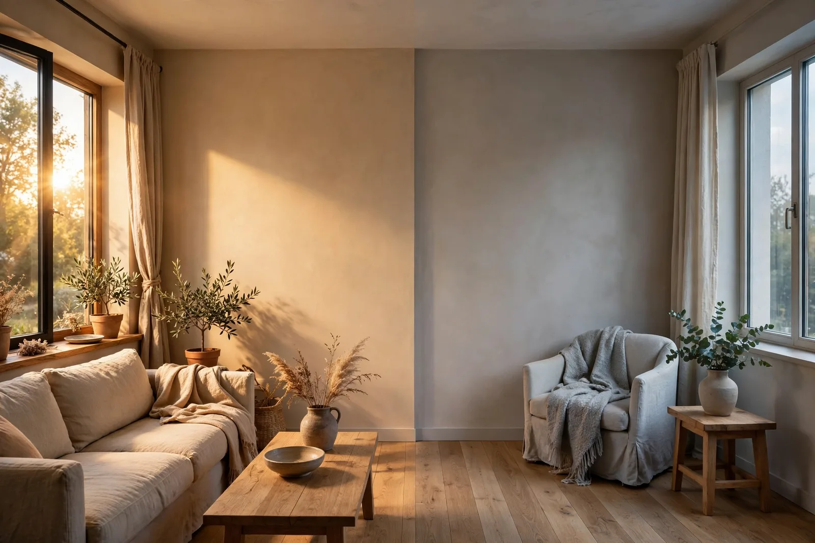
The same paint color can look like two different colors in two rooms of the same house, and the reason is usually not the paint, the brand, or your eyes. It is the direction the room faces. Light has a color of its own: cool and indirect from the north, warm and abundant from the south, cool-bright in an east-facing morning, gold-orange in a west-facing afternoon. Every wall color you choose is filtered through that light, and choosing without knowing your room’s exposure is like choosing a fabric without checking its color in daylight. This guide gives you the strategy for all four exposures, what north-facing rooms need, what south-facing rooms can handle, how to tame the east-west swing, and how to keep the whole house flowing when every room gets different light. Paint colors shift with lighting, surface, and sheen, so always test a large physical sample in your own space, in your own light, before committing, screen swatches are approximations. The Global Abode is an independent publication, not affiliated with or endorsed by Sherwin-Williams or Benjamin Moore; all color names and codes are referenced as widely-known designer examples.
Key takeaway: Exposure is the single biggest variable in how a paint color reads. North-facing rooms get cool, consistent, indirect light, compensate with warm colors (warm whites, warm greiges, or committed deep tones) and avoid cool grays and stark whites. South-facing rooms get warm, abundant light, they can take cool colors and saturated tones that would feel cold or flat elsewhere, while warm colors intensify and need restraint. East and west rooms swing between light temperatures through the day, choose neutral-warm tones that survive both. Undertone notes below are widely-reported designer observations, not exact manufacturer specifications.
Why Exposure Is the Number-One Color Variable
Ask a designer why the same color looks different in two rooms and they will ask one question first: which way do the rooms face? Not the bulb, not the floor, not the paint brand, the exposure. Natural light is not neutral white light. It arrives with a color temperature of its own, and that temperature changes with direction, time of day, season, and weather. Everything you see on your walls is paint color plus light color, blended. Choose the paint without accounting for the light and you are choosing blind.
In the Northern Hemisphere, which covers most of our readers in the USA and the UK, the four exposures behave like four different light sources. North-facing rooms receive indirect, diffuse daylight all day: no direct sun, a cool blue-gray cast, remarkably consistent from morning to evening. South-facing rooms receive direct, warm, golden sunlight for most of the day: abundant, strong, with crisp shadows, and it intensifies whatever color it touches. East-facing rooms get bright, cool light in the morning that fades to soft, neutral light by afternoon. West-facing rooms are dim and cool in the morning, then drenched in warm, orange-gold light from mid-afternoon onward. These are not subtle differences, they are different lighting conditions entirely, and the paint must be chosen for each.
This is why the color that glows in the showroom can fall flat at home, and why a color that looks perfect in your friend’s south-facing living room looks washed-out or chilly in your north-facing one. The paint did not change; the light did. Designers consistently describe exposure as the first thing they read in a room, before the finishes, before the furniture, before the paint deck opens. It is the lens every other decision is filtered through.
One honest note for readers in the Southern Hemisphere, including our Australian audience: north and south exposures reverse. In Australia, north-facing rooms receive the warm, strong, direct sunlight, while south-facing rooms receive the cool, indirect light. East and west behave broadly the same everywhere. So read the guidance below by light character, “the cool indirect exposure” and “the warm direct exposure”, and map it to whichever compass direction delivers that light in your part of the world. Our natural light guide covers the orientation science behind all of this in full.
Tip: Not sure which way your rooms face? Open a compass app on your phone and stand at each room’s main window, it takes five minutes for the whole house, and it is the single most useful piece of information you can bring to a paint decision. Write the exposure on your sampling notes for each room.
North-Facing Rooms: Compensating for Cool Light
North-facing rooms are the ones that cause the most paint regret, because their light is deceptive: it is soft, consistent, and shadowless, beautiful for artists, tricky for paint. The cool, blue-gray cast of north light does two things to a wall color. It cools whatever warmth the color has, and it exposes whatever cool undertone the color was hiding. A white that reads clean and neutral in a south-facing room can read faintly gray in a north-facing one, not because the paint changed, but because the light did.
The core strategy: add warmth on purpose. In a north-facing room, warm colors, warm whites, warm greiges, warm beiges, soft creams, counteract the cool cast. The warmth and the coolness meet in the middle, and what the eye reads is balance rather than coldness. Designers consistently reach for colors with warm undertones in these rooms: warm whites like Alabaster and White Dove-style warm off-whites, warm greiges, and gentle warm beiges. A touch of warmth goes a long way, even if the color still reads neutral, the warm undertone is doing quiet work against the cool light.
What to avoid in north rooms. Cool grays, blue-grays, icy blues, stark cool whites, and flat pastels, north light makes all of them read colder, flatter, or dingier than they do on the chip. A crisp cool white does not brighten a north-facing room; it reflects the room’s cool light faithfully, which reads as gray and lifeless. Anything labeled “cool” or “silver” is waving a flag that the room’s light will amplify. Our guide to whites for dark and north-facing rooms walks through the warm whites that actually work, and the bright cool whites that fail.
The yellow trap, the one exception to “add warmth.” Here is the nuance designers flag most often: not all warmth is safe. Yellow-based paints, buttery creams, golden beiges, can go green or muddy under cool north light, because the yellow undertone collides with the blue-gray cast instead of neutralizing it. This is the most common north-room failure after the cool-gray mistake. The warmth you want is red- or pink-based warmth, creams and warm whites with a warm-neutral or faintly rosy base, rather than yellow-based warmth. Warmth, yes; yellow, carefully.
The second strategy: commit to depth. If the north-facing room is a space where coziness beats brightness, a study, a media room, a moody bedroom, consider the opposite move: deep, saturated colors with warm undertones. Deep forest greens, warm charcoals, navy, chocolate, terracotta, these do not fight the cool light; they absorb it and become atmospheric. A deep color in a north room reads as intentional and enveloping, while a pale cool color in the same room reads as a failed attempt at brightness. The middle ground, a mid-tone cool color, is the one choice that reliably fails in north light.
Fix the artificial light too. Designers consistently note that many north rooms that feel cold are simply underlit in the evening, and no wall color solves underlit. Warm 2700–3000K bulbs, layered in lamps rather than a single overhead, are part of the north-room color strategy: the warm artificial light does at night what the warm paint does by day. Fix the bulbs before you judge the paint.
South-Facing Rooms: The Most Forgiving Light in the House
South-facing rooms are the opposite problem, and it is a good problem to have. These rooms receive abundant, warm, direct sunlight for most of the day, with strong shadows and beams of light. The light is warm and golden, and it renders colors accurately, even intensifying them. A color that looks calm on the chip can look noticeably warmer, brighter, and more saturated on a south-facing wall at 2pm.
The core strategy: cool tones are safe, and everything intensifies. South-facing rooms can carry colors that would feel cold or flat elsewhere, soft blues, blue-greens, cool grays, mineral tones, because the warm light neutralizes their coolness and they land in balance. This is the room where a cool gray reads as sophisticated rather than chilly, where a soft blue reads as serene rather than icy. If you have been holding back on a cooler palette, the south-facing room is where it belongs.
What to watch with south rooms. The abundance is the catch. Warm colors, creams, yellows, blushes, terracottas, appear warmer, more vivid, and more intense in south light than they do anywhere else. A warm beige that reads as subtle elsewhere can read as distinctly golden in a south-facing room; a soft blush can go noticeably pink at midday. This is not a reason to avoid warm colors, many south rooms are gorgeous in warm tones, but it is a reason to sample and step back: choose the warm color half a step calmer than your instinct, because the light will do the rest. Softer tones are the safe default in south rooms unless you genuinely love intensity.
Deep and saturated colors thrive here. South-facing rooms receive enough light to carry depth: deep greens, rich navies, warm charcoals, saturated terracottas all have the light they need to show their complexity rather than collapsing into darkness. If the north room’s strategy was “compensate,” the south room’s is “indulge”, this is where the bold color you were nervous about has the light to prove itself.
Whites in south rooms. Bright, clean whites glow beautifully in south-facing rooms, this is where they belong. But watch the warm whites: a creamy warm white that reads as gentle elsewhere can read distinctly yellow in strong south sun, especially in the afternoon. If the room gets very strong direct light, consider a cleaner or slightly cooler white than you would elsewhere, the warm light supplies the warmth the paint does not need to.
Watch out: The south-facing room changes character between noon and evening more than any other exposure, brilliant and warm at midday, then suddenly dependent on artificial light after sunset. Always judge your finalist at the room’s brightest hour and at 8pm under your actual lamps. A color that is perfect at 2pm and wrong at 8pm is not the right color for a room you use in the evening.
East and West Rooms: Managing the Daily Swing
East- and west-facing rooms are the tricksters of the house: they do not have one light character, they have two, and the paint has to survive both. Understanding the swing is the whole job.
East-facing rooms: bright cool morning, soft neutral afternoon. These rooms wake up with bright, cool-toned light, sometimes a gray-yellow morning light that can wash out color, and settle into softer, more neutral light by afternoon and evening. The practical question is when you use the room. A bedroom used mostly in the morning and evening will live in two different lights; a home office used all day sees the full swing. Designers consistently recommend neutral-warm tones that read consistently under both, warm greiges, balanced neutrals, soft warm whites, and caution against strong cool tones, which can feel chilly once the morning brightness fades. A saturated palette is often preferred here: colors with enough body hold their character through the swing better than pale tints that wash out.
West-facing rooms: dim cool morning, intense warm afternoon. These rooms are quiet and cool in the morning, then flooded with rich, gold-orange light from mid-afternoon onward, the most dramatic daily light shift in the house. That afternoon sun can be overwhelming: it penetrates deep into the room and intensifies warm colors dramatically. Designers consistently advise cool to neutral tones for west-facing rooms that are used in the afternoon, soft cool neutrals, muted blues and greens, balanced grays, because they stay composed under the orange afternoon light instead of overheating. A warm beige that looks perfect at 10am can look aggressively golden at 5pm. If the room is used mainly in the morning (a breakfast nook, a morning office), warmer tones are safe, the room never sees the intense afternoon version.
| Exposure | Light character | Color strategy |
|---|---|---|
| North | Cool, indirect, consistent all day; blue-gray cast | Warm colors to compensate (warm whites, warm greiges); avoid cool grays and stark whites; or commit to deep warm-toned darks |
| South | Warm, abundant, direct most of the day; intensifies color | Cool tones safe and balanced; warm colors intensify, step back half a shade; deep colors thrive |
| East | Bright cool morning, soft neutral afternoon; washes out color early | Neutral-warm tones that read consistently; saturated colors hold better than pale tints; match to time of use |
| West | Dim cool morning, intense orange-gold afternoon | Cool to neutral tones for afternoon use; warm tones risk overheating at 4–6pm; morning-use rooms can go warmer |
The time-of-use rule. For east and west rooms especially, the room’s schedule is a color input: choose for the light the room will be lived in, not the light it gets when you are elsewhere. A west-facing dining room used for dinner lives in the orange afternoon and the evening lamplight, not the dim morning. A west-facing bedroom used for sleeping and dressing lives in the morning. Sample at the hours that matter.
Keeping Flow When Every Room Gets Different Light
Here is the real challenge: your house does not have one exposure. The north-facing bedroom needs warmth, the south-facing living room can take cool tones, the west-facing study swings orange in the afternoon, and they all have to read as one home. How do you honor each room’s light without the house becoming four different palettes?
The answer: one undertone family, adjusted per room. Choose the home’s dominant temperature direction from the rooms that matter most, usually the main living spaces and the sightlines, and then vary within it rather than leaving it. The north-facing bedroom gets the warmest version of the family; the south-facing living room gets the cooler or more saturated version; the west-facing room gets the neutral middle that survives the afternoon swing. The family holds across the house; the expression of it shifts with the light. This is the step-don’t-swap discipline from our color flow framework: depth and warmth may vary room to room, but the temperature family stays constant.
Let the connectors be neutral. Hallways, stairs, and landings, the spaces that physically join rooms of different exposures, should carry the family’s calmest neutral. They are the bridges: a hallway in the anchor neutral lets a warm north bedroom and a cool south living room read as one continuous gradient instead of two separate statements. If the connectors take sides, the house fractures.
Same color, different rooms, expect it to shift. One of the most useful things to internalize: the same paint color will read differently in the north bedroom and the south living room, and that is not a failure, it is physics. Designers often use this deliberately: one warm greige carried through the house will read warmer and cozier in the north rooms and cleaner and brighter in the south rooms, giving the house natural variation within one coherent palette. Judge each room’s version on its own merits, in its own light.
When exposures demand different families. Sometimes the honest answer is that a room’s light genuinely wants a different temperature than the rest of the house, a very cool north-facing study in an otherwise warm home, say. The rule: give it a door. Closed rooms are allowed their own temperature logic, because the doorway breaks the sightline and the eye resets. The family rule governs flow, the connected spaces, not every room with a door.
Our small-space and low-light palette guide covers the dim-room end of this same problem, and our 48-hour sampling method is how you verify that each room’s version of the palette actually works in its own light.
The Sampling Protocol for Each Exposure
Sampling is where exposure strategy becomes a decision. The same 48-hour board test applies everywhere, but each exposure has its own moments that matter, and its own things to watch for.
North-facing rooms: sample on the north wall itself, the wall that receives the cool light most directly. Check at midday (the room’s most neutral light) and at 3–4pm (when the cool cast is most pronounced), then at 8pm under your actual lamps. Watch for: the color going gray, flat, or dingy in the afternoon check; yellow undertones turning greenish or muddy; cool undertones you did not see on the chip. The afternoon check is the verdict, if the color holds its warmth there, it will hold it anywhere in the room.
South-facing rooms: sample on the wall that receives direct sun. Check at the brightest hour (usually early-to-mid afternoon) and at 8pm. Watch for: warm colors reading more intense or golden than expected at peak sun; whites reading yellow in strong afternoon light; saturated colors looking electric rather than rich. The peak-sun check is the verdict for intensity, if the color is too much at 2pm, it is too much.
East-facing rooms: sample on two walls, the east wall (morning light) and an adjacent wall. Check at 8–9am (the bright cool wash) and again in the afternoon. Watch for: pale colors washing out in the morning brightness; cool colors feeling chilly once the morning light fades. The morning check tests washout; the afternoon check tests whether the color still has body.
West-facing rooms: sample on the west wall. Check in the morning (the dim cool baseline) and at 4–6pm (the intense orange-gold peak). Watch for: warm colors becoming overwhelming or brassy in the late-afternoon sun; the color reading like two different paints between morning and evening. The 5pm check is the verdict, if the color survives the orange hour without overheating, it will work all day.
Every exposure: test on at least two differently oriented walls, a wall facing the windows reads differently from a wall beside them, and corners and recesses deepen every color. Move the boards around the room; do not judge from one spot. And always finish with the evening lamplight check under the bulbs you will actually live with, because artificial light is the constant in every room regardless of exposure.
Choosing colors for the whole house, not just one exposure?
The Whole Home Paint Guide is a complete, ready-to-use color system, anchor neutrals, trim and ceiling pairings, accent colors, all with undertones already coordinated, so every room’s color works in its own light while the whole house stays one coherent palette. And the Paint Color Workbook includes room-by-room worksheets and a 48-hour sampling checklist for testing every color in its actual exposure with evidence, not guesswork.
Frequently asked questions
A warm white or warm greige is the safest choice for keeping the room light, colors with warm undertones that counteract the cool, blue-gray cast of north light. Soft warm whites like Alabaster, warm greiges, and gentle warm beiges are the most widely-referenced designer choices. Alternatively, commit to depth: deep warm-toned darks (forest green, warm charcoal, terracotta) absorb the cool light and become atmospheric. Avoid cool grays, stark whites, and anything labeled cool or silver, north light makes them read colder and dingier.
Both work, south-facing rooms are the most forgiving exposure. Cool colors (soft blues, blue-greens, cool grays) are safe here because the warm sunlight neutralizes their coolness, and this is the room to use them if you love them. Warm colors work too, but they intensify in south light, a warm beige reads warmer and more vivid than it does elsewhere, so choose them half a step calmer than your instinct says. Always judge the finalist at peak sun and at 8pm before committing.
Choose for the light the room will be lived in, not the light it gets when you are elsewhere. East rooms get bright cool morning light and soft neutral afternoons, neutral-warm tones that read consistently through the swing work best. West rooms get dim cool mornings and intense orange-gold afternoons, cool to neutral tones prevent the 4–6pm overheating that warm colors suffer. In both, sample at both ends of the day: the swing is the test.
Yes, and designers often do. The same color will read differently in each exposure (warmer and cozier in the north room, cleaner and brighter in the south room), and that natural variation is a feature, not a failure. Judge each room’s version in its own light before deciding. If the color fails in one exposure, going gray in the north room or glaring in the south, adjust within the same undertone family rather than abandoning the palette: a step warmer for the north room, a half-step calmer for the south.
Avoid cool grays, blue-grays, icy blues, stark cool whites, and flat pastels, north light amplifies their coolness and they read cold, flat, or dingy. Also be cautious with yellow-based creams and golden beiges: under cool north light they can go green or muddy, which is one of the most common north-room failures. The safe warmth is warm-neutral and faintly rosy-based warmth, not yellow-based warmth.
No, you need one undertone family, expressed differently per room. Choose the home’s dominant temperature from the main living spaces, then vary within it: the warmest expression in north rooms, the cooler or more saturated expression in south rooms, the neutral middle in east and west rooms. Keep the connectors (hallways, stairs) in the family’s calmest neutral. Closed rooms with doors are allowed their own temperature logic, since the doorway breaks the sightline. See our color flow framework for the full method.

