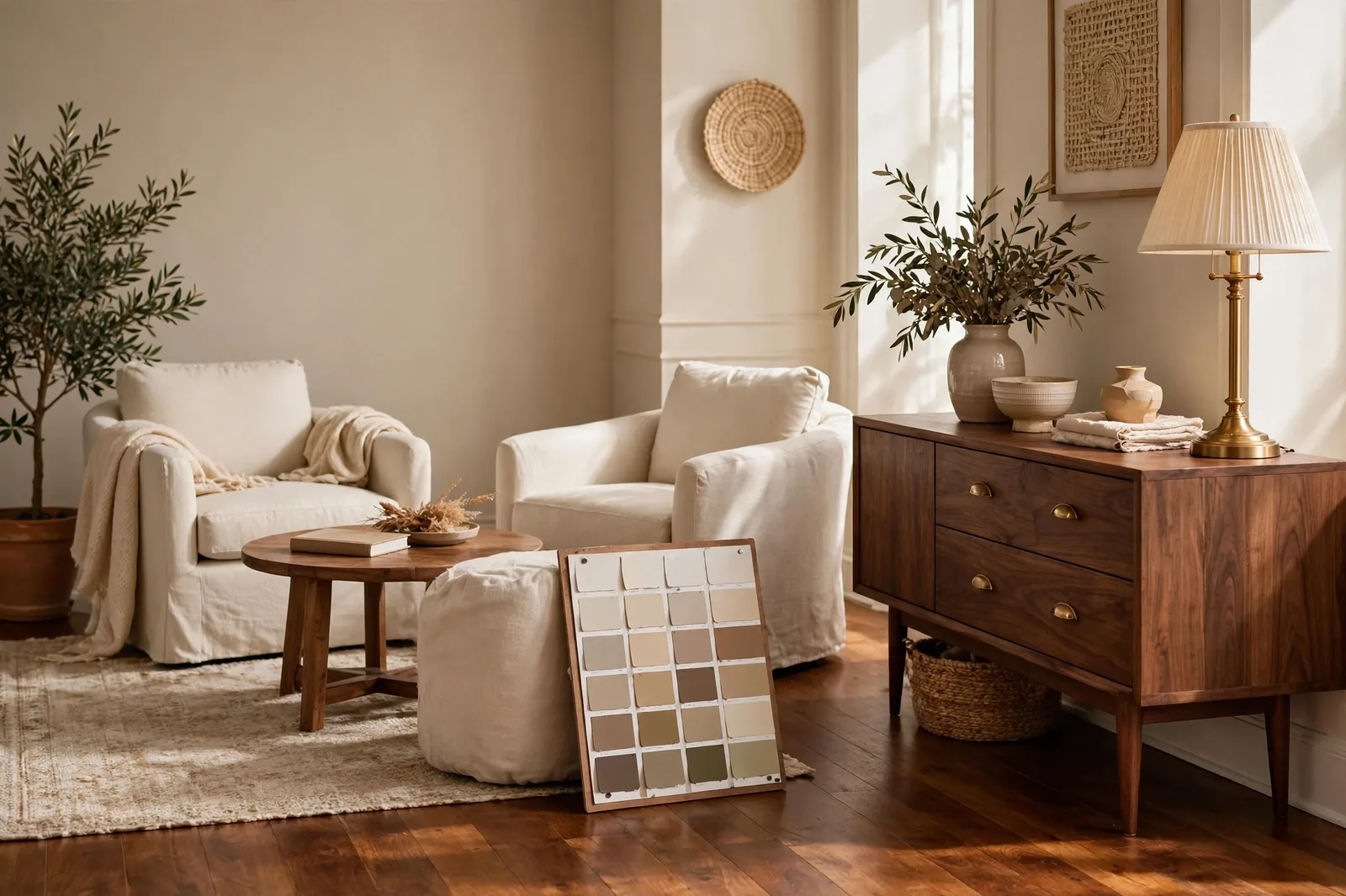
Your wood floor is the largest fixed surface in your home, and the one you can’t repaint on a weekend. The wall color is the flexible partner, the floor is the permanent one, and the relationship between them decides whether a room feels intentional or slightly off in a way nobody can name. This complete guide teaches the method designers use: read your wood’s undertone, choose the wall family that agrees with it, and test the two together before the gallons are open. Oak, walnut, cherry, maple, espresso, gray-washed, every major wood type gets its wall verdict, its watch-outs, and its sampling rules. Paint colors shift with lighting, surface, and sheen, so always test a large physical sample of the real paint against your actual floor, in your own light, before committing, screen swatches are approximations. The Global Abode is an independent publication, not affiliated with or endorsed by Sherwin-Williams or Benjamin Moore; all color names and codes are referenced as widely-known designer examples.
Key takeaway: Walls and wood floors match by undertone, not by name. Read the floor’s undertone first, warm woods (oak, hickory, cherry) with warm-leaning walls; dark red-browns (walnut, mahogany, cherry) with cooler, calmer walls that let the wood’s richness carry the warmth; pale and gray-washed woods (maple, ash, white oak) with almost anything, lean cool for modern and warm for traditional. The universal rule: the wall’s temperature should agree with, or deliberately contrast, the floor’s temperature, and you decide which move you’re making before you buy paint. Undertone notes below are widely-reported designer observations, not exact manufacturer specifications.
The Floor-First Rule: Floors Are Forever, Walls Are Flexible
Every paint decision in a home with wood floors should start with the same sentence: the floor isn’t changing, so the wall must agree with it. Refinishing or replacing a wood floor costs thousands and disrupts the whole house; repainting a wall costs a gallon and a Saturday. The floor is the permanent partner. The wall is the flexible one. The flexible one adapts.
This sounds obvious, and yet the most common paint mistake in homes with wood floors is made at the paint store, where people choose wall colors against white board and memory. White board doesn’t argue. Your floor does. The wall color that looked perfect in the store can read yellow against your oak, icy against your walnut, or muddy against your cherry, not because the paint is wrong, but because the paint was chosen without the floor in the conversation. The floor gets a vote. Give it the first one.
The floor-first method has two parts. First, the temperature agreement principle: the wall’s temperature should agree with the floor’s temperature, or, in the cases where contrast is the move, disagree deliberately and confidently. A warm floor (oak, hickory) with a warm wall (warm white, warm greige, soft beige) feels collected and intentional. A warm dark floor (walnut, mahogany) with a cooler wall (soft gray, cool white, muted blue-gray) feels balanced, the wall’s coolness keeps the room from going amber, and the floor’s richness supplies all the warmth the room needs. What never works is the accidental mismatch: a wall that leans warm without intending to, against a floor that leans cool, so the two look like they came from different renovations. Agreement or deliberate contrast, never accidental clash.
Second, the depth relationship: as a general rule, walls should be lighter than the floor. Light walls over a dark floor create the classic, grounded look, the room feels anchored below and open above, which reads as natural the way the sky is lighter than the ground. This is a rule with famous exceptions: a deep navy or charcoal wall against a light oak floor can be stunning in a well-lit room, and dark walls against dark floors can work when the lighting is generous and the woodwork is crisp. But if you’re choosing between light and dark walls and you aren’t sure, lighter is the safer default, especially in small rooms, dim rooms, and north-facing rooms, where a dark floor plus dark walls can close a space in.
The floor-first rule also means something practical about when you choose. Sample wall colors against the floor, not against the paint store’s white walls. Hold the boards low, at floor height, where the eye actually compares them, and step back to standing height to judge. Floors are viewed from above and at a distance; walls are viewed from straight on. The comparison has to happen in the room, in the geometry where you’ll live with it.
Tip: If your home has the same wood floor running through multiple rooms, which most do, choose one wall color (or one wall family) that travels with it through the whole open plan. The floor is the constant; the wall should be constant too. A different undertone in every room forces the eye to renegotiate the floor-wall relationship at every doorway, and the house feels restless. One floor, one wall strategy.
Reading Your Wood’s Undertone: The White-Paper Test
Every wood has an undertone, a hidden hue in the grain that becomes visible only when you know to look for it. Oak reads golden-yellow. Cherry reads red. Walnut reads purple-brown. Maple reads pale and honeyed. Espresso reads near-black with a cool cast. Gray-washed floors read, well, gray. That undertone is the thing your wall color is really matching, not the wood’s name, not its lightness or darkness, but its hidden hue.
The white-paper test is how you read it. Lay a sheet of plain white printer paper on the floor in daylight. The paper gives your eye a true-white reference, and against it, the wood’s undertone jumps out: you’ll see the gold in golden oak, the red in cherry, the coolness in espresso, the pinkish cast in some mahogany stains. Thirty seconds, no equipment, and it tells you which temperature family your floor belongs to, warm, cool, or neutral.
Most wood floors fall into one of three temperature families:
Warm woods lean yellow, gold, orange, or red. Golden oak, white oak, hickory, cherry, most stained pines, warm walnut, the majority of American wood floors are warm. Warm woods want warm walls or deliberate contrast: warm whites, warm greiges, soft beiges, earthy tans for harmony; cool grays and blue-grays for contrast (handled carefully). The warm-wood failure is the unintended cool wall, a wall with a blue-gray undertone chosen without noticing, which makes the floor look more orange by contrast and the room feel disconnected.
Cool woods lean gray, ash, or near-black. Gray-washed oak, weathered finishes, espresso and ebony stains, charcoal-stained floors. Cool woods want cool or neutral walls, soft grays, clean whites, blue-grays, greiges with a gray pull. The cool-wood failure is the warm wall that fights them: a warm beige against a gray-washed floor can make both look like mistakes from different eras.
Neutral woods sit near the middle, pale maple, natural ash, white oak, light neutral stains. Neutral woods are the most forgiving floors in the house: they pair with warm walls and cool walls alike, which means the room’s light and style get to decide. If your floors are neutral, skip ahead to the style question, the floor won’t argue either way.
One more reading skill: grain contrast matters as much as undertone. Busy, high-contrast grain (hickory, character-grade oak) is visually loud, it wants calm, quiet walls that don’t compete. Tight, even grain (maple, quarter-sawn oak) is quiet, it can carry a wall with more color and personality. If your floor is doing a lot of visual talking, let the walls be the listeners.
Watch out: The red-undertoned floor is the one that sinks the most wall choices. Cherry, mahogany, and some red-oak stains carry a strong red or pink-red undertone that amplifies against the wrong wall, beige walls can look pinkish, gray walls can look muddy, and green walls can go olive in ways nobody predicted. Red woods need the calmest, most neutral walls you can give them: soft warm whites, light taupes, muted blue-grays. Test large, test against the actual floor, and judge in evening lamplight, which is when red undertones wake up.
Oak and Warm Woods: Golden Oak, White Oak, Hickory
Oak is the great survivor of American flooring, it was in the houses of the 1990s and it’s in the renovations of today, and it’s also the most forgiving wood to pair walls with. Oak’s golden warmth is friendly rather than demanding, which is why designers call it versatile: it harmonizes with warm walls and holds its own against cool ones, provided the pairing is intentional.
| Wood type | Best wall family | Watch out for |
|---|---|---|
| Golden oak (yellow-orange undertone) | Warm whites (Alabaster, Greek Villa), warm greiges (Accessible Beige, Agreeable Gray), soft sages | Cool blue-gray walls make the floor look more orange by contrast; test before committing |
| White oak (neutral-warm, muted) | Almost anything, warm whites, cool grays, greiges, soft blues | Its neutrality is the trap: choose by the room’s light and style, not by the floor |
| Hickory (warm, high-contrast grain) | Calm neutrals, warm whites, light greiges, soft beiges | Busy grain competes with busy walls; keep the walls quieter than the floor |
| Pine / warm stained softwoods (honey, amber) | Warm whites, creams, warm greiges; soft greens for contrast | Yellow-heavy walls plus yellow-toned floors can go golden, test at midday sun |
| Red oak with warm stain (red-orange cast) | Neutral warm whites, light taupes, muted blue-grays | The red cast amplifies against warm walls; lean neutral, not warm-on-warm |
Golden oak, the 1990s kitchen floor, now back in style, is warm with a yellow-orange undertone. Its best walls are warm whites and warm greiges that echo the warmth without doubling it: Alabaster or Greek Villa on the walls, Accessible Beige or Agreeable Gray for a touch more color. The famous golden-oak mistake is the cool gray wall chosen from a trend photo: against a blue-gray wall, golden oak’s orange side comes forward hard, and the room reads as dated rather than refreshed. If you want gray walls with golden oak, choose a warm gray (a greige), the beige thread in the gray shakes hands with the warmth in the floor.
White oak is the designer darling of the moment, neutral-warm, muted, with a quiet grain that doesn’t fight anything. White oak floors genuinely work with almost every wall family: warm whites for traditional, cool grays for modern, greiges for transitional, soft blues and sages for color. The white-oak trap is decision paralysis, not mismatch: because the floor agrees with everything, you have to choose by light, style, and mood instead. Pick the wall the room wants.
Hickory is the loudest common floor, dramatic grain contrast, color variation from board to board, a lot of visual energy. Hickory rooms need calm walls: warm whites, light greiges, soft beiges, nothing with a strong personality of its own. The wall’s job in a hickory room is to recede and let the floor be the star. Busy walls plus busy floors is the one combination that reliably exhausts the eye.
For the wall-color side of the golden oak equation, our white paint with wood floors guide goes deep on the white families, and our greige guide covers the warm-neutral family that loves oak.
Dark and Red-Toned Woods: Walnut, Cherry, Espresso
Dark floors change the rules, not because they’re harder, but because they ask a different question. With light floors, the question is which wall agrees with the wood’s undertone. With dark floors, the question is do I harmonize with the warmth, or balance it with coolness? Both are legitimate design moves. The mistake is making neither choice, a wall that’s neither warm enough to harmonize nor cool enough to balance, sitting in muddy indecision.
Walnut, rich, deep brown with a purple-brown undertone, is the sophisticated dark wood. Its best walls are the calm ones: soft warm whites, light greiges, muted blue-grays, soft sages. Walnut’s purple-brown thread means it pairs beautifully with walls that have a whisper of gray or green in them, the undertones rhyme. The walnut failure: walls that are too warm and too dark, which pushes the whole room into a heavy, amber gloom. With walnut, the wall should be lighter and calmer than the floor, let the floor carry the drama.
Cherry and mahogany, the red woods, are the most undertone-sensitive floors in the house. Their red thread is strong, and it amplifies against the wrong wall. The safest walls for red woods are the most neutral ones: soft warm whites, light taupes, warm grays with restraint. Cool walls can work as deliberate contrast, a muted blue-gray against cherry is a classic, but the wall must be confidently cool, not accidentally cool. And warm beige walls against cherry need testing: the beige’s yellow plus the floor’s red can read pinkish in evening light. Test red-wood pairings at 8pm under your actual lamps, that’s when the red wakes up.
Espresso and ebony, near-black, cool-cast stains, are the most modern dark floors, and they pair with the most modern walls: clean whites, soft grays, blue-grays, greiges with a gray pull. Espresso’s coolness means warm walls need to be chosen deliberately, a warm white against espresso is fine, but a warm beige can look disconnected, like the wall belongs to a warmer house. The espresso rule: walls lighter, walls calmer, walls with presence. A near-black floor needs a wall with enough lightness to keep the room open and enough character to not disappear.
The universal dark-floor rule: create contrast without going stark. Dark floors absorb light, so the walls have a lighting job to do, they must bounce light back into the room. Walls in the light-to-mid-light range (warm whites, light greiges, soft grays) do this naturally. If you want a dark wall against a dark floor, do it in a room with generous light, and keep it to the rooms that can take the drama, dining rooms, studies, powder rooms, not the small north-facing bedroom.
For the undertone method behind all of this, our undertones guide teaches the temperature-matching system, and our fixed-finish matching framework extends it to stone, tile, and cabinetry.
Pale and Gray Woods: Maple, Ash, Gray-Washed
Pale and gray woods are the easy floors, and the ones where the room gets to decide. Maple, ash, birch, pale natural finishes, gray-washed oak: these floors are light enough and neutral enough that they don’t impose a wall temperature. That’s a gift, but it means the decision moves to light, style, and mood.
Maple and ash, pale, honeyed, tight-grained, are warm-neutral. They pair beautifully with warm whites and greiges for a soft, Scandinavian-leaning warmth, and with cool grays and soft blues for a crisper, more modern read. Maple’s honey undertone is gentle: it doesn’t fight warm walls and doesn’t demand them. In a north-facing room, lean warm (warm whites, warm greiges) to keep the room from feeling cold; in a bright south room, lean whichever way the style points.
Gray-washed and weathered woods, the farmhouse and coastal floors, are cool by design. Their gray cast wants cool or neutral walls: soft grays, clean whites, blue-grays, greiges with a gray thread. The gray-wash failure is the warm beige wall that makes both the floor and the wall look like they’re from different design eras, the floor says coastal-modern, the wall says Tuscan-2005. Keep the wall’s temperature in the same decade as the floor’s.
White oak in pale finishes, the current favorite, is the most forgiving floor of all. Warm whites, cool grays, greiges, soft color: it takes everything. The only caution is depth: pale floors plus pale walls plus pale furniture can wash a room out into a beige fog. If everything is light, the room needs something with depth, a dark door, deep upholstery, black metals, a walnut table, to give the eye somewhere to land.
One more pale-floor principle: light floors can carry deeper walls. This is the inverse of the dark-floor rule. A pale maple floor reflects light back up, which means a mid-tone wall, a sage, a dusty blue, a warm greige with depth, reads as cozy rather than closing-in. If you’ve been wanting a wall with real color but your dark-floor rooms can’t take it, the pale-floor room is where it lives.
The Sightline Test: One Floor, Many Rooms
The hardest floor-wall decision isn’t one room, it’s the whole house. Most homes have one wood floor running through the main level, crossing living rooms, hallways, kitchens, and entries in unbroken sightlines. The wall color has to work with the floor in every one of those rooms, under different light, and the eye has to read the whole sequence as one home.
The sightline test is how you check. Stand in the room with the most light, usually the living room or the open-plan main space, and look through the doorways and down the hallways. Every wall you can see in that sightline should belong to the same undertone family. Not the same color, the same family. A warm white in the living room, a warm greige in the hallway, a warm beige in the bedroom: different colors, one temperature agreement, and the house feels coherent. A warm white in the living room, a cool gray in the hallway, a pink-beige in the bedroom: the floor is the only constant, and every doorway is a small argument.
This is why the whole-house wall strategy matters more than any single room’s perfect color. The method:
Step 1: Choose the anchor. Pick the wall family that agrees with your floor’s undertone, warm white/greige for warm floors, cool gray/white for cool floors, either for neutral floors. This family carries the main living spaces and the connecting hallways.
Step 2: Step it, don’t swap it. Bedrooms and secondary rooms can go a step deeper or lighter within the same family, the same greige two steps deeper in the study, the same white family in the bedroom. Depth changes; temperature doesn’t.
Step 3: Test the transitions. Paint boards for each room’s color, prop them in the doorways, and look down the sightlines. The transitions should feel like a gradient, not a gear change. If one room’s wall makes the floor look different, more orange, more pink, more gray, that room’s undertone is off.
Step 4: Mind the trim. Trim is the frame around every wall-floor meeting. One trim white through the whole house, chosen to agree with the floor’s temperature: warm whites for warm floors, clean whites for cool floors. Trim is the constant that lets wall colors vary, but it has to agree with the floor first, because it touches the floor in every room.
The sightline test catches the mistake that no single-room test can: the wall that’s perfect in its own room and wrong for the house. A cherry-floor home with a perfect warm-white living room and a cool-gray hallway doesn’t have a hallway problem, it has a house problem. Test the house, not just the room.
Choosing wall colors for your floors, or building the whole palette?
The Whole Home Paint Guide is a complete, ready-to-use color system, anchor neutrals chosen to agree with warm wood floors, trim and ceiling pairings, accent colors, all with undertones already coordinated, so your walls and your floors read as one intentional design. And the Paint Color Workbook includes the floor-first worksheets, undertone-testing pages, and a room-by-room sampling checklist for testing wall finalists against your actual floors with evidence, not guesswork.
Frequently asked questions
Yes, with the right gray. Oak’s warmth wants a warm gray (a greige like Agreeable Gray or Accessible Beige), whose beige thread shakes hands with the floor’s warmth. A cool blue-gray against golden oak is the classic mismatch: the floor looks more orange by contrast and the room reads as dated. The rule is temperature agreement, not color avoidance, gray is fine, blue-gray is the risk. Test a large board against your actual floor in daylight and evening light before committing. Our greige guide covers the warm-gray family in full.
Light, calm walls: warm whites, light greiges, soft grays, muted blue-grays. Dark floors absorb light, so the walls have a lighting job, bounce it back. Match the wall’s temperature to the floor’s undertone: warm red-browns (walnut, mahogany, cherry) pair beautifully with cooler, calmer walls that let the wood’s richness carry the warmth; cooler near-black stains (espresso, ebony) pair with soft whites and grays. Keep walls lighter than the floor in most rooms. See our undertones guide for the temperature-matching method.
Carefully, and test it. Cherry’s strong red undertone can make beige walls read pinkish, especially in evening lamplight when red undertones wake up. If you want beige with cherry, choose a restrained, gray-civilized beige (not a yellow-heavy one) and test a large board against the actual floor at 8pm under your lamps. Safer bets for cherry: soft warm whites, light taupes, and muted blue-grays as deliberate contrast. The redder the floor, the calmer the wall should be.
Both are legitimate, the mistake is doing neither. Harmony: warm walls with warm woods, cool walls with cool woods, the room feels collected and calm. Deliberate contrast: a cool gray wall against walnut, a warm white against espresso, the contrast is confident and the room feels designed. What fails is the accidental middle: a wall that leans slightly warm against a cool floor, or slightly cool against a warm floor, so the two look like a mistake rather than a choice. Decide which move you’re making before you buy paint, then commit to it.
A warm greige or a soft warm white, the most temperature-flexible neutrals. Mixed woods (oak floors, walnut furniture, cherry built-ins) need a wall that doesn’t take sides: warm greiges like Agreeable Gray bridge warm and cool elements, and soft warm whites like Alabaster recede without arguing. Avoid walls with a strong undertone of their own, a pink-beige or a blue-gray will agree with one wood and fight another. The wall in a mixed-wood room should be the diplomat, not another debater. Our fixed-finish matching framework extends this to stone and tile.
Paint large boards (2×2 feet minimum), two coats, in your actual sheen, then test them low, at floor height, where the eye actually compares wall to floor, and step back to standing height to judge. Check at four moments: morning, midday, late afternoon, and 8pm under your evening lamps (red undertones wake up at night). Hold the board against the floor and the trim together, all three must agree. Photograph from across the room: cameras exaggerate undertones and show you what guests notice first. Live with the boards for 48 hours. Our 48-hour sampling method walks through every step.

