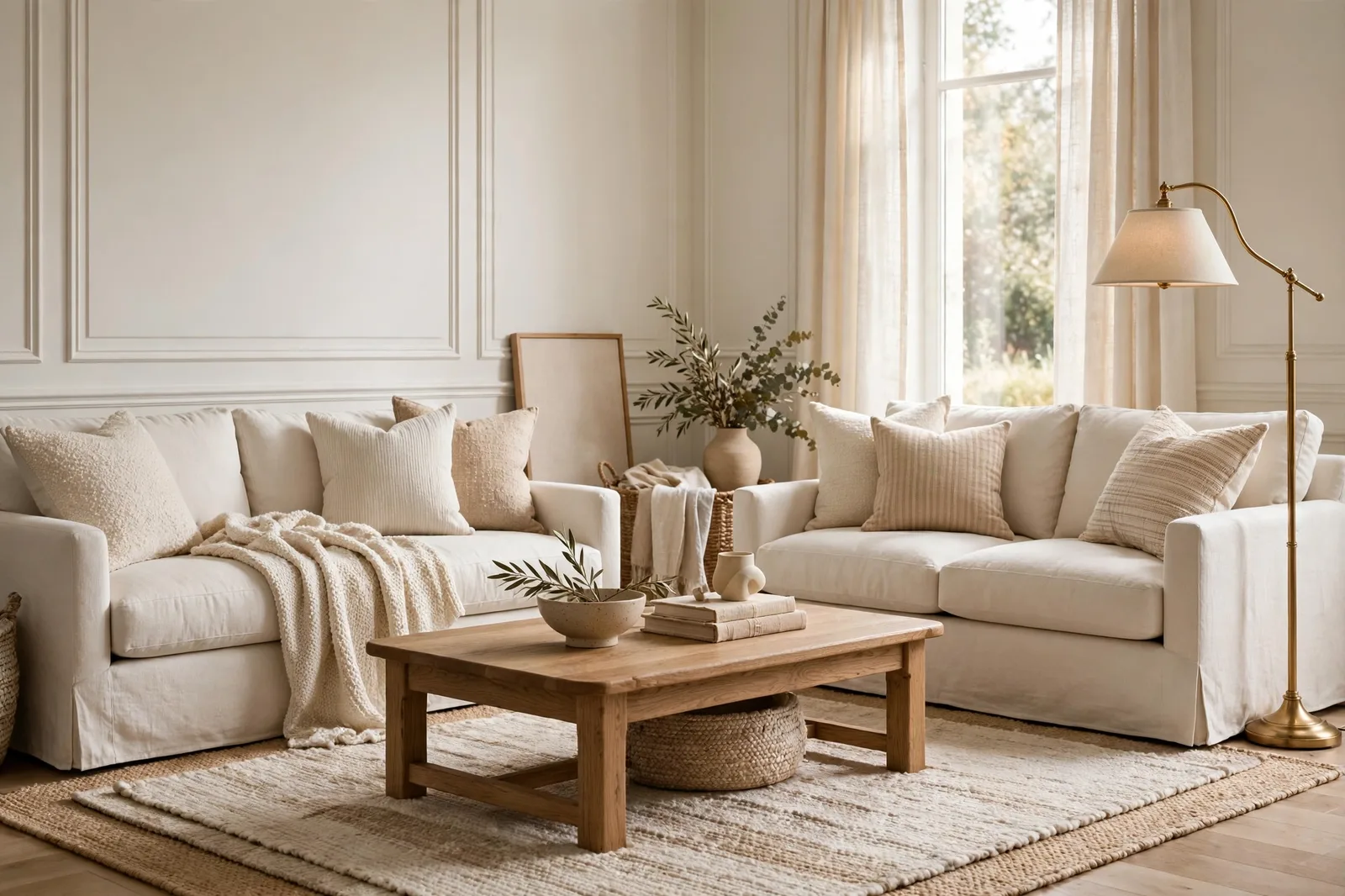
If paint colors had a hall of fame, White Dove would be one of the first names voted in. Benjamin Moore’s OC-17 is the soft warm white that designers have specified on trim, cabinets, walls, and exteriors for decades, not because it is trendy, but because it is reliable in the way few whites manage to be: warm without being creamy, bright without being stark, and neutral enough to sit beside almost anything without arguing. This complete guide covers what White Dove really is, how its undertones behave in different light, where it shines and where it stumbles room by room, the pairings designers return to, and the sampling protocol that tells you whether it belongs in your home. Paint colors shift with lighting, surface, and sheen, so always test a large physical sample in your own space before committing, screen swatches are approximations. The Global Abode is an independent publication, not affiliated with or endorsed by Benjamin Moore or Sherwin-Williams; all color names and codes are referenced as widely-known designer examples.
Key takeaway: White Dove OC-17 is a soft, warm off-white with a whisper of yellow softened by a gray base, warm enough to feel welcoming, restrained enough to read as white. It is less creamy and a touch more muted than Alabaster, crisper than Swiss Coffee, and noticeably softer than Simply White. It shines as trim and cabinetry in warm-leaning homes, on walls in north-facing rooms that need warmth without yellow, and anywhere you want one white carried confidently through the house. It struggles next to bright blue-whites (where its gray softness shows), in kitchens with cool gray tile, and on exteriors against very light siding. Undertone notes below are widely-reported designer observations, not exact manufacturer specifications.
What White Dove Is: The Benjamin Moore Icon
Every brand has one white that defines it. For Benjamin Moore, that white is White Dove, OC-17, a soft, warm off-white that has been specified on everything from Brooklyn brownstone trim to farmhouse cabinets to whole-house wall systems for longer than most design trends have lasted. It is not the brightest white, not the warmest white, not the crispest white. It is the middle white, and that middle is exactly why it has stayed relevant while flashier whites have come and gone.
White Dove sits right at the edge between white and off-white. In bright, sun-filled rooms it often reads as a clean, fresh white; in lower light it softens into something creamier and more enveloping. That range is the first thing to understand about it: it is not one reading, but a small band of readings, and the room’s light decides which one you get. Designers love this behavior because it means White Dove adapts, the same color can feel fresh in the kitchen and cozy in the bedroom, and both readings are correct.
Its character in one line: White Dove is the white for people who find white too cold but cream too much. It carries enough warmth to feel welcoming, a whisper of yellow, softened and “grayed out” so it never goes buttery, but it stops well short of cream. Designers describe it as refined rather than rich, sophisticated rather than cozy. It has manners. It does not demand attention; it makes everything around it look better.
It helps to place White Dove against the whites it is always compared to. Next to Alabaster (SW 7008), White Dove reads as the slightly more muted, slightly less creamy option, Alabaster has more visible warmth; White Dove has more restraint. Next to Simply White (OC-117), White Dove reads as the softer, warmer sibling, Simply White is crisper and brighter with a cleaner finish. Next to Cloud White (OC-130), White Dove reads as the gentler, more traditional choice, Cloud White carries more pronounced yellow warmth. And next to the brand’s own Chantilly Lace (OC-65), White Dove looks positively warm, Chantilly Lace is the near-true white, crisp and cool, the modern answer where White Dove is the timeless one.
Its history is part of its identity. White Dove has been a designer staple for decades, the default “soft white” on millwork, built-ins, and cabinetry in homes where the architect wanted warmth without yellow and brightness without starkness. It is the white that shows up in renovation after renovation because it solves the problem most whites can’t: it reads as white in the photograph and feels like home in person.
Tip: The fastest way to understand White Dove is the three-board test: paint large boards of White Dove, Alabaster, and Simply White, prop them together in daylight, and look. In ten seconds you’ll see the whole story, Alabaster reads warmest and creamiest, Simply White reads crispest and brightest, White Dove sits calmly in the middle. Whichever one your eye settles on is usually the right white for your home’s overall temperature.
Undertones and Light Behavior: Gray-Restrained Warmth
White Dove’s undertone story is subtle, which is exactly why it works, and exactly why it needs a careful look. The base is a warm white with a gentle yellow undertone, but that yellow has been softened, muted, “grayed out,” in the language designers use. The gray in the mix is doing the important work: it keeps the warmth from ever reading as yellow, and it keeps the white from ever reading as creamy. The result is a warmth you feel rather than see, the room feels welcoming, but you can’t quite point to why.
What makes White Dove interesting is what it doesn’t have. It has no pink thread, no green cast, no blue flash, the surprise undertones that sink so many white choices. Color consultants consistently describe it as one of the more predictable whites to live with: warm without golden, soft without muddy, bright without stark. That predictability is the core of its reputation. When a designer specifies White Dove for a client they can’t visit every week, they are betting on this consistency, and it usually pays.
Light changes the reading through the day, and White Dove’s range is one of its defining traits:
South-facing rooms: bright, warm sun shows White Dove at its freshest, clean, luminous, reading as a true white with just a whisper of warmth. This is the version from the portfolio photographs. Strong daylight keeps the gray base quiet and the warmth gentle.
North-facing rooms: cool, indirect light brings out the soft side. White Dove absorbs the cool cast gracefully, its warmth pushes back against the gray-blue light, and the room stays cozy where crisper whites would go icy. This is why designers reach for it so often in north rooms: it is one of the most forgiving whites for cool light.
Morning and evening: warm light at the edges of the day makes White Dove glow, the yellow whisper comes forward and the room feels enveloped. Under warm 2700–3000K lamplight in the evening, it is at its coziest: soft, glowing, never yellow. Under cool daylight-balanced bulbs, it flattens slightly and the gray base shows more, warm bulbs are its natural partner.
Next to a brighter white, White Dove’s softness becomes visible. This is the contrast effect that causes the most surprises: White Dove trim next to a bright white ceiling, or White Dove cabinets next to a crisp white quartz countertop, can read as dingy or gray by comparison, not because White Dove changed, but because the neighbor is brighter. It is the same behavior every soft white shows, and it is the single most important thing to test before committing.
The honest summary: White Dove is one of the least surprising whites you can choose, no pink flashes, no green casts, no dramatic shifts. Its two consistent behaviors are the softening in dim light (where it reads as a warm off-white rather than a bright one) and the contrast effect against brighter whites. Know about both in advance, test for them, and there are very few ways for this color to surprise you.
Room by Room: Where It Shines and Where It Stumbles
White Dove is versatile, but it is not universal. Here is the honest room-by-room verdict.
Trim and millwork, the star turn. This is White Dove’s most famous job, and the one designers specify it for most. On trim, baseboards, crown molding, wainscoting, and built-ins, it reads as a soft, refined white, warm enough to feel intentional, never stark, never yellow. It is the default trim white in homes with warm walls, warm wood floors, and traditional-to-transitional style. The rule: use it in satin or semi-gloss for trim, where the sheen adds crispness that balances the color’s softness.
Kitchen cabinets, shines. White Dove is one of the most-specified cabinet whites in the business, and for good reason: it flatters wood floors, warms up the room, and is far more forgiving than crisp whites when it comes to showing wear. It pairs beautifully with warm granite, butcher block, and brass hardware. The caveat is the contrast effect: against bright white quartz countertops or crisp white backsplash tile, White Dove cabinets can read as creamy or dingy by comparison. In kitchens with cool, bright-white hard finishes, a crisper white is usually the safer cabinet choice. Use a dedicated cabinet enamel in satin or semi-gloss.
Living rooms, shines. On living room walls, White Dove makes the space feel open while keeping it warm, furniture stands out, art pops, and the room glows softly in the evening while staying fresh by day. It flows beautifully through open plans and works across styles from traditional to modern. Few whites do the living room this well.
Bedrooms, shines. Warm whites are natural bedroom colors, and White Dove’s softness makes it restful without being flat. It absorbs cool morning light gracefully and glows under warm lamps at night. In very dim bedrooms, expect it to read as a soft creamy white rather than a bright one, which is usually exactly what a bedroom wants.
Bathrooms, works, with attention to tile. White Dove works in bathrooms with warm tile, warm metals (brass, bronze), and wood vanities. Against cool gray tile, Carrara marble, or chrome fixtures, its warmth can look mismatched, the tile looks colder and the paint looks creamier than either does alone. Match the wall’s temperature to the tile’s temperature and it behaves. Use a moisture-appropriate sheen (satin) and a bath-rated formula.
Exteriors, shines with the right neighbors. White Dove works on exteriors, siding, trim, doors, where it reads as a soft, clean white in bright sun: warm and welcoming, never stark. The classic execution is White Dove on the siding with a crisper white on the trim, or White Dove trim against a deeper body color. The caution: against very light siding, it can look dingy by comparison, it needs enough contrast to read as intentional. Always test exterior colors on large boards on the actual house, in morning and afternoon sun.
Whole-house use, shines. White Dove is an excellent whole-house white in warm-leaning homes: carried on trim throughout, or on walls room to room, it flows without fighting. Color-drenching a room in White Dove, walls in eggshell, trim in satin, ceiling in flat, is one of the most forgiving moves in design: it removes the trim decision entirely and makes small rooms feel larger and calmer.
Watch out: White Dove’s single biggest failure mode is the bright-white neighbor. Trim in White Dove next to a bright white ceiling, cabinets in White Dove next to crisp white quartz, walls in White Dove under a stark white door, in every case, White Dove reads as dingy or gray by comparison. This is not a flaw in the color; it is how eyes work. Never pair White Dove with a noticeably brighter or cooler white without testing the two together first. Either commit to White Dove everywhere in the sightline, or step the brighter white down to something closer.
Best Pairings: Trim, Accents, and Coordinating Neutrals
White Dove is a team player, it was designed to sit inside a palette, not to stand alone. Here are the pairings designers return to, with the honest notes on each.
| Pairing | Why it works | Watch out for |
|---|---|---|
| Simply White OC-117 (trim) | The classic Benjamin Moore pairing, crisper and slightly brighter, it frames White Dove walls with clean definition | The contrast is visible; in dim rooms it can make White Dove read creamy by comparison, test first |
| Chantilly Lace OC-65 (trim) | Maximum crispness against White Dove’s softness, the modern, high-contrast execution | The strongest contrast on this list; best in bright rooms and modern schemes |
| White Dove in a higher sheen (trim) | Same color, satin or semi-gloss, the definition comes from sheen, not color, for the calmest possible look | Removes all contrast; ideal for color-drenching, less ideal where trim should pop |
| Revere Pewter HC-172 | The all-time designer pairing, warm greige walls with White Dove trim is the classic transitional room | A whole-house favorite combination; the temperatures agree perfectly |
| Edgecomb Gray HC-173 | Lighter, airier greige with White Dove trim, soft, calm, endlessly livable | Keep the greige on the walls and White Dove on trim for the clearest hierarchy |
| Hale Navy HC-154 | The signature accent, deep navy against soft white is the most timeless contrast in design; islands, doors, built-ins | The navy must be the deliberate dark; White Dove everywhere else keeps it from closing in |
| Soft sages and muted greens | Muted green and warm white is a natural pairing, the green reads richer against the warmth | Choose warm-leaning sages for the most harmonious read |
| Wrought Iron / deep charcoals | Deep warm darks that give White Dove rooms their anchor, front doors, shutters, accent walls | The dark accent keeps a soft-white scheme from feeling flat |
| Warm woods and brass | Oak, walnut, brass, and leather are White Dove’s native companions, the warmth echoes and the room feels collected | This is the combination the color was made for; it rarely fails |
Two pairing principles cover nearly everything. First, trim one step crisper: White Dove walls want trim that is slightly brighter and cleaner, Simply White is the default Benjamin Moore answer, Chantilly Lace the bolder choice. Trim in the same White Dove at a higher sheen can work, but it removes the definition that makes trim look like trim. Second, accents with temperature agreement: White Dove’s warm partners (navy, deep green, warm bronze, warm greige) harmonize; its cool partners (soft blue-grays, black metals) contrast gently. Both work, the choice is whether you want the room to feel enveloping or composed.
Fixed Finishes: Floors, Stone, and Tile
Walls are repaintable; floors and stone are not. White Dove’s relationship with fixed finishes is what decides whether it belongs in your home.
Warm wood floors, excellent. This is White Dove’s home turf. Oak, hickory, walnut, and warm stained floors all harmonize with its warmth, the floor and the wall agree, and the room feels intentional from the first glance. Designers consistently call this pairing out as one of the color’s strengths. If your home has warm wood floors throughout, White Dove is one of the safest whites you can choose, on trim, on cabinets, or on walls.
Warm granite and natural stone, excellent. The busy warm granites, golds, rusts, creams, blacks in one slab, are where White Dove earns its cabinet reputation. It brightens the kitchen without fighting the stone’s warmth, which is exactly what cooler whites fail to do against warm granite. If your counters are warm granite and your backsplash is beige-toned, White Dove is the white that belongs there.
White marble and white quartz, caution. Here the contrast effect returns, and it is the pairing designers flag most often with this color. Against cool-veined Carrara marble or bright white quartz, White Dove’s softness becomes visible, the stone looks crisper and the paint looks warmer, grayer, or dingier than either does alone. It can still work if the marble has warm gold threading or the overall scheme is warm, but test a large sample against the actual stone before committing. In kitchens with white quartz and cool finishes, Simply White or Chantilly Lace are usually safer.
Cool gray tile, caution. Cool gray tile (blue-gray veining, concrete-look) leans cool while White Dove leans warm, and the two can look like they came from different renovations. The tile makes the paint look creamy; the paint makes the tile look cold. If your bathroom or kitchen is gray-tile-dominant, choose a less warm white, or warm up the room’s metals and textiles to bridge the gap.
Warm brick and exterior stone, excellent. On exteriors, White Dove loves warm brick, natural stone, and wood accents. The warmth in the paint echoes the warmth in the masonry, and the whole facade reads as cohesive. Against cool gray stone or stark modern materials, it can look out of place, match the exterior’s temperature the same way you’d match an interior’s.
The rule underneath all of it: White Dove wants warm company. Warm floors, warm stone, warm metals, warm woods, with those, it glows. With cool finishes, it has to work harder, and sometimes the harder-working choice is a different white.
How to Sample White Dove: The Gray Check
White Dove is not a color you can judge from a chip. Its defining characteristic, the soft, gray-restrained warmth, only reveals itself at scale and in your light. Here is the sampling protocol that answers the only question that matters: is this too soft (or too warm) for my room?
Step 1: Paint large boards, two coats, in your actual sheen. Minimum 2×2 feet, a full poster board is better. Whites need scale more than any other color family, because the differences you’re judging are subtle. Use the sheen you plan to buy: eggshell for walls, satin or semi-gloss for trim and cabinets, flat for ceilings. Sheen shifts whites visibly, a glossier White Dove reads slightly deeper and more reflective.
Step 2: Run the gray check. This is the White Dove-specific test. Prop your White Dove board next to a board painted in a crisp white (Simply White or Chantilly Lace) and look at them together in daylight. If the White Dove reads as pleasantly soft, you’re in its comfort zone. If it reads as gray, dingy, or dull next to the crisp white, your room’s finishes are probably cooler than White Dove wants, consider stepping to the crisper white. Then remove the crisp white board and judge the White Dove alone: whites should always get a solo viewing, because the contrast test exaggerates differences.
Step 3: Check at four moments. Morning, midday, late afternoon, and evening under your actual lamps. White Dove’s warmest reading comes in the evening under warm bulbs; its freshest reading comes at midday. The evening check is the verdict, if you love it at 8pm under your lamps, you’ll love it always.
Step 4: Test against your fixed finishes. Hold the board against your floors, your countertop, your tile, your planned wall or trim color. This is where the warm-finish harmony (or the cool-finish mismatch) shows up. Pay special attention to anything bright white in the room, counters, appliances, existing trim, because those are the neighbors that will make White Dove read soft or dingy.
Step 5: Photograph from across the room. Phone cameras exaggerate undertones slightly, which makes them useful lie detectors: if White Dove looks yellow in the photo, it will read as warm-but-fine in person; if it looks neutral in the photo, it will read as clean white in person. Use the photo as a conservative preview, not a verdict.
For the complete method, our guide to testing paint samples walks through every step in detail.
Building a whole palette around White Dove, not just one wall?
The Whole Home Paint Guide is a complete, ready-to-use color system, anchor neutrals, trim and ceiling pairings, accent colors, all with undertones already coordinated, so White Dove lands in a house designed to hold it. And the Paint Color Workbook includes side-by-side comparison worksheets and a room-by-room sampling checklist for testing finalists with evidence, not guesswork.
Frequently asked questions
Warm, it is a soft warm white with a whisper of yellow softened by a gray base. But it is a restrained warmth: the gray in the mix keeps it from ever reading yellow or creamy, and it has no pink or green threads. If you want a white with warmth you can feel but never have to explain, White Dove is the definition. Our undertones guide explains how to read warmth in any white.
White Dove is the slightly more muted, slightly less creamy of the two, a soft warm white with gray restraint. Alabaster is the warmer and creamier, with a more visible beige-yellow warmth. Designers often describe White Dove as the more versatile, more refined choice and Alabaster as the cozier one. In warm-leaning homes with wood floors, either works; in mixed or cooler homes, White Dove is usually the safer pick. Test both large, side by side, the difference is subtle on chips and clear on walls. Our Sherwin-Williams whites guide covers Alabaster’s family in depth.
Simply White is crisper, brighter, and cleaner, the fresh white to White Dove’s soft white. They are the classic pairing, not competitors: Simply White is the standard trim partner for White Dove walls, giving clean definition without harsh contrast. As a wall color, choose Simply White when you want brightness and freshness; choose White Dove when you want warmth and softness. Our white paint comparison covers the full lineup.
Cloud White is the warmer and more yellow of the two, a soft white with clearly visible warmth that reads traditional and cozy. White Dove is cooler and more restrained by comparison, its gray base making it the more contemporary, more flexible pick. If Cloud White feels like a warm embrace, White Dove feels like a warm handshake, still warm, but with more composure. Choose Cloud White for golden traditional warmth; choose White Dove when you want warmth that stays neutral.
All three work, with different logic. On trim, White Dove is the designer default in warm-leaning homes, soft, refined, never stark. On walls, it is a forgiving whole-house white that adapts to changing light. On both, color-drenching, it is one of the most forgiving moves in design: walls in eggshell, trim in satin or semi-gloss, ceiling in flat, all White Dove. If you want definition between wall and trim, pair White Dove walls with Simply White trim. See how light changes paint color for the orientation rules behind the choice.
Beautifully, with the right neighbors, it is a classic exterior white. In bright sunlight it reads as a soft, clean white: warm and welcoming, never stark, without any identifiable yellow. It suits traditional, farmhouse, and transitional exteriors, especially with warm brick, natural stone, or wood accents. The caution: against very light siding it can look dingy by comparison, so it needs enough contrast to read as intentional. Always test on large boards on the actual house, in morning and afternoon sun.

