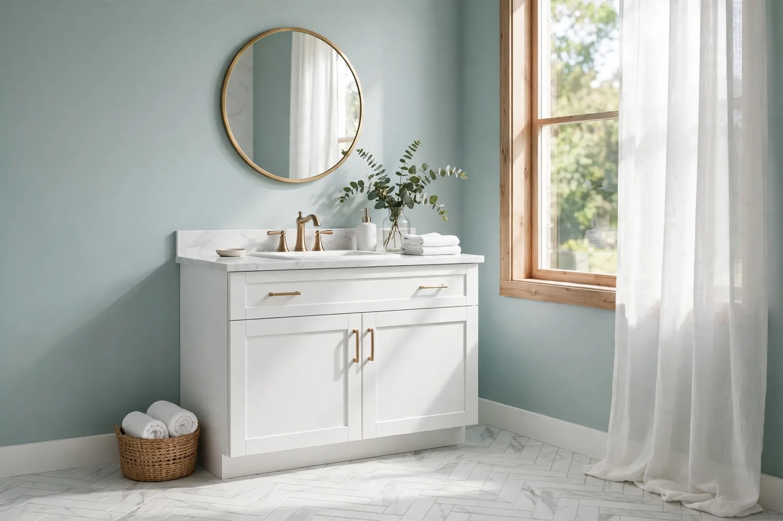
Bathrooms ask more of a paint color than almost any room in the house, and give it less wall to work with. The room is small, steamy, and dominated by tile; the paint has to flatter the tile’s undertone, survive daily humidity, bounce light around a small footprint, and still feel like a place you want to start and end your day. This guide treats bathroom color as the coordination problem it is: five designer-favored color families, each judged on how it behaves against tile, vanity, and fixtures; the tile-undertone rule that prevents the most common bathroom regret; the moisture and sheen decisions that keep the paint looking good for years; and where a powder room gets to break the rules. Colors shift with lighting, surface, and sheen, so always test a large physical sample in your actual bathroom before committing. Sherwin-Williams and Benjamin Moore color names appear as widely-known designer references only; The Global Abode is an independent brand, not affiliated with or endorsed by either company.
The Bathroom’s Three Constraints: Small, Steamy, Tile-Heavy
Every room has constraints, but bathrooms stack three of them at once, and each one narrows the color field.
Constraint one: the room is small. Most bathrooms are the smallest rooms in the house, and color behaves differently in small rooms. Mid-tone colors read deeper than expected; dark colors can feel enclosing rather than dramatic; light colors bounce the limited light around and keep the room feeling intentional rather than cramped. This is why bathrooms skew lighter than the rest of the house, it’s not a lack of courage, it’s physics.
Constraint two: the room is steamy. Daily showers raise humidity, heat the air, and deposit condensation on every surface. Paint film in a bathroom gets cycled through humidity spikes that no bedroom paint ever sees. That means the finish choice (section 5) matters as much as the color choice, and it means some finishes and formulations genuinely fail here while thriving elsewhere.
Constraint three: the room is tile-heavy. In most bathrooms, tile, floor, shower surround, maybe a backsplash, covers more wall area than paint does. Tile is a fixed finish: expensive, permanent, and full of undertone information. The wall color doesn’t get to be the room’s color story; it gets to respond to the tile’s color story. This is the constraint that causes the most bathroom regrets, because it’s the one most often ignored, people choose the wall color first and discover later that it fights the tile it sits next to.
There’s a fourth, subtler constraint worth naming: bathroom light is rarely flattering. Many bathrooms have small windows, frosted glass, or no window at all, and the lighting is often overhead vanity lighting at 3000K–4000K, designed for grooming, not for showing off wall color. Undertones surface aggressively under bright overhead light, and colors that looked soft on the chip can look washed out or, worse, reveal a green or gray cast you didn’t order. Judge bathroom samples in the room’s actual lighting, every light on, door closed, the way you’ll actually see the walls.
The good news: once you accept the three constraints, the decision gets much easier. You’re not choosing from the whole fan deck, you’re choosing from the families that survive smallness, steam, and tile. That’s a short, well-tested list.
The Five Bathroom Color Families Compared
These are the five families designers return to again and again for bathrooms, not because they’re the only options, but because they’re the ones that consistently survive the three constraints. Each is judged on the feel it creates, the tiles and fixtures it flatters, and the caveat to test before committing.
| Family | Best colors | The feel | Watch out for |
|---|---|---|---|
| Soft whites | White Dove (OC-17), Pure White (SW 7005), Alabaster (SW 7008) | Clean, bright, timeless, the room feels larger and the light multiplies | Can go flat or cold under cool overhead lighting; the white must agree with the tile’s undertone or both look wrong |
| Pale blues & blue-greens | Sea Salt (SW 6204), Rainwashed (SW 6211), Palladian Blue (HC-144) | Fresh, spa-like, serene, the classic “bathroom color” for good reason | The chameleons: Sea Salt shifts green-to-blue through the day; test under your actual lighting before committing |
| Soft sage greens | Clary Sage (SW 6178), Retreat (SW 6207), October Mist (1495) | Calm, organic, restorative, nature indoors without the tropical commitment | Can read muddy in dim bathrooms; flatter warm brass and wood vanities, fight cool chrome |
| Warm greiges | Agreeable Gray (SW 7029), Repose Gray (SW 7015), Edgecomb Gray (HC-173) | Soft, enveloping, sophisticated, warmth without color commitment | Go heavier than expected in small, windowless rooms; match to gray or warm tile undertones carefully |
| Soft warm neutrals | Accessible Beige (SW 7036), Canvas Tan (SW 7531), Shoji White (SW 7042) | Cozy, gentle, flattering, the most forgiving light for faces in the mirror | Can read as “tan” in strong sun; test against beige tile so the two don’t merge into one muddy tone |
A few notes on how each family behaves in the actual room:
Soft whites are the default for structural reasons: they bounce the limited light around, they never fight the tile, and they make small rooms feel bigger. White Dove is the warm, soft workhorse; Pure White is the cleaner, more neutral option; Alabaster brings the most warmth. The mistake people make with white bathrooms is assuming any white works with any tile, it doesn’t. A cool-leaning white against warm beige tile, or a warm white against cool gray tile, makes both look slightly off. Match the white’s undertone to the tile’s undertone (section 3) and the combination looks inevitable.
Pale blues and blue-greens are the most-requested bathroom family, and Sea Salt is the name that comes up most, designers and homeowners consistently describe it as the bathroom color, soft enough to live with, fresh enough to notice. But it’s also the most light-reactive: it reads greener in warm light, bluer in cool light, and it shifts through the day. Rainwashed is the steadier, slightly deeper and bluer sibling; Palladian Blue is Benjamin Moore’s answer, a pale blue with a whisper of gray-green that stays calm in most lights. If you want the spa feeling without the shape-shifting, Palladian Blue is the safer pick.
Soft sage greens are the bathroom’s quiet luxury: green is the color psychology pick for restoration and calm, and a muted sage on bathroom walls reads as a deep breath. Clary Sage is the warmest and coziest, flattering wood vanities and brass; Retreat is the balanced middle; October Mist is the lightest and freshest. The bathroom-specific caveat: sages need decent light to show their green. In a dim, windowless bath, a sage can lose its green and read as a murky gray-beige, test it in the room’s actual gloom, not just in daylight.
Warm greiges bring the whole-house-neutral logic into the bathroom: they coordinate effortlessly with the hallway and bedroom palette, and they’re the most forgiving choice when the tile’s undertone is ambiguous. Agreeable Gray is the warm, balanced workhorse; Repose Gray is the slightly cooler, softer option; Edgecomb Gray is the lightest and warmest of the three. The small-room warning is real: greiges are mid-tones, and mid-tones read deeper in small rooms. In a tiny bath, step one notch lighter than your instinct says.
Soft warm neutrals, Accessible Beige and its lighter cousins, are the face-flattering family. Warm, muted walls are the most forgiving light for morning faces, and in a room where you look in the mirror every day, that matters. Accessible Beige is the deeper, cozier option; Shoji White is the lighter, airier one; Canvas Tan sits between them. Pair them with warm tile, wood vanities, and brass, and the bathroom feels like a warm towel. Pair them with cool gray tile and the warmth fights the stone, undertone agreement is everything.
The Tile Rule: Matching the Wall to Your Tile’s Undertone
This is the section that prevents the most common bathroom regret. Tile is the room’s biggest, most permanent color decision, and every tile has an undertone, warm or cool, pink or green or gray, whether you notice it or not. The wall color must agree with that undertone. When it doesn’t, the room looks assembled rather than designed: both the tile and the paint look slightly wrong, and you can’t quite say why.
Gray tile (the most common modern bathroom). Gray tile is rarely neutral, it leans cool-blue-gray, warm-greige-gray, or green-gray, and the lean decides the wall. Cool gray tile (blue-gray veining, concrete-look) wants cool-leaning walls: Repose Gray, pale blue-grays, Pure White, or a soft blue like Rainwashed. Warm gray tile (greige, warm concrete) wants warm-leaning walls: Agreeable Gray, White Dove, Edgecomb Gray. The mistake is pairing a warm white with cool gray tile (the white looks dingy) or a cool gray wall with warm greige tile (the wall looks icy). Stand the sample against the tile in the bathroom’s light, agreement is visible in ten seconds.
White subway tile (the classic). White subway tile looks simple but it isn’t: most subway tile leans slightly cool or slightly warm, and the grout adds its own voice. Cool-leaning subway with bright white grout wants cleaner whites on the wall (Pure White, Simply White) or pale blues; warm-leaning subway with warm grout wants warm whites (White Dove, Alabaster) or soft greiges. The grout matters more than people think, a warm gray grout against a cool white wall is a quiet clash that nags forever.
Beige and travertine tile (the warm traditional bathroom). Beige tile has pink, gold, or green threads, and the wall must agree with the thread, not just the beige. Pink-threaded travertine wants warm, pink-tolerant walls (warm whites, Accessible Beige); gold-threaded stone wants warm golds and creams; green-threaded stone wants the sage family. The worst pairing for beige tile is a cool gray or blue-gray wall, the tile looks dated and the wall looks cold, and both get blamed.
Marble and marble-look tile. White marble carries cool gray veining (sometimes with warm gold threading); the wall should respect the veining. Cool-veined marble wants cool-leaning or neutral walls, Pure White, Repose Gray, pale blue-grays. If the marble has warm gold threading, a warm white wall can work beautifully. The rule: the wall color should come from the veining, not the white ground, the ground is easy; the veining is where clashes hide.
Patterned and colorful tile. If the tile is the star, patterned cement, deep green zellige, a bold mosaic, the wall’s job is to get out of the way. Pull the quietest tone from the tile (the background color, the lightest tone) and use it as the wall color, one or two steps lighter. A statement tile plus a statement wall is two accents fighting in a small room; the tile wins the fight and the wall looks like a mistake.
The floor-to-wall handoff. Don’t forget the floor tile, it’s visible in every sightline. The wall color should relate to the floor’s undertone the same way it relates to the wall tile’s. A bathroom with warm floor tile and a cool wall is a room arguing with itself at ankle level.
Vanities and Fixtures: White, Wood, Navy, Chrome vs. Brass
After tile, the vanity and the fixtures are the bathroom’s fixed voices. They don’t cover as much area as tile, but they sit at eye level, the vanity is what you look at in the mirror’s reflection, and the fixtures are the jewelry. The wall color needs to flatter both.
White vanities are the neutral partner: they work with every family in the table. The wall gets to carry the room’s personality, a soft blue, a sage, a warm greige, while the white vanity stays crisp. The one caution: with white vanities and white walls, match the whites’ undertones or the vanity will look dingy next to the wall (the same white-on-white rule as every other room).
Wood vanities, oak, walnut, warm stained, want warmth echoed on the walls. Warm whites, soft sages, warm greiges: the green-and-wood pairing is a natural one, and a muted sage wall makes a wood vanity look richer and more intentional. Cool blue-grays and crisp cool whites fight warm wood, the wood looks orange by contrast and the wall looks cold. If the vanity is the warmest thing in the room, the wall should meet it at least halfway.
Navy, green, and dark vanities are the bathroom’s color commitment, and the wall must respect it the same way kitchen walls respect dark cabinetry: stay light, stay quiet, stay warm. White Dove or a soft warm white against a navy vanity is the classic combination; a light warm greige works too. The vanity is the room’s moment of color, the wall is its frame.
Chrome and nickel fixtures are cool metals: they want cool-leaning or neutral walls. Pale blues, blue-grays, Repose Gray, Pure White, the cool family. Warm beige walls next to cool chrome is one of the quieter clashes in the bathroom; each is fine alone, and together they look like they came from different renovations.
Brass, gold, and bronze fixtures are warm metals: they want warm-leaning walls. Warm whites, sages, warm greiges, Accessible Beige, the warm family. Brass against a cool blue-gray wall can still work if the wall is muted enough, but the combination needs the undertone bridge: a warm greige that holds both the brass and the blue is the peacemaker.
Black fixtures are the neutral metal: they work with everything, but they raise the contrast. Black fixtures against a soft white wall is crisp and modern; against a deep moody wall (in a powder room) it’s dramatic. The wall choice with black fixtures is about the mood you want, not about undertone diplomacy.
The mirror deserves a mention: it’s the largest reflective surface in the room, and it doubles whatever wall color is opposite it. A strong wall color gets amplified by the mirror; a quiet one gets doubled into calm. If you’re considering anything with real saturation, check the mirror’s reflection before committing, you’re painting twice the wall you think you are.
Moisture, Mold, and the Sheen Decision
Bathroom paint fails differently than other paint: it doesn’t just look tired, it peels, bubbles, and grows things. The sheen and formulation decisions are what stand between a bathroom that looks good for a decade and one that needs repainting in three years.
Satin is the bathroom wall standard. Paint professionals and manufacturers consistently recommend satin for bathroom walls: it has enough sheen to resist moisture and wipe clean, it stands up to scrubbing, and modern mildew-resistant formulations are built around it. Satin is the finish that balances cleanability with a residential look, it doesn’t read as “bathroom paint,” it just reads as paint that works.
Semi-gloss is the upgrade for the wettest zones. The wall inside the shower surround (if painted), the wall directly behind the toilet, the window trim and casings, high-contact, high-splash surfaces earn semi-gloss. It’s the most moisture-resistant and scrubbable standard finish. The trade: semi-gloss shows wall imperfections mercilessly, so the prep has to be good, fill, sand, prime, or every flaw gets a spotlight.
Eggshell is the conditional choice. In a well-ventilated bathroom, a real exhaust fan that actually gets used, a window that opens, a quality eggshell can work on the walls, and it hides imperfections better than satin. In a steamy, fan-less, or heavily used family bathroom, eggshell is asking for trouble: it absorbs more moisture, cleans less well, and fails earlier. When in doubt, satin.
Bath-specific formulas are worth it in hardworking bathrooms. The major brands all make paints formulated for bathrooms, with extra mildew resistance and moisture tolerance built in. In a steamy primary bath, a kids’ bathroom, or any bathroom without a strong exhaust fan, the bath-specific formula is a durability purchase, not a luxury one. It’s the difference between paint that fights the environment and paint that surrenders to it.
Ventilation is part of the paint system. No paint formulation survives a bathroom where steam sits for hours. Run the exhaust fan during every shower and for twenty to thirty minutes after; if there’s no fan, the window is the fan. Squeegee the shower walls. These aren’t paint tips, they’re the conditions paint needs to do its job. The best satin in the world fails in a sealed steam box.
Ceilings: don’t forget them. Bathroom ceilings take the most direct steam, and they’re the surface most often painted in flat by habit. A flat ceiling in a steamy bath is a mildew invitation. Use a bath-specific formula on the ceiling too, in flat or, better for steam, a satin or semi-gloss formulated for bathrooms. The ceiling is the hardest-working painted surface in the room; paint it like it.
Prep is the whole game. Bathroom repaints fail at the prep stage more than the paint stage: existing mildew must be killed (not painted over), glossy old paint must be deglossed or primed, and any peeling must be scraped to sound edges. A mildew-killing primer on previously affected areas isn’t optional, it’s the difference between a repaint that lasts and one that blooms again in a year.
Powder Rooms vs. Full Baths: Where Drama Is Allowed
Everything above describes the full bathroom, the steamy, daily-use, tile-heavy room. The powder room plays by different rules, and it’s where bathroom color gets to have fun.
The powder room is the exception to every constraint. No shower means no steam, the moisture constraint disappears. It’s small, but it’s a visited small: guests see it for two minutes, which means it can carry a color that would be exhausting in a room you live in. Tile is usually minimal, a floor, maybe a small backsplash, so the wall color gets to be the room’s story instead of responding to someone else’s. And the lighting is entirely artificial, which means you control it completely: warm 2700K lighting makes deep colors glow instead of cave.
This is where the dark colors live. Deep greens (Evergreen Fog), navies (Hale Navy), charcoals (Iron Ore, Kendall Charcoal), moody plums and deep teals, the powder room is the one bathroom where a dark, saturated wall is not a risk but a signature. The classic execution: all four walls in the deep color, warm brass fixtures, a white or marble sink, warm lighting. It’s the smallest room in the house and the most memorable, the jewel box.
Wallpaper belongs here too. Powder rooms are the natural home of bathroom wallpaper: no steam to peel it, small walls that make even expensive paper affordable, and a contained space where a bold pattern reads as intentional. If you’ve been saving a pattern you love, the powder room is where it goes.
The full bath stays the course. In the steamy, daily-use bathroom, the families from section 2 are still the answer, light, tile-coordinated, moisture-ready. The place for personality in a full bath is the vanity color, the mirror, the textiles, the art, the changeable things. Walls in a full bath are infrastructure; walls in a powder room are fashion.
The hallway rule. One structural note: the powder room usually opens directly off a hallway or entry, which means its color is seen from the neutral connector spaces. A deep, saturated powder room glimpsed through a doorway from a calm greige hallway is one of the great small moments in a house, the contrast is the point. Just keep the trim white consistent with the rest of the house, so the doorway reads as a frame around the jewel, not a clash.
Coordinating the bathroom with the rest of the house?
The Whole Home Paint Guide is a complete, ready-to-use color system, anchor neutrals, gentle color moments, trim and ceiling pairings, all with undertones already coordinated, so your bathroom color lands in a house designed to hold it. And the Paint Color Workbook includes room-by-room sampling checklists and undertone worksheets for matching walls to tile with confidence.
Frequently asked questions
A soft white (White Dove, Pure White) or a pale blue-green (Sea Salt, Palladian Blue), light colors bounce the limited light around and keep the small room feeling intentional. Keep the trim the same white in a higher sheen so there are no visual stops. Avoid mid-tone greiges in tiny, windowless baths: they read deeper than expected and the room closes in. See how light changes paint color for the full orientation rules.
Only if the white is lonely. An all-white bathroom works when the white has company: texture in the tile, warmth in the fixtures (brass, wood), contrast in the vanity or the mirror frame. The classic white bathroom, white subway tile, warm brass, a wood vanity, a soft white wall, is timeless precisely because the white is the background for everything else. Boring comes from one white with nothing to play against, not from white itself.
In a powder room, absolutely, it’s the ideal home for deep greens, navies, and charcoals, with warm lighting and brass fixtures. In a steamy full bath, dark walls are riskier: they show every water spot, they need excellent ventilation and a scrubbable sheen, and a small dark room can feel enclosing rather than dramatic. If you want the moody full bath, commit fully, dark walls, warm 2700K lighting, and a satin or semi-gloss bath formula, or keep the walls light and put the drama in the vanity.
Match the wall to the tile’s lean: cool gray tile (blue-gray veining) wants cool-leaning walls, Repose Gray, pale blue-grays, Pure White, Rainwashed. Warm gray tile (greige, warm concrete) wants warm-leaning walls, Agreeable Gray, White Dove, Edgecomb Gray. The mistake is crossing the streams: a warm white against cool gray tile looks dingy, and a cool gray wall against warm greige tile looks icy. Hold the sample against the tile in the bathroom’s light, agreement shows in seconds. Our undertones guide explains the matching method.
Warm whites (White Dove, Alabaster), soft warm neutrals (Accessible Beige, Shoji White), or a warm sage (Clary Sage), walls that agree with the stone’s warm thread. Read the thread: pink-threaded travertine wants warm, pink-tolerant walls; gold-threaded stone wants warm creams; green-threaded stone wants the sage family. Avoid cool grays and blue-grays, they make beige tile look dated and the wall look cold. And watch the beige-on-beige trap: near-neighbor beiges clash, so either match the undertone precisely or step clearly away to white, blue, or sage.
Satin is the standard, washable, moisture-resistant, and mildew-resistant, in a bath-specific formula for steamy rooms. Step up to semi-gloss for the wettest zones (shower surround walls, behind the toilet, trim and casings). Eggshell only in well-ventilated bathrooms, never in a steamy or fan-less bath. Never flat on bathroom walls. And paint the ceiling in a bath-appropriate formula too, it’s the hardest-working surface in the room. Our sheen guide covers the full room-by-room system.

