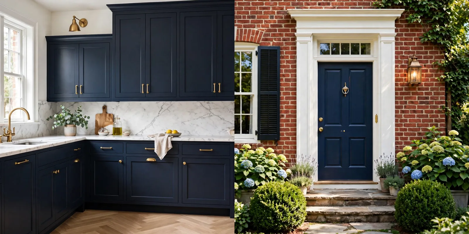
Kitchen cabinets and house exteriors are the two surfaces where a paint color has to work hardest. Cabinets are touched dozens of times a day, scrubbed, splattered, and viewed from inches away. Exteriors are viewed from the street, blasted by sun, and expected to hold their color for a decade. These are not places for impulse color choices. This guide gathers the Benjamin Moore colors designers reach for most often on cabinetry and exteriors, organized into a cabinet shortlist, four detailed deep-dives, an exterior shortlist, the rules that govern how color behaves outdoors, and the sheen and prep decisions that determine whether the job lasts. Two disclaimers before we begin: paint color appearance shifts with lighting, surface, and sheen, so always test a physical sample in place before committing, colors shown on screens are approximations. And The Global Abode is an independent publication, not affiliated with or endorsed by Benjamin Moore.
The short version: For cabinets, the designer shortlist centers on White Dove OC-17 (warm white), Hale Navy HC-154 (deep navy), Kendall Charcoal HC-166 (soft black-charcoal), and Revere Pewter HC-172 (warm greige). For exteriors, start with White Dove or Simply White for bodies and trim, then build around Revere Pewter, Boothbay Gray HC-165, Edgecomb Gray HC-173, or a deep accent like Hale Navy, Kendall Charcoal, or Wrought Iron 2124-10 for doors and shutters. Cabinets want satin or semi-gloss sheen over careful prep; exteriors want a durable satin on the body with one deliberate light-to-dark step deeper than your first instinct, because sunlight washes color out.
Why Cabinets and Exteriors Deserve Their Own Guide
Wall paint forgives. A bedroom wall in the wrong undertone is a weekend repaint. Cabinets and exteriors are not that forgiving. A cabinet color you regret means sanding, priming, and re-spraying every door and drawer front, days of labor and real disruption. An exterior color you regret means scaffolding, crew schedules, and a paint bill that runs into the thousands. The stakes are higher, the light behaves differently, and the durability requirements are stricter.
Cabinets live in artificial light half the day. Under-cabinet LEDs, pendants, and task lighting all shift how a color reads, and cabinets sit next to the hardest-working finishes in the house: stone, stainless steel, and wood floors. A white that looked soft on a wall can turn chalky against marble; a navy that looked moody in a showroom can read flat under warm LEDs. The cabinet shortlist exists because certain colors have been tested, in hundreds of real kitchens, against these conditions.
Exteriors invert the problem. Instead of controlled indoor light, a house body gets raw sunlight, overcast sky, shade from trees, and the reflected color of the roof, brick, and landscaping. Colors read dramatically lighter outdoors than they do indoors, sometimes by a full shade or more, and undertones that seemed invisible on a chip can announce themselves across forty feet of siding. Add the fixed materials you cannot change (the roof, the stone foundation, the neighbor’s house) and exterior color becomes a coordination exercise, not just a preference.
This guide treats the two projects separately because their logic is different. Cabinet color is about precision at close range and durability under touch. Exterior color is about composition from a distance and harmony with fixed materials. What follows is the combined shortlist, the colors that keep showing up in designer work, plus the rules that make them succeed.
The Cabinet Shortlist: Whites, Neutrals, and Deep Colors
Designers do not start from the whole Benjamin Moore fan deck when choosing cabinet colors. They start from a working shortlist of proven performers, grouped by how much color presence they bring into the room. Below are the colors that surface again and again in designer-reported kitchen projects.
The whites
| Color | Code | What it does on cabinets | Best with |
|---|---|---|---|
| White Dove | OC-17 | A soft, warm white that stays gentle rather than stark; never reads sterile | Wood floors, brass hardware, natural stone |
| Simply White | OC-117 | Crisp and bright with just a hint of warmth; reads cleaner than White Dove | Modern kitchens, gray-veined marble, chrome |
| Chantilly Lace | OC-65 | The closest thing to a pure white; cool and precise | All-white kitchens, black hardware, cool countertops |
White Dove is the undisputed workhorse here. Designer Jeanne Barber of Camden Grace Interiors calls it a warm, soft white that works across any kitchen style, noting that its subtle warmth plays nicely with wood floors, brass hardware, and natural stone while its neutrality makes it the perfect backdrop for bolder choices on islands, countertops, and backsplashes. Simply White is the pick when you want more crispness, it bridges warm and cool without committing hard to either. Chantilly Lace is the choice for deliberately cool, gallery-like kitchens where precision is the point.
The neutrals
| Color | Code | What it does on cabinets | Best with |
|---|---|---|---|
| Revere Pewter | HC-172 | Warm greige with a hint of gray-green; depth without darkness | White Dove walls, marble, oil-rubbed bronze |
| Edgecomb Gray | HC-173 | Lighter warm greige; soft and sophisticated, leans beige in warm light | Creamy whites, warm woods, quiet hardware |
| Coventry Gray | HC-169 | Medium cool-warm gray; reads as a true mid-tone neutral | White trim, navy accents, stainless steel |
Revere Pewter is the neutral that refuses to date. It has enough depth to stand up to white walls and enough warmth to avoid the flat, muddy grays of the cool-gray era. Edgecomb Gray is its lighter sibling, excellent for kitchens where you want the warmth of a greige but need the room to stay bright. Coventry Gray sits a step deeper and cooler, and it crosses over beautifully to exteriors, which we will get to shortly.
The deep colors
| Color | Code | What it does on cabinets | Best with |
|---|---|---|---|
| Hale Navy | HC-154 | Deep maritime navy with charcoal grounding; architectural, not trendy | White Dove uppers, natural stone, warm metals |
| Kendall Charcoal | HC-166 | Rich warm charcoal; dramatic but softer than black | Brass or nickel hardware, light countertops |
| Narragansett Green | HC-157 | Deep green with gray undertones; historic and grounded | White uppers, butcher block, aged brass |
| Cheating Heart | 1617 | Near-black with blue-black depth; the boldest choice here | Warm white walls, honed stone, statement lighting |
| Wrought Iron | 2124-10 | Soft black with gray warmth; crisp without harshness | Shaker cabinetry, marble, polished nickel |
Deep cabinet colors work best as accents, the island, the pantry wall, the lower cabinets, with lighter uppers or walls to balance them. They also shine in smaller doses: a wet bar, a butler’s pantry, or a powder room vanity. The rule of thumb: the darker the color, the more important the lighting plan becomes. Deep colors reveal every imperfection in the finish, so they demand the best prep of any choice on this list.
Cabinet Deep Dives: The Four Most-Chosen Colors
Four colors account for a remarkable share of designer cabinet work: White Dove, Hale Navy, Kendall Charcoal, and Revere Pewter. Here is why each one earned its place, and how to get each one right.
White Dove OC-17: the warm white standard
White Dove is warm without being creamy, soft without being yellow. That balance is why it survives in both traditional and modern kitchens. It reads as clean white from across the room and reveals its warmth only when you look closely, which means it coordinates with warm wood floors and honey-toned stone without fighting cooler elements like stainless steel. Pair it with Simply White trim for a subtle layered-white look, or let it stand alone on perimeter cabinets with a deeper island color. Because it is one of the most sampled whites, note that its warmth deepens slightly in low-sheen cabinet finishes, so test in satin or semi-gloss on an actual door sample.
Hale Navy HC-154: the deep navy classic
Hale Navy is what designers call “a classic for a reason.” Designer Sara Swabb of Storie Collective points out that it has real depth without feeling heavy, which makes it feel architectural rather than trendy, and that it plays beautifully with natural stone, warm metals, and both light and dark woods, without falling apart as the light changes throughout the day. That last quality matters enormously in kitchens, which are used from morning coffee through evening cleanup. Use Hale Navy on the island with White Dove perimeter cabinets for the most forgiving version of the two-tone look, or go all-in on full navy cabinetry in a kitchen with strong natural light and light countertops.
Kendall Charcoal HC-166: the soft near-black
Kendall Charcoal is what you reach for when black feels too stark but gray feels too timid. It is a deep, warm charcoal with enough saturation to read as a true dark color and enough warmth to sit comfortably next to wood tones and brass. On islands it creates a furniture-like anchor; on full cabinet runs it gives a kitchen the confidence of a tailored suit. It pairs exceptionally well with honed marble, the light countertop against the dark base is one of the most reliable high-end contrasts available. Because it is deep, it benefits from a slightly higher sheen (semi-gloss) to keep it from reading flat in dim light.
Revere Pewter HC-172: the greige that works everywhere
Revere Pewter is the neutral you choose when white feels too bright and a deep color feels like too much commitment. Its warm gray-green character gives it depth that flat grays lack, and it shifts subtly through the day, cooler in morning light, warmer in the evening, which keeps it interesting rather than boring. It works as a full-kitchen color in rooms with decent natural light, and it is one of the few neutrals that also performs on exteriors, pairing with white trim and a navy or near-black front door. If you are choosing between Edgecomb Gray and Revere Pewter, Edgecomb is the safer choice for darker kitchens; Revere is the richer choice for brighter ones.
Designer tip: The two-tone kitchen, light perimeter cabinets with a dark island, or light uppers with dark lowers, is the safest way to use a deep color. You get the drama where it matters (the island is the visual anchor of most kitchens) while the room’s overall light level stays high. Hale Navy or Kendall Charcoal on the island with White Dove perimeters is a combination that rarely fails.
The Exterior Shortlist: Body, Trim, and Door Colors
Exterior color is a three-part composition: the body (the largest surface), the trim (the architectural detail), and the door or shutters (the accent). The most common mistake is choosing these three in isolation. Choose them as a set, and anchor the whole set to the fixed materials, roof, brick, stone, that you cannot change.
| Role | Color | Code | Notes |
|---|---|---|---|
| Body, off-white | White Dove | OC-17 | The safe classic; warm enough to avoid the clinical look in full sun |
| Body, bright white | Simply White | OC-117 | For modern farmhouse and contemporary exteriors; pair with matching trim |
| Body, warm greige | Edgecomb Gray | HC-173 | Appears lighter outdoors; pairs with white trim and blue or teal accents |
| Body, mid greige | Revere Pewter | HC-172 | Versatile with white or dark trim; works with many accent colors |
| Body, gray | Boothbay Gray | HC-165 | Soft gray-blue body; pair with Simply White trim and navy door |
| Body, gray | Stonington Gray | HC-170 | Cooler gray; best with cool trim and a contrasting dark accent |
| Body, gray | Coventry Gray | HC-169 | A Benjamin Moore staple for curb appeal; balanced and timeless |
| Body, green | Louisburg Green | HC-113 | Medium green with gray undertones; pairs with light gray and off-white |
| Trim, warm | White Dove | OC-17 | Matches warm bodies; never looks harsh |
| Trim, clean | Simply White / Chantilly Lace | OC-117 / OC-65 | For cool bodies and modern exteriors |
| Door / shutter accent | Hale Navy | HC-154 | The classic front-door and shutter color against whites and grays |
| Door / shutter accent | Wrought Iron | 2124-10 | Soft near-black; elegant on doors, shutters, and trim details |
| Door / shutter accent | Black Forest Green | HC-187 | Deep green with presence; stately on doors against warm whites |
| Door / shutter accent | Kendall Charcoal | HC-166 | Grounds the composition; pairs with warm bodies and bronze hardware |
A note on Benjamin Moore’s own guidance: the brand lists neutrals like Copley Gray, Coventry Gray, and Revere Pewter, plus Louisburg Green, among its most popular exterior colors, and recommends combinations like Revere Pewter with Swiss Coffee trim for curb appeal. That aligns with what designers actually specify: mid-tone bodies, warm or clean white trim, and a single confident accent.
Exterior Rules: Light, Roof, Brick, and Why Exteriors Read Lighter
There are four rules that govern every exterior color decision. Learn them once and every house becomes easier to paint.
Rule one: exteriors read lighter. The same color that looks like a rich mid-tone on an interior wall can read a full shade lighter on a sunlit exterior. Full sun bleaches color; overcast sky grays it out. The practical consequence: choose your body color one deliberate step deeper than your first instinct. If you love a light greige on the chip, sample the next-deeper option on the siding before deciding. Colors like Edgecomb Gray appear noticeably lighter when painted on exteriors, this is not a flaw, it is physics.
Rule two: the roof and brick vote. Your exterior palette is not just three colors, it is three colors plus the roof, plus any brick or stone, plus the driveway and landscaping. A brown roof pulls every body color warmer; a charcoal roof pulls everything cooler. Brick with orange undertones will fight a cool gray body but flatter a warm greige. Before choosing anything, photograph the house in midday light and identify the undertones of the fixed materials. Then build the palette around them instead of against them.
Rule three: match trim temperature to body temperature. Warm body colors (White Dove, Edgecomb Gray, Revere Pewter) want warm whites on trim, White Dove or similar. Cool body colors (Stonington Gray, Simply White exteriors) can take cleaner whites like Simply White or Chantilly Lace. Putting a stark cool trim against a warm body makes the body look unintentionally yellow; putting a creamy trim against a cool body muddies the coolness. This single decision does more for an exterior’s cohesion than almost any other.
Rule four: light exposure is not uniform. The north side of a house gets cool, indirect light that deepens and grays colors. The south side gets warm, direct sun that lightens and warms them. The same paint will look like two different colors on different elevations, expect it, and sample on at least three exposures (sun-facing, shaded, and street-facing) before committing. View the samples at different times of day and photograph them from the street, because that is how the house will actually be seen.
Warning: Never finalize an exterior color from a chip indoors or from a screen. Paint large swatches, several square feet, directly on the siding or on large plywood panels held against the house, on at least three different exposures. Colors shift dramatically with sun, shade, and surrounding materials, and a repaint caused by a skipped sampling step is the most expensive color mistake in home improvement.
Sheen and Prep: The Durability Half
Color gets the attention; sheen and prep do the work. On cabinets and exteriors, the wrong finish will fail before the color ever gets a chance to disappoint you. This is the half of the project that determines whether the job looks good in year five, not just month one.
Cabinets: satin or semi-gloss, over meticulous prep
Cabinets need a finish that can be wiped down repeatedly without burnishing and that resists the moisture, grease, and hand oils of a kitchen. Satin and semi-gloss are the standard choices: satin for a softer, more current look, semi-gloss for maximum scrubbability and a touch more depth on dark colors. Benjamin Moore’s Advance line, a waterborne alkyd, is the cabinet painter’s go-to for its hard, furniture-like cure and smooth flow, though it needs generous drying time between coats.
Prep is non-negotiable on cabinets, and it is where most DIY jobs fail. The sequence: remove doors and hardware, degrease thoroughly (kitchen cabinets carry years of airborne grease), scuff-sand, prime with a bonding primer, sand again lightly, then apply two finish coats with adequate cure time. Skipping the degrease step is the single most common cause of peeling cabinet paint. Deep colors show every brush mark and imperfection, so spraying gives the best result on them; rolling is acceptable for whites and light neutrals if you use a high-quality finish roller and keep a wet edge.
Exteriors: satin on the body, semi-gloss on trim and doors
On the body, a low-lustre or satin finish is the standard: it sheds water, resists dirt pickup, and hides siding imperfections better than glossier finishes. Flat finishes hide the most but are harder to clean and less durable in weather, so they are best reserved for surfaces that never get touched. Trim and front doors take semi-gloss, which highlights architectural detail and stands up to handling. Use exterior-formulated paints, interior paints lack the binders, UV stabilizers, and mildewcides that exterior exposure demands, and interior colors should always be tested outdoors because exterior light changes how pigments read.
Exterior prep follows the same logic as cabinets but at house scale: pressure wash, scrape and sand failing paint, repair and caulk gaps, and prime bare wood before the finish coats. Dark exterior colors are more vulnerable to UV fading, so they benefit from high-quality exterior primer and a paint with strong UV resistance. A dark front door in full southern sun will fade faster than the same color in a shaded entry, factor exposure into the color choice itself.
Designer tip: Budget the same care for sampling exteriors as for cabinets. Buy sample pots of your top three body colors, paint large panels, and live with them on the house for several days across different weather. The few extra dollars and days are trivial next to the cost of repainting a whole exterior, and the street view, not the close-up, is the verdict that matters.
Frequently Asked Questions
The questions below come up in nearly every cabinet and exterior consultation. The answers are short because the guidance above already did the heavy lifting.
White Dove OC-17 is the most widely recommended choice: a warm, soft white that works across kitchen styles, flatters wood floors and natural stone, and never reads sterile. Choose Simply White OC-117 if you want a crisper, slightly cooler white, or Chantilly Lace OC-65 for the closest thing to a pure white in a deliberately cool kitchen.
Yes, with conditions. Dark colors like Hale Navy or Kendall Charcoal work best on the island or lower cabinets, balanced with light uppers, light countertops, and strong lighting. Deep colors also reveal every finish flaw, so they need the most careful prep and application of any choice. Avoid all-dark cabinetry in a small, low-light kitchen unless you are deliberately going for a moody, enclosed feel.
Many Benjamin Moore neutrals, Revere Pewter, Edgecomb Gray, White Dove, cross over successfully, but always test the color outdoors first. Exterior light and exposure change how pigments read, colors appear lighter in full sun, and exterior formulations have different binders and weather resistance than interior paints. Sample on the actual siding on multiple exposures before committing.
It depends on climate, exposure, surface material, and paint quality, but a well-prepped, high-quality exterior paint job typically holds for many years before needing a refresh. South- and west-facing elevations fade and weather faster than shaded sides, and dark colors in full sun fade fastest of all. Proper prep, washing, scraping, caulking, and priming bare wood, is the biggest factor in longevity, more than the color choice itself.
Paint large swatches, several square feet each, directly on the siding or on large panels held against the house, on at least three different sun-facing and shaded walls. View them at different times of day and in different weather, and photograph them from the street, since that is how the house will actually be seen. Sample your trim and accent colors alongside the body color so you can judge the full composition.
Both work; the choice is about effect. Using the same white (for example, White Dove on both cabinets and trim) creates a seamless, calm envelope. Using a slightly crisper trim white against White Dove cabinets, or Chantilly Lace trim against warmer cabinets, defines edges and architectural detail. Just keep the trim’s temperature consistent with the body or cabinet color so one does not make the other look yellow or gray by accident.
Plan Your Whole-Home Color System
Cabinet and exterior colors should not be chosen in isolation, they are chapters in your home’s full color story. Our Modern Farmhouse Whole-Home Paint System maps every surface, from cabinets to siding, into one cohesive palette.

