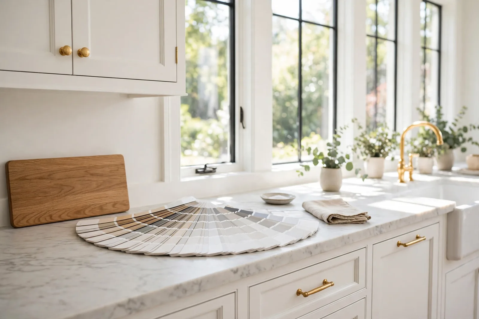
Every few years, a paint color gets crowned by a big brand’s Color of the Year program, and then quietly fades into the fan deck. Simply White didn’t fade. A decade after Benjamin Moore named Simply White (OC-117) its 2016 Color of the Year, it’s still one of the most requested whites in designer work, and for an unusual reason: it’s the brightest white in the Off White collection, yet it never reads cold. A whisper of yellow undertone keeps it warm; near-maximum light reflectance keeps it crisp. That combination sounds like it should be impossible, bright and warm is a contradiction most whites can’t hold, and it’s exactly why this color deserves a complete guide of its own.
Why Simply White still has a cult following
White paint is supposed to be simple. It’s not, as anyone who has stood in front of forty nearly identical swatches knows. Whites split into tribes, creamy, crisp, stark, warm, and most homeowners arrive at the white decision exhausted, after the big colors have already drained their attention. That’s the context in which Simply White built its reputation: it became the white for people who want one answer that behaves.
Its résumé is part of the story. When Benjamin Moore named it Color of the Year for 2016, the brand positioned it as the definitive white of the moment, and the design world, which usually treats Color of the Year picks as a passing headline, kept using it long after the year ended. Today it turns up in designer portfolio after designer portfolio: on trim through entire houses, on kitchen cabinetry, on exteriors, on built-ins. Bloggers who used it for a decade report that it survived renovations, style changes, and whole-room repaints without anyone asking to change it. A white that homeowners live with happily for ten years is a white with something structurally right about it.
What’s structurally right is the tension it holds. Most whites sit cleanly on one side of the warmth line: creamy warm whites read yellow in bright sun, and crisp cool whites read icy in dim rooms. Simply White sits on the line, bright enough to read as genuinely white, warm enough to never read sterile. Designers describe it as fresh and uplifting without the starkness of a pure white, and that “without the starkness” clause is doing most of the work. Stark whites are unforgiving: they expose every wall imperfection, flatten texture, and turn dim corners clinical. Simply White’s faint warmth forgives all of that, a little, which is exactly what a lived-in house needs.
It’s also unusually adaptable across styles. The same white works in a modern farmhouse, a traditional colonial, and a minimalist kitchen, not because it’s bland, but because its warmth is so slight that the architecture and furnishings do the styling, not the paint. That’s the real reason for the cult following: it’s a white that stays out of the way while making everything else look good.
Undertone anatomy: the yellow whisper
Here’s the entire personality of Simply White in one sentence: it’s a bright white with a faint yellow undertone that you mostly can’t see, until the light changes and then you can.
The yellow is real but quiet. Designers consistently describe it as a “whisper” or “hint”, enough to warm the color and keep it from going sterile, not enough to read as cream or off-white in balanced light. Hold Simply White against a sheet of true white paper and the undertone announces itself: the color goes gently warm next to pure white, where a neutral white like Chantilly Lace barely moves. That paper test is the fastest way to feel the difference, and it’s worth doing before you read another word.
What makes the yellow interesting is that it’s light-dependent, it doesn’t behave the same way in every room:
In bright, balanced daylight, the undertone recedes almost completely. The color reads as a clean, crisp white, bright, fresh, and close to neutral. This is the Simply White most people fell in love with, and it’s why the color photographs so well in sun-filled rooms.
In dim rooms or under artificial light, the yellow comes forward. Without strong daylight to balance it, the warmth becomes more visible, designers report it reading gently creamy in hallways, basements, and evening lamplight. This is not a flaw; it’s the undertone doing its job. A bright white with zero undertone goes icy in dim light. Simply White’s yellow keeps it friendly instead.
Under warm bulbs (2700K), the warmth amplifies noticeably. Warm lighting plus a warm-leaning white stacks warmth on warmth, and the yellow can read stronger than you’d expect. If you’re sensitive to yellow, this is the combination to watch, moving to a slightly more neutral bulb (3000K) often calms it without changing the color at all.
Next to cooler colors, the undertone sharpens by contrast. Put Simply White trim against a light blue-gray or cool gray wall and the yellow leans out a little, the eye reads warmth comparatively, and a cool neighbor makes any white look warmer than it is. This is the most common “my white looks yellow” complaint, and it’s almost always a pairing effect rather than a color problem.
The practical upshot: Simply White is not one fixed color; it has a range. Bright-room crisp to dim-room creamy is the spectrum, and your house’s lighting decides where on it you live. None of the range is bad, but the version you fall in love with in a south-facing kitchen may not be the version that shows up in a north-facing hallway, so test both.
The big three comparisons: White Dove, Chantilly Lace, Swiss Coffee
Simply White is almost never chosen in isolation, it’s chosen against the other famous whites. Here are the three comparisons that actually happen in real houses, settled.
Simply White vs. White Dove (OC-17)
This is the most common duel, and the answer is simpler than the internet makes it sound. Simply White is brighter and more neutral; White Dove is softer, warmer, and creamier. White Dove carries a greige-tinged warmth that makes it read as distinctly soft on the wall, designers call it cozy and enveloping, the white that made a thousand farmhouse trim systems famous. Simply White has less color in it: it reads fresher, cleaner, and more modern, with a brightness White Dove doesn’t attempt.
When to choose which: pick White Dove when you want warmth to be felt, traditional rooms, dim spaces, farmhouse trim systems, anywhere “cozy” is the goal. Pick Simply White when you want brightness to be felt, kitchens, modern spaces, rooms that need to read crisp rather than soft. Against each other on the wall, the difference is unmistakable: White Dove looks like a warm white, Simply White looks like white that happens to be warm.
Simply White vs. Chantilly Lace (OC-65)
Now the other direction. Chantilly Lace is the purest, most neutral white of the three, Benjamin Moore’s closest thing to a true white, with almost no discernible undertone. Simply White is warmer and slightly softer by comparison; Chantilly Lace is cooler, crisper, and more reflective.
When to choose which: pick Chantilly Lace for true modern and minimalist spaces, gallery-white rooms, and anywhere you want maximum brightness and zero warmth, but only in rooms with genuinely good light, because it can read icy in dim north rooms. Pick Simply White when you want Chantilly Lace’s brightness without the sterility risk, the yellow whisper is insurance against coldness, which is why it’s the safer choice for whole-house trim and for homes with mixed lighting.
One nuance worth knowing: in very bright rooms the two can look almost identical, the difference emerges in dimmer conditions, where Chantilly Lace goes cooler and Simply White goes warmer. Judge them in your dimmest room, not your brightest.
Simply White vs. Swiss Coffee (OC-45)
Swiss Coffee is the creamier, more traditional sibling, noticeably warmer and deeper than Simply White, with a golden undertone that designers describe as enveloping. It goes more golden in strong sun and reads as a true “warm white” on the wall, where Simply White still reads as white.
When to choose which: pick Swiss Coffee for traditional kitchens, cozy bedrooms, and rooms where you want the warmth to be a feature rather than an insurance policy. Pick Simply White when Swiss Coffee feels too creamy, which it will in bright rooms and modern schemes. These two are far enough apart that the choice is usually obvious once samples are on the wall.
| White | Brightness | Warmth | Undertone | Best for |
|---|---|---|---|---|
| Simply White (OC-117) | Very high, brightest of the group | Gentle, light-dependent | Faint yellow whisper | Trim, cabinets, kitchens, whole-house white needing brightness + warmth |
| White Dove (OC-17) | High, softer | Noticeable, stable | Warm with a greige touch | Traditional rooms, dim spaces, farmhouse trim, cozy walls |
| Chantilly Lace (OC-65) | Very high, the crispest | Minimal | Near-neutral | Modern/minimalist spaces, bright rooms, gallery-white looks |
| Swiss Coffee (OC-45) | Moderate | Pronounced | Golden-cream | Traditional kitchens, bedrooms, anywhere warmth is the feature |
How light transforms Simply White, direction by direction
The undertone is light-dependent, so the room’s exposure is a genuine decision input. Here’s what designers report, direction by direction.
North-facing rooms are Simply White’s quiet triumph. North light is cool and indirect, it makes crisp neutral whites read icy and blue. Simply White’s yellow whisper is exactly the counterweight: it absorbs the cool cast and reads as clean and friendly instead of cold. Designers consistently reach for it in north rooms when Chantilly Lace would go sterile. The caveat: in a very dim north room, the yellow can become the most visible thing about the color, test it there before committing.
South-facing rooms are where Simply White is at its brightest and most neutral. Generous warm sun balances the yellow undertone, and the color reads as the crisp, clean white from the brochure. Watch one thing: in intense afternoon sun, the brightness can verge on glaring, pair it with enough texture and mid-tone furnishings to give the eye somewhere to rest.
East rooms give you both personalities in one day: warm and glowing in the morning sun, cooler and more composed by afternoon. Simply White handles the swing gracefully, the morning light activates the warmth, the afternoon light quiets it. It’s one of the reasons designers trust it in bedrooms, which are so often east-facing.
West rooms demand the most care. Golden evening sun amplifies every warm undertone, and Simply White’s yellow is no exception, in a west-facing room at sunset, it can read noticeably warmer than it does at noon. If your west rooms are your evening living spaces, test the color at 6pm, not at noon, and decide whether you love the golden version.
Artificial light is where most Simply White surprises actually happen, because people test in daylight and live in lamplight. Warm 2700K bulbs push the yellow forward, sometimes charmingly (cozy evening rooms), sometimes too far (kitchens where you want crispness). Neutral 3000K bulbs are the sweet spot for most homes: they keep the warmth without amplifying it. Cool 4000K+ bulbs, rare in homes, sharpen the color toward neutral and can make it feel flat.
Where designers actually use it: trim, cabinets, kitchens, exteriors, walls
Simply White’s résumé is unusually broad. Here’s where it earns its keep, and the reasoning for each.
Whole-house trim and doors. This is the classic Simply White deployment, trim, baseboards, casings, and interior doors through the entire house in one consistent white. The logic is structural: trim is the frame every wall color is judged against, and a bright-but-warm white flatters both warm and cool wall colors without fighting either. Designers who run one trim white house-wide reach for Simply White when they want brightness with insurance, the yellow whisper keeps it from reading cold against warm walls, while the high brightness keeps it crisp against deep ones.
Kitchen cabinets. Cabinets are where brightness matters most and where the undertone does its best work. Simply White cabinets read clean and fresh, the look most kitchen renovations are chasing, while the faint warmth keeps them from the sterile, laboratory feeling that true-neutral whites can produce under kitchen lighting. It pairs naturally with warm wood islands, brass hardware, and marble or quartz counters alike.
Kitchens as a whole (walls + cabinets). The all-Simply-White kitchen is a designer staple: walls, cabinets, and trim in the same white, with contrast coming from hardware, wood, and stone rather than paint. It works because the color’s brightness bounces light around a hardworking room, and its warmth keeps the all-white scheme from feeling clinical.
Built-ins and millwork. Bookshelves, wainscoting, window seats, anywhere painted woodwork is the feature, Simply White gives it a crisp, polished read while staying warm enough to feel like furniture rather than plastic.
Exteriors. On siding and trim, Simply White reads as a bright, clean white that doesn’t go blue in daylight the way cooler whites can. Its warmth is an asset outdoors, it keeps the house from looking stark against the landscape. Test it against your roof and stone, though: a warm white next to a cool gray roof can read creamy by comparison.
Walls. Yes, but with a condition: Simply White walls are at their best in rooms with genuinely good light. In bright rooms it’s luminous and fresh. In dim rooms it can read a little flat or characterless, designers note that on walls, without the architectural interest of trim or cabinets, the color sometimes needs the room to do more of the work. If your walls are dim, White Dove or a softer white may serve you better; if they’re bright, Simply White is superb.
Ceilings. A bright warm white is exactly what most ceilings want, it disappears overhead while bouncing light down, and the faint warmth keeps it from the cold “lid” feeling of stark whites. Simply White on ceilings with slightly deeper wall colors is a combination designers use constantly.
Trim and ceiling pairings, plus the 48-hour test
Simply White plays two roles, the trim white and the wall white, and the pairing rules differ for each.
When Simply White is the trim: it pairs with almost any wall color, which is the point of a universal trim white. The pairings to think about are the close ones: Simply White trim against White Dove walls gives you gentle, warm contrast, the classic layered-white look. Against Chantilly Lace walls, the trim reads slightly warmer and softer than the walls, which some designers love (it takes the edge off) and some avoid (it can read as “the trim is dirty” if the contrast is too subtle, make the difference deliberate). Against colored walls, greiges, blues, greens, it simply works, which is why it’s the default.
When Simply White is the wall: the trim should be brighter and cleaner, or the same color. Simply White walls with Simply White trim (same color, trim in semi-gloss) is the seamless choice, one color, two sheens, subtle architectural definition. For contrast, a crisper neutral white on the trim sharpens the look; a warmer cream on the trim softens it. The rule from every white guide applies: keep wall and trim in the same temperature family, and make any difference between them obvious enough to look intentional.
Ceilings: Simply White on the ceiling with Simply White trim is the standard whole-house system, consistent, bright, done. In rooms with colored walls, it keeps the ceiling feeling high and light without introducing a second white to coordinate.
Sheen matters more than people expect. Simply White in flat on walls reads soft and chalky-elegant; in eggshell it gains a gentle glow; in semi-gloss on trim it’s crisp and wipeable. And sheen shifts the color slightly, glossier reads a touch deeper and more saturated. Test the actual sheen you plan to buy, not just the color.
Then the test that settles it, the 48-hour method, Simply White edition:
1. Paint large boards (at least 2×2 feet), two coats, in your actual sheen. Small swatches can’t show you how a bright white behaves at scale.
2. Place the boards against your real fixed finishes, floors, counters, existing trim, and against your shortlisted wall colors if Simply White is the trim candidate.
3. Check at four moments: morning, midday, late afternoon, and under your evening lamps. The evening check is the one that matters most for this color.
4. Photograph the boards from across the room. Cameras exaggerate undertones, the yellow whisper your eyes adapt to will jump out in a photo, which tells you what guests will notice before they adapt.
5. If you’re choosing between Simply White and a finalist, test them side by side on the same board. The comparison reveals differences that isolation hides.
For the full protocol, our guide to testing paint samples walks through every step.
Choosing between finalists? Work through it methodically.
The Paint Color Workbook includes side-by-side white comparison worksheets, undertone-testing pages, and a room-by-room sampling checklist, so the decision between Simply White, White Dove, and Chantilly Lace happens with evidence in your own light, not in the paint aisle. And the Whole Home Paint Guide gives you a complete color system, every room mapped, trim and ceiling pairings included, so the whole house stays coordinated.
Frequently asked questions
Warm, it carries a faint yellow undertone that keeps it from reading sterile. But it’s the mildest kind of warm: in bright daylight it reads as a clean, crisp white, and the warmth only becomes noticeable in dim rooms or under warm artificial light. Think of it as a bright white with warm insurance, not a warm white per se.
Three usual causes: dim lighting (without strong daylight, the yellow undertone becomes more visible), warm 2700K bulbs (they amplify it, try 3000K neutral bulbs), or contrast (next to a cooler white or cool-colored wall, any warm white looks more yellow by comparison). Check bulbs and neighboring colors before blaming the paint, the fix is usually environmental, not a repaint.
For brightness and crispness, Simply White; for softness and warmth, White Dove. Simply White trim reads cleaner and more modern, and its brightness makes it the better universal trim white across varied wall colors. White Dove trim reads cozier and more traditional, and it’s more forgiving in dim rooms. If your house has mixed lighting and you want one trim white everywhere, Simply White is the safer default.
Yes, it’s one of the most common whole-house deployments. Use the same color in different sheens (eggshell or flat on walls, semi-gloss on trim) for subtle definition, or pair Simply White walls with a crisper neutral white trim for contrast. Avoid pairing it with a trim white that’s only microscopically different, near-identical whites read as a matching mistake.
It’s one of the better whites for north rooms. Cool, indirect north light makes neutral whites read icy, Simply White’s faint yellow undertone absorbs that cool cast and keeps the room feeling clean rather than cold. Just test it in your dimmest north room first, since very low light can make the yellow more visible than you’d like. See how light changes paint color for the full orientation guide.
Simply White is warmer and more forgiving; Chantilly Lace is purer, cooler, and crisper. Simply White’s faint yellow undertone keeps it from ever reading sterile, which makes it safer in dim rooms and mixed lighting. Chantilly Lace’s near-neutral character makes it the choice for true modern and minimalist spaces, but it demands good light. Our five-white comparison puts all the contenders on one spectrum.

