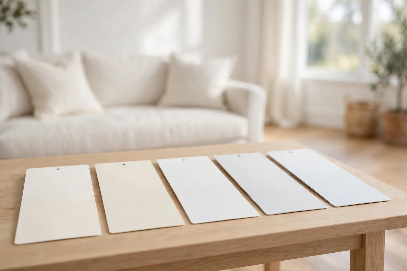
Type “best white paint color” into any search box and you’ll drown in pairwise battles: Alabaster vs. White Dove, Pure White vs. Alabaster, Simply White vs. everything. Every comparison is honest, and none of them helps, because no two whites exist in a vacuum. What you need isn’t another head-to-head. It’s the full spectrum: the five most-chosen whites in American homes, ranked warm to cool, with a framework that picks your winner from your light, your finishes, and your trim.
Why five whites beat another two-way battle
Here’s the structural problem with the white-paint internet: it’s built from duels. Alabaster vs. White Dove. Pure White vs. Alabaster. Simply White vs. Chantilly Lace. Each article picks two fighters, declares a winner for “warmth” or “crispness,” and leaves you exactly where you started, because the question was never “which of these two is better.” The question is “which of the entire field belongs in my house.”
Whites don’t have independent personalities the way colors do. A white is defined by its relationship to other whites: it is warmer than, cooler than, deeper than. Remove the neighbors and the description collapses. That’s why designers don’t compare two whites, they line up five, six, ten of them against white paper and watch the undertones announce themselves. The spectrum is the information. The pair is a parlor game.
So this guide does what the duels can’t: it puts the five whites that show up most often in real designer work, Sherwin-Williams Alabaster, Benjamin Moore White Dove, Sherwin-Williams Pure White, Benjamin Moore Simply White, and Benjamin Moore Chantilly Lace, on a single warm-to-cool spectrum, then gives you the decision framework that places you on it. You’ll learn each white’s character, undertone family, light behavior, finish pairings, trim partner, and the room it wins in. Then three questions narrow the field to one.
The warm-to-cool spectrum: all five, ranked
Designers who consult on thousands of rooms (Kylie M Interiors reports 12,000+ consults and counting) consistently describe these five whites as sitting in a recognizable order, and that order matters more than any individual review. When you see the whole spectrum at once, you stop asking “which white is best” and start asking “how warm or cool do I need to be,” which is the question that actually has an answer.
Warmest to coolest, as designers report it:
1. Alabaster (Sherwin-Williams), the warmest of the five. Creamy, soft, beige-tinged. The farmhouse icon.
2. White Dove (Benjamin Moore), warm, but with a gray undertone that reins in the cream. The designer’s “works everywhere” default.
3. Pure White (Sherwin-Williams), the neutral middle. Crisp without being stark, warm without being creamy.
4. Simply White (Benjamin Moore), brighter and lighter than the middle, but with a hidden warm lean that surprises people.
5. Chantilly Lace (Benjamin Moore), the crispest of the five. The closest to reading as genuinely white on the wall.
Two counterintuitive facts that trip people up. First: Pure White is warmer than White Dove, despite what the names suggest, designers consistently flag this, because “pure” sounds like it should be the cooler one. Second: Simply White is not a simple white, it’s brighter than you’d expect and carries more yellow than its name implies, which is why it’s also the most commonly regretted pick on this list when chosen without testing. Both facts are only visible on the spectrum. In isolation, the names lie.
The warm end: Alabaster and White Dove
These two are the most compared whites in existence, and the comparison has a simple answer: they’re closer to each other than to anything else on this list, and the differences between them are subtler than the internet makes them sound.
Alabaster, the warm classic
Character: warm, creamy, soft, the white that made modern farmhouse famous. Designers describe it as sitting right on the line between true white and off-white, which is exactly its appeal: it reads as white in bright rooms and as a gentle cream in dim ones.
Undertone family: warm, beige and soft yellow, grounded by a neutral gray base that keeps the yellow from taking over. That gray base is the technical reason Alabaster rarely looks yellow; it looks creamy, which is a different and safer thing.
Light behavior: forgiving in low and north-facing light, where it stays fresh instead of going flat. In bright south-facing sun it holds its character well, designers report it reads clean and soft rather than washed out, but in warm evening sun the cream deepens, so test it at sunset if your rooms run west.
Fixed finishes it suits: warm oak floors, older granite countertops, brass and oil-rubbed bronze hardware, Tuscan and traditional cabinetry, exposed beams. This is the white for houses with warm bones, it agrees with everything warm instead of fighting it.
Trim pairing: Alabaster works as both wall and trim color, designers often use it for the whole trim system in warm homes. If you want the trim to pop slightly, a crisper neutral white (Pure White territory) one step brighter works, but keep it in the same warm-neutral family.
The room it wins: the whole main floor of a farmhouse, transitional, or traditional home, anywhere warmth is the goal and the finishes are warm. It’s also a designer favorite for exteriors in shade, where brighter whites can look stark.
White Dove, the designer’s default
Character: warm, but quieter and more muted than Alabaster. If Alabaster is a cozy sweater, White Dove is a well-cut blazer, same warmth, more restraint. Designers consistently call it the most versatile white in the Benjamin Moore lineup.
Undertone family: warm with a gray undertone that keeps it from going creamy. That gray is White Dove’s superpower: it stops the warmth from tipping into yellow in bright light, which is why designers trust it in rooms where Alabaster might read too buttery.
Light behavior: remarkably stable across light conditions, designers report it doesn’t shift dramatically, which is rare for a warm white. It holds its softness in north rooms and doesn’t yellow aggressively in south rooms. That stability is why it leads designer consult lists for walls, cabinets, trim, and exteriors alike.
Fixed finishes it suits: slightly more forgiving than Alabaster with mixed finishes, warm woods and cool stones alike, because the gray undertone gives it a foot in both camps. Vintage-inspired and transitional interiors especially.
Trim pairing: White Dove on walls pairs beautifully with White Dove on trim (the classic designer move), or with a slightly brighter neutral white trim for gentle contrast.
The room it wins: anywhere you need one white that simply works, the “I don’t want to think about this anymore” choice. If your house has mixed warm and cool finishes and you need a white that offends nobody, White Dove is the answer.
The middle: Pure White, the most versatile of the five
Character: the neutral center of the spectrum. Crisp enough for modern spaces, soft enough for traditional ones. Designers describe it as “clean without being stark”, the white that doesn’t commit to warm or cool, which is both its strength and its challenge.
Undertone family: neutral with the faintest warm lean, designers report it’s actually warmer than White Dove, a fact that surprises almost everyone. It has a touch of gray that keeps it from going sterile, but not enough to read as gray on the wall.
Light behavior: performs best in medium to bright natural light. In very dim rooms it can read slightly flat, it doesn’t have the creamy warmth of Alabaster to carry it through low light, but in good light it’s one of the most stable whites available.
Fixed finishes it suits: the widest range on this list. Works with both warm and cool finishes because it doesn’t strongly belong to either family, gray floors, oak floors, white quartz, black granite, chrome, brass. When your finishes are mixed and you can’t pick a side, the middle is the honest answer.
Trim pairing: the professional default trim white in modern and transitional homes, designers use it as the trim partner for nearly every wall color, warm or cool. As a wall color, pair it with Pure White trim for a clean uniform look, or the same for gentle contrast that reads as intentional.
The room it wins: kitchens and bathrooms with mixed finishes, modern cabinetry, and anywhere the trim needs to be a true team player. If you’re painting the whole house one white and can’t decide on temperature, start here, it’s the center for a reason.
One more thing designers note: Pure White, White Dove, and Chantilly Lace are the most-requested whites for white quartz countertops, the cool-leaning trio that keeps a bright kitchen feeling cohesive. Alabaster, by contrast, shows up more with older granite and Tuscan-style homes. Your countertop is already voting; listen to it.
The bright end: Simply White and Chantilly Lace
These are the two brightest whites on the list, and the two most misunderstood, because brightness is not the same as neutrality.
Simply White, the bright one with a secret
Character: bright, light, and airier than anything else here, designers describe it as one of the brightest whites available. On the chip it looks like the cleanest white imaginable.
Undertone family: warm yellow, and this is the secret. Simply White carries noticeably more yellow than its brightness suggests. In neutral light it reads fresh and clean; in warm afternoon sun or under warm bulbs, the yellow can come forward strongly. Designers flag it as the white most likely to surprise people with how warm it reads on the wall versus the chip.
Light behavior: thrives in bright, neutral light where its brightness is the star. In south-facing rooms or under 2700K bulbs, test carefully, that’s where the hidden yellow wakes up. In cool north light, interestingly, the yellow lean keeps it from going icy, which makes it a stealth option for dim rooms if you want brightness without coldness.
Fixed finishes it suits: bright modern kitchens, white-on-white schemes, spaces where you want maximum light bounce. Less suited to rooms with strong warm finishes, where it can stack warmth-on-warmth and push yellow.
Trim pairing: works as its own trim white in bright homes. Pair wall Simply White with trim Simply White for seamless brightness, or step down to White Dove trim for softness.
The room it wins: dark hallways, small rooms, and north-facing spaces that need every photon, anywhere brightness is the entire job. Just test it in warm light first.
Chantilly Lace, the crispest of the five
Character: the cleanest, most neutral white here, the one designers reach for when the client says “I just want it to look white.” Crisp, architectural, uncompromising.
Undertone family: neutral with the faintest cool lean, as close to a true neutral white as this lineup gets. It has almost no yellow, which is why it reads as “actually white” where Simply White reads as “bright but warm.”
Light behavior: loves bright light, in sun-filled rooms it’s luminous and clean. In dim or north-facing rooms it can read slightly cold and flat, because there’s no warm undertone to keep it friendly. This is the white most sensitive to low light on the list.
Fixed finishes it suits: white quartz and marble, chrome and stainless steel, gray tile, black window frames, the cool, crisp finishes of modern and minimalist homes. The designer’s pick for gallery-white spaces.
Trim pairing: the classic crisp trim white, designers pair it with everything from navy walls to greige to pure white walls. As a wall color, pair with Chantilly Lace trim for the full crisp effect.
The room it wins: bright modern kitchens and baths, minimalist spaces, and any room where crispness is the aesthetic. The “white box” gallery look starts here.
“Which white are you?”, the 3-question decision framework
Five profiles are information; three questions are a decision. Answer them in order, each one eliminates part of the field.
Question 1, How much natural light do you have?
Low, north-facing, or shaded: eliminate the bright end. Chantilly Lace goes cold and flat in weak light; Simply White can work but needs careful testing. Your field: Alabaster, White Dove, Pure White, the three with enough undertone body to stay friendly in dim rooms.
Bright, south-facing, or generous: the whole field is open, but be careful with the warm end. Alabaster’s cream deepens in strong warm sun, and Simply White’s hidden yellow wakes up. In bright rooms, the crisp end (Pure White, Chantilly Lace) often performs best because the light balances their coolness.
Question 2, Are your fixed finishes warm or cool?
Warm, oak floors, older granite, brass, warm wood trim: stay on the warm side. Alabaster and White Dove agree with warm finishes; Pure White is the safe middle. Chantilly Lace next to warm oak is one of the most common real-home clashes there is, the cool trim/white makes the warm wood look orange and the white look harsh.
Cool, gray floors, white quartz or marble, chrome, gray tile: stay neutral-to-cool. Pure White, Simply White, and Chantilly Lace keep the family together. A creamy warm white next to cool white quartz can cast yellow-green, deeply unflattering.
Mixed: Pure White or White Dove, the two most finish-forgiving whites on the list.
Question 3, What feeling are you after?
Cozy, traditional, farmhouse, welcoming: Alabaster or White Dove.
Clean, versatile, works-everywhere: Pure White or White Dove.
Bright, airy, maximum light: Simply White.
Crisp, modern, architectural: Chantilly Lace.
Where your three answers converge is your white. If they point in different directions, bright light, warm finishes, modern feeling, that’s what Pure White is for: the center holds.
| White | Temperature | Best light | Best finishes | Trim partner | Wins in |
|---|---|---|---|---|---|
| Alabaster | Warm, creamy | Low/north (forgiving); any | Warm oak, granite, brass, beams | Alabaster, or crisper neutral | Farmhouse main floors, traditional homes |
| White Dove | Warm, gray-muted | Any, most stable | Mixed finishes, vintage interiors | White Dove, or slightly brighter neutral | Anywhere you need one safe white |
| Pure White | Neutral, faint warm | Medium to bright | Widest range, warm and cool | Pure White (the default trim white) | Kitchens, baths, mixed-finish homes |
| Simply White | Bright, hidden yellow | Bright neutral; test in warm light | Bright modern, white-on-white | Simply White, or White Dove | Dark halls, small rooms, north rooms needing light |
| Chantilly Lace | Crisp, faint cool | Bright, goes cold in dim rooms | Quartz, marble, chrome, gray tile | Chantilly Lace (the crisp trim standard) | Modern kitchens, minimalist spaces |
And the trim question, settled: in almost every case, use the same undertone family on walls and trim, warm walls with warm trim, neutral with neutral, cool with cool. The most common white-paint mistake in real homes is pairing a creamy warm wall white with a stark cool trim white; the contrast makes the wall look dirty by comparison. If your trim is already painted and you’re choosing walls, hold wall candidates against the actual trim, not against white paper, the trim is the reference white your eye will judge everything against. For the full three-whites system (walls, trim, ceiling), our guide to warm vs. cool white walks through match, contrast, and three-tier approaches.
Choosing between finalists? Work through it methodically.
The Paint Color Workbook includes side-by-side white comparison worksheets, undertone-testing pages, and a room-by-room sampling checklist, so the decision between these five happens with evidence in your own light, not in the paint aisle under fluorescent lights.
Frequently asked questions
White Dove reads slightly whiter, Alabaster sits a touch deeper on the spectrum, right on the line between true white and off-white, with a creamier beige lean. White Dove’s gray undertone keeps it lighter-feeling and more neutral. In a bright room the difference is subtle; in dim light, Alabaster’s creaminess is more noticeable.
Warm, and warmer than most people expect. Simply White is one of the brightest whites available, which makes people assume it’s neutral or cool, but it carries a noticeable yellow undertone that comes forward in warm afternoon sun or under warm bulbs. Test it in your actual light before committing.
Designers most often cite Sherwin-Williams Alabaster and Benjamin Moore White Dove as the two most-chosen whites overall, with Pure White, Simply White, and Chantilly Lace close behind. Popularity shouldn’t choose for you, though, the “best” white is the one that agrees with your light and finishes.
Yes, same-white rooms look clean and uniform, and designers do it often (White Dove on walls and trim is a classic). The professional alternative is a trim white slightly brighter and cleaner than the wall white, in the same undertone family. Make the difference obvious enough to look intentional; two nearly-identical whites read as a matching failure.
Three usual causes: the white’s own yellow undertone (common with Simply White and other bright-but-warm whites), warm south-facing sun or 2700K bulbs amplifying it, or contrast, a warm white next to an even warmer finish reads yellow by comparison. Check bulbs first (moving to 3000–3500K neutral high-CRI bulbs often calms it); if the undertone itself is the cause, the fix is a repaint in a more neutral white. Our guide to testing paint samples shows how to catch this before the gallons are open.
Yes, your existing trim is the reference white your eye will judge the walls against. Hold wall candidates directly against the trim in your room’s light. A creamy wall white next to stark cool trim makes the walls look dingy; a crisp wall white next to creamy aged trim makes the trim look dirty. Undertone agreement between wall and trim matters more than either color alone, see our undertones guide for the paper test.

