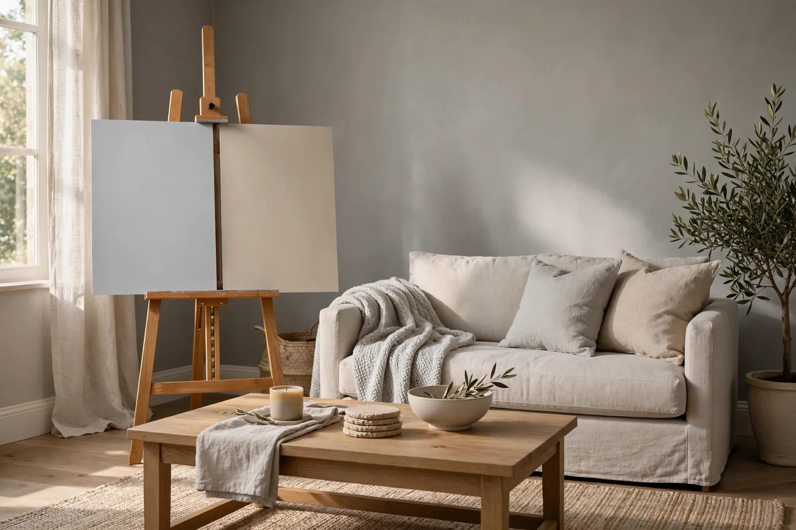
They sit next to each other on the fan deck, two light neutrals that look nearly identical at arm’s length, and homeowners have been choosing between Sherwin-Williams Repose Gray (SW 7015) and Agreeable Gray (SW 7029) for a decade. The trouble is that “nearly identical” chips become clearly different walls. One leans cooler and more tailored; one leans warmer and more forgiving. The right choice has less to do with which color is better and more to do with which house it’s going in.
Why this comparison matters more than it looks
Most paint comparisons are easy: beige vs. gray, warm vs. cool, light vs. dark. The choice announces itself. Repose Gray and Agreeable Gray are different, both are light warm-ish neutrals, both read “greige” in most showrooms, and both are among the most specified residential neutrals in the country. Choosing between them on a two-inch chip is essentially guessing.
And yet designers report that the two behave like different colors once they cover real walls. One stays steady; one shifts. One cools a room down; one warms it up. One forgives mixed finishes; one demands them to agree. Homeowners routinely repaint after discovering they picked the wrong one, not because either color is bad, but because the difference that was invisible on the chip is inescapable at full scale.
This guide doesn’t declare a winner. It does something more useful: it shows you exactly how the two differ, in light, against finishes, room by room, and then gives you a framework for deciding which one your house is asking for.
Meet the two colors: character and undertone family
Start with the broadest description, because everything else follows from it.
Repose Gray is the cooler, grayer of the two. Designers describe it as a true neutral gray with a quiet warm undertone, it reads as gray first, warmth second. Its hidden undertone family leans toward green with a violet shadow: in bright, balanced light it behaves like a clean, composed gray, but in cool or dim conditions a faint purple note can surface. That violet flash is the most-reported surprise about Repose Gray, designers flag it consistently, and it’s the reason sampling matters more here than the chip suggests.
Agreeable Gray is the warmer of the two. It sits in the greige family, gray with enough beige that it reads as a warm neutral first, gray second. Designers describe its undertones as warm beige with a whisper of green, and in low light some report a muted violet note as well. It generally shifts less dramatically than Repose Gray, which is why many designers call it the more forgiving color, but “forgiving” cuts both ways, as we’ll see in the light test.
A useful mental image: Repose Gray makes a room feel edited and composed. Agreeable Gray makes a room feel settled and inviting. Same weight class, different emotional register.
| Repose Gray (SW 7015) | Agreeable Gray (SW 7029) | |
|---|---|---|
| Reads as | Gray first, warm second | Warm neutral first, gray second |
| Undertone family | Green with a violet shadow | Warm beige with a whisper of green |
| Relative depth | A touch deeper | A touch lighter |
| Predictability | More consistent, “what you see is what you get,” with the violet caveat in cool dim light | More variable across rooms, warmer and softer, but can go flat in low light |
| Mood | Clean, calm, tailored | Cozy, welcoming, enveloping |
| Style fit | Modern, contemporary, minimalist, anywhere a cleaner gray is wanted | Transitional, farmhouse, traditional, anywhere warmth is wanted |
The light test: how each one reads, direction by direction
If there’s one section that justifies this article, it’s this one. The two colors’ biggest differences show up under different light, and most comparisons skip the directional detail entirely.
North-facing rooms: cool, indirect, dim
North light is the stress test for every gray. In north-facing rooms, Repose Gray leans into its violet shadow, designers consistently report a cooler, slightly purple-gray cast in these conditions. Some homeowners love it (it reads as a “real” gray); others didn’t sign up for purple. Meanwhile, Agreeable Gray in north light can read flatter and more muted than expected, its warmth doesn’t have enough light to activate, so it may sit somewhere between beige and gray without committing to either. Designers often recommend Agreeable Gray for north rooms anyway, because its inherent warmth compensates for the cool light, but it needs contrasting elements (crisp trim, deeper textiles) so it doesn’t go lifeless.
South-facing rooms: bright, warm, generous
South light is where both colors are at their best, and most honest. Repose Gray in strong south light loses the violet entirely and reads as a clean, balanced gray with a quiet warmth; designers call some south-facing Repose rooms genuinely luminous. Agreeable Gray in south light is warmer and cozier, reading closer to a soft beige-gray, the version of the color most people fell in love with on the chip. If your house faces south, you can pick on pure preference, because the light flatters both.
East and west rooms: the shifters
East rooms go from warm morning to cool afternoon; west rooms do the reverse, with a dramatic golden evening. Repose Gray in east light reads warm and welcoming before noon and cooler and more composed after, a pleasant daily rhythm. In west light, the golden evening sun softens Repose’s gray edge beautifully, though the violet note can peek through in shadowy corners at midday. Agreeable Gray handles the swings with less drama: it glows in warm morning or evening sun and stays soft (if slightly flat) through the cool hours. In open layouts where one color has to survive several exposures at once, Agreeable Gray’s steadiness is a genuine advantage.
The finish test: floors, cabinets, and countertops decide
Light explains how a color behaves; finishes explain whether it belongs. This is the step most comparison articles wave past, and it’s where the real decision lives. Run each color against your fixed surfaces.
Wood floors
Warm oak or honey-toned floors, the most common American flooring, pair more naturally with Agreeable Gray. The color’s beige warmth harmonizes with golden wood; the relationship reads intentional. Repose Gray next to warm oak can work, but the cool gray against warm gold creates a contrast that some rooms handle gracefully and others fight, sample it beside your floors, not a memory of them.
Gray-washed or cool-toned floors flip the verdict. Repose Gray sits comfortably with cool wood and gray tile, reading as one continuous cool family. Agreeable Gray against cool gray floors can look disconnected, the beige warmth has nothing to echo.
Dark walnut or espresso floors suit either, but for different reasons: Agreeable Gray softens the contrast and warms the room up; Repose Gray sharpens it into a more contemporary, high-contrast look.
Cabinets and countertops
The kitchen counter is an underrated tiebreaker. Cool-toned quartz or Carrara-style marble push Repose Gray cooler and read crisp and intentional together, one of the color’s best pairings. The same cool counters against Agreeable Gray can make the beige feel disconnected, like warmth dropped into a cool room. Conversely, warm wood cabinets, butcher block, or warm-veined stone welcome Agreeable Gray and can leave Repose Gray feeling like the cold guest. White cabinetry works with both, it’s the great neutralizer, but designers note the pairing differs: white cabinets + Repose Gray reads modern and architectural; white cabinets + Agreeable Gray reads softer and more transitional.
Room by room: which one wins where
Assembled from how designers report deploying the two colors across real homes:
Living rooms, With ample south or west light, Repose Gray is striking: sophisticated, composed, a backdrop that lets art and textiles pop. With north or limited light, Agreeable Gray is the safer whole-room choice, its warmth fills the gap the light leaves.
Kitchens, Agreeable Gray is more commonly specified here, and the reasoning is sound: kitchens layer daylight, overhead fixtures, and task lighting all day, and Agreeable handles those transitions with ease. It also flatters the warm-white and cream cabinetry that dominates current kitchen design. Repose Gray wins the kitchen when the palette is already cool, white cabinets, cool counters, black hardware, where it reads as the architectural finish the design wants.
Bedrooms, Agreeable Gray reads more enveloping and cocooning, especially with darker furnishings like walnut bed frames. Repose Gray creates a calmer, more collected atmosphere, and in a south-facing bedroom washed with warm morning light, designers describe it as genuinely glowing.
Open-concept main floors, Agreeable Gray is the more common whole-home pick: its moderate depth and steady warmth tie together spaces with different exposures, which is exactly what an open plan demands. Repose Gray can anchor an open plan too, but only if you prefer the cooler, more tailored end of the spectrum, and you’ve tested it in the plan’s dimmest corner.
Bathrooms and hallways, Either works; Repose Gray’s crispness suits modern baths with white tile, while Agreeable Gray softens small windowless spaces that need warmth.
Trim pairings and the two-sample test
Trim is the frame around both colors, and it changes how each one reads.
For Repose Gray: pair with a clean, crisp white, designers most often reach for a bright white like Extra White or a neutral Pure White. The contrast is the point: crisp trim sharpens Repose’s tailored character. A warm cream trim against Repose Gray can make the wall look cooler and grayer by comparison, not necessarily wrong, but know it’s happening.
For Agreeable Gray: a soft white, Alabaster or Pure White families, keeps the warm, settled feeling intact. A stark bright white against Agreeable Gray can make the wall read dingier by contrast; designers flag this as one of the most common trim mistakes with warm greiges.
Then the test that settles it. Buy sample pots of both colors, this is a comparison that chips genuinely cannot resolve, and paint large boards, two coats each. Live with them for 48 hours:
1. Place both boards against your actual fixed finishes, floors, counters, trim, not against each other in isolation.
2. Check them in morning, midday, evening, and lamplight. Judge each in the room’s worst light, not its best.
3. Watch specifically for Repose Gray’s violet note in cool, dim conditions, and for Agreeable Gray going flat in low light. Whichever flaw you can’t live with has made your decision.
4. Photograph the boards from across the room. Cameras exaggerate undertones, which makes the difference between the two jump out in a way your adapting eyes might miss.
For the full protocol, our guide to testing paint samples walks through every step that prevents repaints.
Want the decision made for you?
If this comparison has you leaning toward one undertone family, the Whole Home Paint Guide takes it from there, a complete Sherwin-Williams color system with every room mapped, trim and ceiling pairings included, and undertones already coordinated for real homes. (Independent guide; not affiliated with or endorsed by Sherwin-Williams.)
Frequently asked questions
Repose Gray is the cooler of the two, it reads as gray first, with a quiet green-violet undertone. Agreeable Gray is noticeably warmer, reading as a warm greige with beige undertones. Put them side by side against white paper and the temperature difference is obvious.
Repose Gray carries a violet undertone that stays hidden in bright, warm light but surfaces in cool, dim conditions, especially north-facing rooms and shadowy corners. It’s the color’s most-reported surprise. If the purple bothers you, options include switching to a warmer bulb, choosing Agreeable Gray instead, or repainting with a neutral that lacks the violet lean. Our undertones guide explains how to spot this before it happens.
Designers usually lean toward Agreeable Gray for north-facing rooms, because its inherent warmth compensates for the cool, indirect light, but it needs contrasting elements so it doesn’t go flat. Repose Gray in a north room can look genuinely purple-gray, so it must be sampled on the actual north wall first. Test both; don’t decide from the chip.
Agreeable Gray, in most cases. Warm oak’s golden undertones harmonize with Agreeable’s beige warmth, while Repose Gray’s cooler gray can create a contrast that not every room handles well. With gray-washed or cool-toned floors, the verdict flips, Repose Gray belongs to that family. Hold samples against your actual floor to decide.
You can, but keep the undertone relationship in mind: they’re close enough that using both in adjacent spaces can look like a mistake, “one of these walls was painted wrong”, rather than a deliberate shift. If you want two different moods, choose colors a full step apart in depth or temperature instead. Our whole-home palette guide covers how to vary colors without losing cohesion.
Repose Gray pairs best with a crisp, clean white (Extra White or Pure White families), the contrast sharpens its tailored character. Agreeable Gray pairs best with a soft white (Alabaster or Pure White families); a stark bright white can make its warmth read dingy by comparison. Keep one trim white consistent through the whole house either way.

