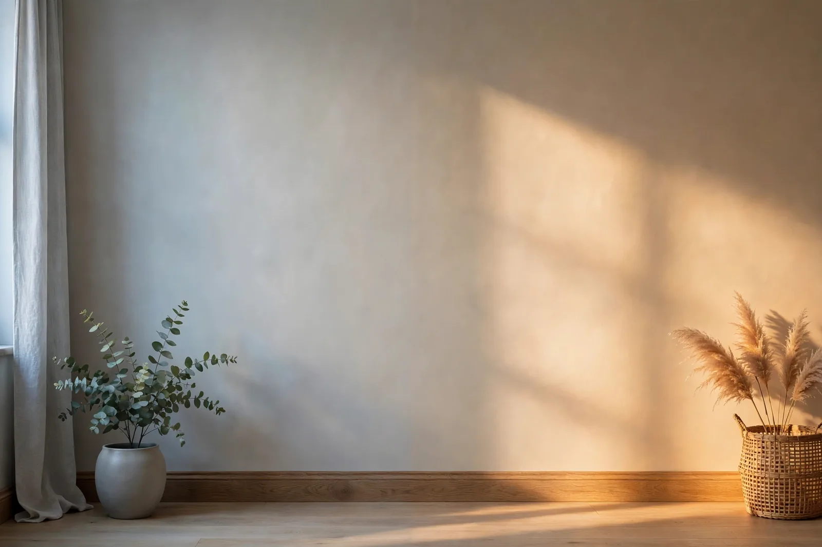
That perfect greige you loved in the store can look like muddy beige in your hallway and icy blue in your bedroom, and neither version is wrong. It’s the same paint. What’s different is the light. Here’s how to read your room’s light first, so you choose a color for the room it will actually live in.
Why light is half the color decision
Paint doesn’t have a fixed appearance. It has a fixed pigment, and that pigment can only reflect the wavelengths of light that fall on it. Change the light, and you change which wavelengths arrive, which changes what bounces back to your eye. The color on the wall literally cannot stay the same when the light changes.
This is why the paint-store experience misleads so many people. Stores are lit with bright, even, neutral lighting designed to make everything look good. Your home is lit by directional sun through windows, filtered by trees, bounced off floors, and it changes by the hour. Color experts at major paint brands consistently point to lighting as the single most common reason a chosen color disappoints.
The practical upshot: choose the color for the light, not for the chip. Every decision in this guide flows from one habit, knowing which direction your windows face before you look at a single swatch.
The four orientations: what each one does to paint
In the Northern Hemisphere, window direction determines the character of your daylight. (If you’re in the Southern Hemisphere, north and south are reversed, the same principles apply, mirrored.) Here’s what each orientation does and how to choose for it.
North-facing rooms: cool, indirect, consistent
North light never gets direct sun. It’s soft, diffused, slightly blue-gray, and remarkably consistent through the day, which sounds ideal until you realize it flattens everything it touches. Whites can read dingy, muted colors go quiet, and any cool undertone gets amplified. A gray with a whisper of blue can read genuinely blue in north light; a beige with a yellow undertone can turn slightly greenish.
The strategy: lean warm. Choose colors with warm undertones, warm whites, creamy beiges, warm greiges, to balance the cool cast. Bolder, more saturated colors also hold up better here than pale muted ones, which the weak light tends to wash into nothing. If you love cool colors, pick warm-toned versions of them (a warm gray instead of a cool gray). And favor higher LRV colors here, since north rooms get the least light to reflect.
South-facing rooms: intense, warm, generous
South-facing rooms get the most light, high, bright, warm sun for most of the day. Colors look their most vivid and saturated here, which is a gift and a trap. Dark colors brighten up beautifully, but pale colors, especially whites, can wash out completely. Warm undertones get turbocharged: a soft yellow can turn buttery, a blush pink can go peachy.
The strategy: you have the most freedom here. Cool colors thrive in south light (blues, greens, and cool grays look their best with warm sun balancing them), and deep, saturated colors hold their richness instead of going heavy. Just be careful with warm whites, test them midday, when they’re most likely to read yellow. For a deeper look at how reflectance interacts with bright rooms, see our guide to what LRV means for your rooms.
East-facing rooms: warm mornings, cool afternoons
East light is the shapeshifter. Before noon it’s warm and golden; by afternoon the direct sun is gone and the light turns cool and blue-gray. A color that glows at breakfast can look flat by dinner. Warm colors, reds, oranges, yellows, love the morning shift; cool colors can feel chilly once the afternoon arrives.
The strategy: choose for the hours you actually use the room. An east-facing kitchen or breakfast nook used in the morning can take warm, cheerful colors confidently. An east-facing bedroom used mostly in the evening needs a color that still looks good in cool afternoon light, which means testing it at 4pm, not 9am.
West-facing rooms: dull mornings, dramatic evenings
West light is east light in reverse, and more intense. Mornings are flat and shadowy; late afternoons and evenings bring strong, low, orange-gold sun that can oversaturate warm colors. Reds, oranges, and yellows can look almost neon in west evening light, while everything looks a touch darker and duller in the morning.
The strategy: be cautious with warm, saturated colors here, the evening sun will push them further than the chip suggests. Cooler and more muted colors handle the golden blast gracefully. And like east rooms, let usage decide: a west-facing living room used in the evenings should be tested at sunset, not at noon.
| Orientation | Light quality | What it does to paint | Best strategy |
|---|---|---|---|
| North | Cool, indirect, consistent | Mutes colors; amplifies cool undertones | Warm-leaning colors, higher LRV, bolder over paler |
| South | Intense, warm, all day | Brightens darks; washes out pale whites | Most freedom, cools thrive, deeps hold richness |
| East | Warm morning → cool afternoon | Glows early, flattens late | Choose for your hours of use; test afternoons too |
| West | Dull morning → golden evening | Oversaturates warm colors at sunset | Cooler/muted colors; test at sunset |
How the same wall changes through the day
Even in a single room, your paint is a moving target. At sunrise the light is warm and low; at noon it’s bright and neutral; at sunset it goes golden-orange; after dark your lamps take over entirely. A color doesn’t just look different room to room, it looks different hour to hour.
This is why the “check it at different times” advice matters so much, and why most people underdo it. Checking twice isn’t enough. The meaningful checkpoints are:
Morning (7–10am). East rooms are at their warmest and most flattering; west rooms are at their dullest. If a color looks dead in a west room at 8am, that’s normal, judge it against the evening instead.
Midday (11am–2pm). The harshest, most revealing light. South rooms are at peak intensity, this is when pale colors wash out and undertones show most honestly. If a color survives midday in a south room, it will thrive everywhere else.
Late afternoon (3–6pm). The golden shift begins. West rooms start glowing; east rooms start cooling. Warm undertones intensify, this is the hour that exposes a “pink problem” in a beige you thought was neutral.
Evening lamplight. The most important check of all, because it’s when most people actually live in their rooms. Incandescent-style warm light (2700K) deepens warm colors and mutes cool ones; cooler daylight bulbs (4000K+) do the reverse.
Seasons, weather, and the winter shift
Light doesn’t just change by the hour, it changes by the season, and the difference is bigger than most people expect. In winter, days are shorter, the sun sits lower, skies are cloudier, and the light that does arrive skews cooler and bluer. Paint reflects less of it, so colors read darker and grayer than they did in July.
Soft creams can look slightly beige, blush pinks go muted, pale yellows turn subdued, and even crisp whites can pick up a blue-gray cast. The effect is strongest in north-facing rooms, which were already running cool, winter can push a borderline gray-beige firmly into “why does this look gray?” territory.
Two practical responses. First, if you’re choosing paint in summer for a room you’ll live in all year, mentally darken and cool your finalists by a notch, that’s closer to their winter truth. Second, this is another argument for warm-leaning neutrals in north-facing rooms: warmth is the buffer that keeps a color honest through December. And remember that undertones reveal themselves most aggressively in cool, weak light, winter is when hidden blue and purple undertones come out to play.
Artificial light: Kelvin and CRI basics
Once the sun goes down, your bulbs become the light source, and bulbs have their own color temperature, measured in Kelvin (K):
2700K, warm white. The classic cozy glow. It deepens warm paint colors (reds, oranges, warm beiges glow) and mutes cool ones (blues and greens go quieter, sometimes muddy). Most living rooms and bedrooms use this.
3000K, soft neutral-warm. A middle ground many designers default to, warm enough to feel inviting, neutral enough to keep colors honest.
4000K+, cool/daylight. Common in kitchens, bathrooms, and offices. It flatters cool colors and keeps whites crisp, but can make warm beiges look flat or slightly green, and feels clinical in a bedroom.
Then there’s CRI (Color Rendering Index), a 0–100 score for how faithfully a bulb reveals color. Cheap LEDs can have a CRI in the 70s, which subtly distorts everything; look for 90+ in rooms where color matters. A high-CRI 3000K bulb is the closest most homes get to “what the paint really looks like” after dark.
The takeaway for paint decisions: test your finalists under the bulbs you’ll actually live with. A color chosen under showroom fluorescents and judged under your 2700K living-room lamps is two different colors. If you’re planning a lighting change (our lighting ideas guide covers the high-impact moves), decide the bulbs first, then finalize the paint.
Testing colors across light conditions
Everything in this guide converges on one protocol. It’s more thorough than “paint a swatch and glance at it,” and it’s the difference between a color you love for a decade and one you repaint in spring:
1. Determine each room’s orientation first. Stand in the room with a compass app. Note which walls the windows are on, a “north-facing room” with one small west window still behaves mostly like a north room.
2. Buy sample pots, not chips, and paint large poster boards with two coats, not the wall. Boards move; walls don’t.
3. Test on every wall of the room. One wall may catch direct sun while the opposite wall sits in shade, the same color can look like two different paints. This matters most in south and west rooms.
4. Check at four times: morning, midday, late afternoon, and lamplight. Photograph each check in the same spot for comparison, memory is unreliable, photos are honest.
5. Judge in the room’s worst light. The color that still looks good in a north room’s gray afternoon or under 2700K lamplight will thrive everywhere else.
6. Confirm next to your fixed finishes, floors, cabinets, countertops, in that same worst light. Light changes the paint; it changes your finishes too, and they have to agree.
A final note on honesty: screen swatches and phone photos are approximate. They’ll get you to a shortlist, but the final decision belongs to a physical sample on a board in your room. No article, app, or visualizer replaces that.
Want the testing done systematically?
The Paint Color Workbook walks you through sampling, comparing, and committing, with worksheets for testing finalists across light conditions, room by room. And the Whole Home Paint Guide gives you a complete system where orientation-proof colors are already chosen.
Frequently asked questions
Lean warm: warm whites, creamy beiges, and warm greiges balance the cool, indirect light. Avoid cool grays and icy blues, which north light makes colder, and favor colors with a higher LRV since these rooms get the least light to reflect.
Because the light source changed completely. Daylight is full-spectrum and directional; your lamps are a fixed color temperature (usually warm 2700K), which deepens warm colors and mutes cool ones. Always judge finalists under the bulbs you’ll actually live with.
Not necessarily, south rooms are the most forgiving and handle both warm and cool colors well. Cool colors do shine here because the warm sun balances them, and deep colors hold their richness. The main caution is pale warm whites, which can wash out or go yellow at midday.
Let the dominant exposure decide, the direction with the most or largest windows usually governs the room’s character. Then test the color on every wall, since the sunlit wall and the shaded wall can read as two different paints.
Yes. Winter light is weaker, lower-angled, and cooler, so colors read darker and grayer, especially in north-facing rooms. If choosing paint in summer, mentally darken and cool your finalists a notch to approximate their winter appearance.
Look for bulbs around 3000K with a CRI of 90 or higher, warm enough to feel inviting, neutral enough to keep colors honest, and faithful enough to reveal what the pigment is really doing. Avoid making final paint decisions under old fluorescents or low-CRI LEDs.

