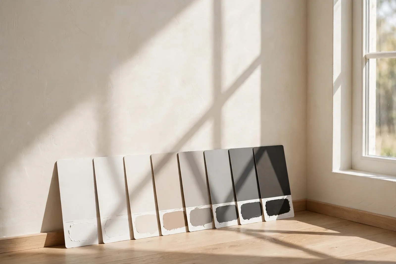
There is a number on every paint chip that predicts, better than the swatch itself, how light or dark a color will feel on your wall. It’s called LRV, and once you know how to read it, you’ll stop guessing about depth and start choosing with data.
What LRV actually measures
LRV stands for Light Reflectance Value, the percentage of visible light a paint color reflects back into the room rather than absorbing. The scale runs from 0 (absolute black, swallowing all light) to 100 (pure white, reflecting it all). In practice, no commercial paint reaches either extreme: real colors sit roughly between 3 and the low 90s.
What makes LRV unusually trustworthy is that it isn’t an opinion or a marketing description. It’s derived from a laboratory measurement of the color’s lightness under standardized light, converted through the CIELAB color space. That’s why manufacturer LRVs are consistent across brands, and why the number on the back of the chip is worth more than the name on the front.
Where to find it: LRV is printed on most paint chips and color strips, listed in the back of fan decks, and published on manufacturer websites (Sherwin-Williams and Benjamin Moore both list it per color). If a color you love has no published LRV, treat that as a small flag, you’re choosing without your best data point.
One important boundary: LRV measures lightness only. It says nothing about hue, saturation, or undertone. A warm beige and a cool gray can share the exact same LRV and look nothing alike on your wall. Which is why LRV is half the decision, and the next section’s partner concept is the other half.
The LRV bands, and what they feel like
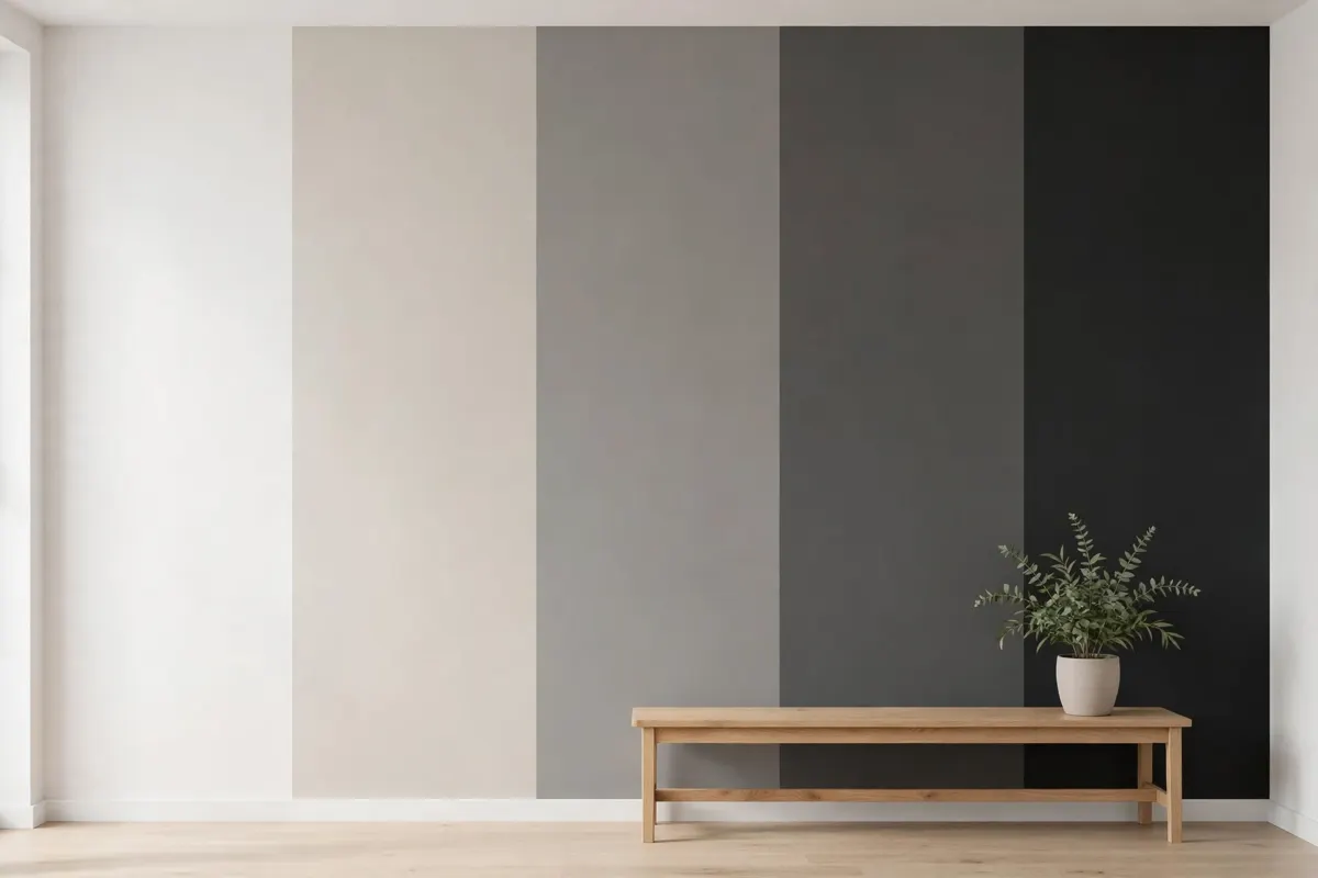
Memorizing numbers isn’t the goal; developing a feel for the bands is. Here’s how the ranges translate into real rooms:
| LRV band | What it feels like | Best used for |
|---|---|---|
| 70–100, Brighteners | Airy and reflective; the color nearly disappears and the light does the talking | Dim rooms, hallways, small spaces, ceilings, anywhere you need to borrow brightness |
| 50–70, Light neutrals | Soft color with real presence, without losing the room’s brightness | Most living spaces and bedrooms, the workhorse band for whole-home palettes |
| 30–50, Mid-tones | Confident color; walls have weight and the room feels grounded | Rooms with good natural light, dining rooms, home offices, spaces you want to feel cocooned but not dark |
| Below 30, Deep & dark | Dramatic and intimate; the walls advance and the room wraps around you | Contained spaces, powder rooms, dining rooms with doors, front doors, built-ins, accent walls |
A few orientation points within the bands: most popular wall neutrals, the warm whites, greiges, and soft beiges designers reach for again and again, cluster in the 50–75 range. True trim whites typically sit in the 80s to low 90s. And once you drop below about 25, you’ve chosen coziness over brightness, a legitimate choice, but make it on purpose.
These boundaries are practical conventions, not official standards, different sources slice them slightly differently. What matters is the relative read: a color at 72 will feel meaningfully brighter than one at 58, and both will feel like different species from one at 22.
LRV by room orientation
A color’s LRV is fixed. Your room’s light is not. The same LRV 62 greige reads soft and luminous in a bright south-facing living room and noticeably duller in a north-facing bedroom with one small window. So the right LRV depends on where the walls are:
North-facing rooms get cool, dim, bluish light all day, the hardest light to paint for. You have two good strategies and one trap. Strategy one: brighten deliberately with an LRV of 70 or above in a warm white or cream, the warmth counteracts the cool light, the high LRV maximizes what little light exists. Strategy two: stop fighting it and go deep and saturated for an intentionally cozy, cocooning room. The trap is the middle: mid-tone colors (roughly LRV 40–60) in a dim north-facing room often read gray, flat, and undefined, neither bright nor muddy, just muddy.
South-facing rooms are the most forgiving, abundant, warm light means you can use almost any band. The caution runs the other direction: very high-LRV whites in a sun-flooded south room can wash out and glare. This is where the 30–60 range earns its keep.
East- and west-facing rooms shift through the day, bright and warm in the morning (east) or afternoon (west), dimmer otherwise. Mid-range LRVs (50–70) handle the swing gracefully; just make sure to check your finalists in both the room’s brightest and dimmest hours.
LRV vs. undertone: different jobs
Here’s the framework that makes both concepts click: LRV answers “how light will this feel?” Undertone answers “what color family is this really?” They do different jobs, and you need both.
Consider two colors that both measure around LRV 60: a warm greige and a cool blue-gray. Same lightness, completely different rooms, one wraps you in warmth, the other reads crisp and cool. LRV never distinguished them; only the undertone could. Now flip it: a warm white at LRV 82 and a warm taupe at LRV 35. Same family, wildly different weight on the wall. Undertone never distinguished those; only LRV could.
The practical workflow, in order:
1. Filter by undertone family first. Match the color’s undertone to your fixed finishes, floors, cabinets, countertops, the way we describe in our whole-home palette guide. This is the decision that prevents the “something feels off” problem.
2. Then use LRV to set the depth. Once you’re in the right family, pick the LRV band that suits the room’s orientation and purpose: higher to brighten, lower for intimacy.
Skip step one and you get a bright room in the wrong color. Skip step two and you get the right color at the wrong depth, a north-facing bedroom in a beautiful warm greige that’s simply too dark for its light.
Using LRV to compare two similar colors
This is where LRV earns its keep as a decision tool. When you’re torn between two similar whites, beiges, or grays, the classic “they look identical on the chips” deadlock, the LRV difference breaks the tie.
The method: put the two chips side by side and read both numbers. A difference of 5–10 points is clearly visible on a real wall, even when the chips look alike. That gap tells you which one will feel brighter, before you buy a single sample pot. It also tells you something chips hide: two “warm whites” can sit ten LRV points apart, and the darker one may read as distinctly cream next to the lighter.
Compare against your trim, too. Hold each finalist next to your trim white’s LRV (most trim whites sit in the 80s to low 90s, check the manufacturer’s data for your exact color). You want enough separation that the trim reads as trim: a wall color within a few points of the trim can look like a mistake rather than a choice.
Compare within the same sheen. Because finish affects perceived reflectance, only compare LRVs of colors you plan to use in the same sheen, otherwise you’re not comparing like with like.
The 5 most common LRV mistakes
1. A dark color in a dark hallway. Low light plus low LRV equals a cave. Hallways get the least natural light in the house, they’re the worst place for a deep color unless the hallway is genuinely well-lit. Give connecting spaces your higher-LRV anchor neutral and save the drama for rooms with doors.
2. The muddy middle in dim rooms. As covered above: mid-tone colors (roughly LRV 40–60) in a poorly lit north-facing room often lose their character and read as gray-beige murk. In dim rooms, commit, go bright (70+) or go intentionally deep.
3. Ignoring the ceiling. Ceilings are usually the highest-LRV surface in the room (bright whites in the 90s). Against mid-tone walls that’s a deliberate, crisp contrast, fine. But an ultra-bright ceiling over deep walls can feel disconnected; some designers drop the ceiling LRV slightly (or color-drench) to keep the room cohesive.
4. Choosing from the chip without reading the number. Two chips can look near-identical under store lighting and sit 12 LRV points apart. The number is free information, read it before you fall in love with the name.
5. Forgetting LRV on exteriors. Outside, LRV stops being just about looks: dark colors (low LRV) absorb significantly more heat, which can accelerate fading and stress certain substrates. Many cladding and trim manufacturers specify minimum LRV requirements, check them before committing to a dramatic dark exterior, especially on sun-facing elevations.
Frequently asked questions
Most bedrooms land happily in the 50–70 band, light enough to feel fresh in the morning, with enough color to feel restful at night. Go higher (70+) if the bedroom is north-facing or small; go lower (30–50) if you want a deliberately cozy, cocooning sleep space. Pair the choice with our small bedroom ideas to keep the room calm as well as well-lit.
No, the right LRV depends on the room’s light. Higher LRV brightens dim rooms, but in a sun-flooded south-facing room, a very high LRV can wash out and glare. Match the band to the light: brighten where light is scarce, and don’t be afraid of depth where light is abundant.
If your goal is brightness, aim for 70 or above in a warm white or cream, the warmth offsets the cool northern light. If you’d rather embrace the mood, go deep and saturated (below 30) for intentional coziness. Avoid the in-between 40–60 range in dim north rooms, where colors tend to read flat and gray.
It’s printed on most paint chips and color strips, listed in the back of manufacturer fan decks, and published on brand websites, both Sherwin-Williams and Benjamin Moore list LRV per color. (The Global Abode is not affiliated with or endorsed by either brand; trademarks belong to their owners.)
Yes, and for practical reasons beyond appearance. Low-LRV (dark) exterior colors absorb more heat, which can speed up fading and stress some cladding materials. Check your substrate manufacturer’s minimum-LRV requirements before choosing a dark exterior, and test large samples against the house in morning, midday, and late-afternoon sun.
Absolutely, LRV measures lightness only, not hue or undertone. A warm beige and a cool gray at the same LRV will feel like different colors on your wall. That’s why the workflow is undertone first (right family), LRV second (right depth). Our color comparisons hub is built on exactly this pairing.
Want the LRV decisions made for you?
The Whole Home Paint Guide is a complete color system with LRV bands already worked out per room, bright where you need brightness, deep where you want drama, undertones coordinated throughout. And the Paint Color Workbook includes side-by-side comparison worksheets for testing your own finalists.

