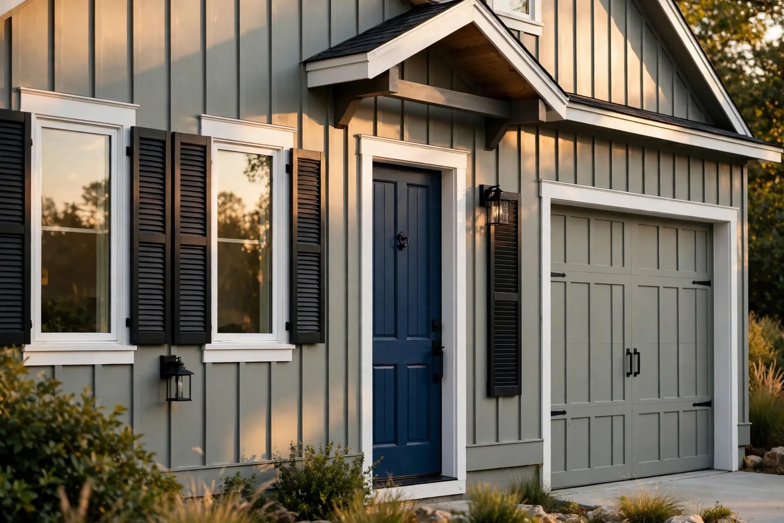
The body color gets all the glory, but the details decide whether an exterior looks intentional or accidental. Trim defines the architecture, shutters punctuate the windows, the garage door either supports or steals the whole composition, and brick and siding have to agree with each other before any of it works. This guide walks through every detail decision in order, what should match, what should contrast, and what should quietly recede, so the front of your house reads as one composed thought. The Global Abode is an independent publication, not affiliated with or endorsed by Sherwin-Williams or Benjamin Moore; color names and codes are referenced as widely-known designer examples. And because exterior colors shift dramatically with sun, shade, and weather, always test large physical samples on the house itself, viewed from the curb, in multiple lights, before committing.
Key takeaway: Give each exterior detail a job. Trim defines and frames, shutters echo or punctuate, the garage door recedes into the field or trim color, and the front door gets the spotlight. When every element has a clear role and nothing competes with the entry, the whole exterior feels intentional, even if the body color itself is simple.
The Detail Hierarchy: Who Does What
Walk past any street of houses and you can feel the difference between exteriors that were planned and exteriors that were painted one decision at a time. The planned ones share a common trait: every detail has a job, and none of the jobs overlap. Trim defines. Shutters punctuate. The garage recedes. The front door leads. When two elements both try to lead, a bold garage door and a bold front door, shutters that fight the trim, the eye has nowhere to rest, and the house feels busy even if the palette is small.
The hierarchy, from most to least visual weight, works like this. The field, the siding or brick covering the largest surface, is the background of the whole composition. The trim is the line work: window casings, corner boards, fascia, porch columns. Shutters are punctuation marks, short, rhythmic, repeated, that give windows presence and rhythm across the facade. The garage door is the largest single moving part of the house, which is exactly why it should not be a focal point; its job is to support the composition by blending in. And the front door is the exclamation point, the one accent the whole street gets to read clearly. For front door thinking, our front door color ideas guide goes deep on making that single accent count.
This hierarchy matters because the most common exterior mistake is not a wrong color, it is a wrong role assignment. A homeowner chooses a gorgeous deep green for the shutters, then repeats it on the garage door at sixteen feet wide, then wonders why the house feels heavy from the curb. The color was fine. The scale was not. Roles keep scale honest: loud colors belong on small elements, quiet colors on large ones, and the single boldest moment belongs to the front door. Once you accept that framework, almost every detail decision answers itself.
Start your own planning by photographing your house straight-on from the curb, then sketching the hierarchy onto it: field, trim lines, shutter positions, garage mass, door. Seeing the roles labeled on a photo makes conflicts visible immediately, the shutter color that is too close to the trim color to read as separate, the garage that is shouting in a color no other element repeats. You are not choosing colors yet; you are assigning jobs. The colors come next, and they will be easier for it.
Trim Colors: Crisp White, Warm White, or Dark?
Trim is the first detail decision because it touches everything, every window, every corner, the roofline, the porch. Its color sets the contrast level of the entire exterior. There are essentially three trim strategies, and the right one depends on your siding type and the look you are after.
Crisp white trim is the classic for a reason. Against colored siding, navy, sage, terracotta, deep green, a clean white gives that sharp, tailored definition that reads as “well-kept” from half a block away. Widely-reported designer observations suggest that white trim works best when it is genuinely clean rather than dingy; a white that has yellowed with age reads as neglect rather than classic. On brick exteriors, white trim is the traditional partner, especially with red and brown brick, because it cools and brightens a warm, heavy material. The watch-out: if your siding is already white or very light, white trim erases the architecture entirely. Trim needs to be distinguishable from the field, or it is not doing its job.
Warm white or cream trim is the choice when crisp white feels too stark. Stone facades, tan brick, beige and greige siding, and most earth-toned exteriors sit more comfortably with a warm white that shares their undertone family. Widely-reported designer observations note that pairing a warm-toned field with a cool white trim can make the trim look bluish or gray in comparison, an undertone clash that only reveals itself once the paint is on the house. If your siding or brick leans warm, pull the trim toward the warm side too: cream, ivory, soft linen whites.
Dark trim, charcoal, near-black, deep bronze, is the modern strategy and one of the strongest trends in exterior design. On light siding it reverses the traditional relationship: instead of light lines on a dark field, you get dark lines framing a light field, which makes windows look larger and the architecture more graphic. Dark trim on white or pale gray siding is crisp and contemporary; dark trim on dark siding is tonal and moody, popular on modern farmhouses and Scandinavian-inspired homes. The trade-off is maintenance visibility: dark trim shows dust, pollen, and fading more readily than white, and it absorbs more heat, worth weighing on sun-blasted south and west exposures.
Trim choice should also respect the siding material. Board-and-batten and lap siding have strong shadow lines that do half the definition work, so they tolerate lower-contrast trim. Smooth stucco has no shadow lines at all, so it needs the trim contrast to articulate the architecture. Brick, with its heavy texture and mortar lines, usually wants the brightest, cleanest trim of all to cut through the visual noise. And remember that trim is not only white-painted wood: window cladding, gutters, and downspouts arrive in factory colors that you cannot easily change, so your trim color has to live peacefully alongside them.
For the finish itself, exterior trim wants a higher sheen than the field, widely, satin or semi-gloss, because the sheen difference is part of what makes trim read as trim. Our paint sheen decision guide breaks down exactly where each sheen belongs on the exterior.
Shutters: Match the Door, Echo the Trim
Shutters are the most misunderstood detail on the exterior, partly because so many of them are doing a job they were never designed for. Historically, shutters covered windows; today they are decorative, and that is fine, but decorative only works when they look plausible. The first rule of shutters is architectural honesty: each shutter should look like it could actually close over the window it flanks. Shutters that are visibly too narrow read as fake from the curb no matter how perfect the color. If your shutters are too small, the most impactful upgrade is not a new color but correctly sized shutters, each one half the window width, with real-looking hardware.
Once the size is honest, color is straightforward because shutters have only three good strategies. Match the front door: the shutter color repeats the door color at a smaller scale, which ties the windows to the entry and gives the whole facade a rhythmic accent. This is the most foolproof approach. Echo the trim in a deeper tone: if the trim is white, the shutters go charcoal, navy, or deep green, a color in the same neutral family but several steps darker. Go tonal with the siding: shutters two to three steps darker or lighter than the field color create a quiet, sophisticated facade where the architecture leads and the color supports.
The strategy to avoid is the orphan accent: shutters in a color that appears nowhere else on the house. Every accent color should appear at least twice, shutters and door, shutters and gable vent, shutters and the mailbox post, so the eye reads it as intentional. And shutters should never match the trim exactly. Trim-colored shutters erase the layering: the window surround melts into one flat frame and the facade loses depth. Contrast between shutter and trim is the whole point; the trim is the line, the shutter is the punctuation.
Material honesty matters too. Board-and-batten shutters suit farmhouse and cottage styles while louvered shutters suit colonial and traditional ones, mismatched style reads as costume. And if your house has shutters on some windows but not others on the same facade, remove the stragglers or complete the set; partial shutters look like the previous owner ran out of budget. Consistency is a color decision too.
The Garage Door: Make It Disappear
The garage door is the elephant on the facade, often the single largest uninterrupted surface on the front of the house, sometimes wider than the entire living-room frontage. Its color decision is therefore the opposite of the front door’s: where the door should draw the eye, the garage should release it. The guiding question is never “what color should the garage door be?” but “how do I make the front door the thing people notice?” Everything the garage does should serve that answer.
The safest and most widely recommended approach is to paint the garage door the field color, the same color as the siding around it. A garage door in the body color visually dissolves into the wall plane; the eye slides past it to the entry, which is exactly what you want. This works on every style and every palette. The trim around the garage door, the casing and any overhead trim, stays the trim color, which gives the opening definition without giving the door itself any attention.
The second option is the trim color. A white or cream garage door on a colored house is clean and traditional, and it works particularly well when the garage is set back, side-facing, or small relative to the facade. The risk is brightness: a big white garage door on a dark house becomes a glowing rectangle that competes with the entry. If the garage is prominent and the trim is white, the field color is usually the calmer choice.
What the garage door should never be is the accent color. The accent belongs to the front door at human scale; repeating it at sixteen feet wide does not double the charm, it dilutes it. A red front door is welcoming; a red garage door is a billboard. The one exception designers sometimes allow is a natural wood or wood-look garage door on craftsman, farmhouse, or modern homes, where the material itself is the interest rather than the color, but even then, the stain should be subdued and repeated in another wood element so it reads as a material story, not a random feature.
Hardware is the garage door’s secret weapon. Decorative hinges, handles, and window inserts in black or oil-rubbed bronze can give a plain steel door a carriage-house character for very little money, and the hardware should match the home’s other metals rather than introducing a new finish. If your garage door has windows, their style should relate to the house’s windows. And keep the finish satin: glossy garage doors show every dent and ripple in the metal, while flat finishes chalk and fade fastest on that big sun-facing plane.
Designer tip: Stand at the curb and squint at your house until the details blur. Whatever shape you still see clearly is your dominant element, and it should not be the garage. If the garage is what survives the squint test, its color is too loud, too bright, or too different from the field. Repaint it toward the siding color and squint again; the front door should be the last thing standing.
Brick and Siding Combinations
Two-material exteriors, brick on the lower level with siding above, brick front with siding sides, stone accents against lap siding, are everywhere in newer construction, and they fail more often than single-material houses for one reason: the two materials were chosen independently. Brick has fixed, unchangeable undertones. Siding is the variable. The siding color must be chosen for the brick, never the other way around, because the brick is not moving.
Start by reading the brick honestly. Hold a white poster board against it and look at what the brick looks like next to true white, that reveals the undertone your eyes were normalizing. Red and orange brick leans warm; brown brick can lean warm or cool; gray brick often carries blue or green undertones that only show in certain light. The mortar matters as much as the brick: light mortar brightens and cools the overall read, dark mortar deepens and warms it. Widely-reported designer observations suggest that siding colors which share the brick’s undertone family, warm siding with warm brick, feel harmonious, while cross-undertone pairings (a cool gray siding on warm red brick) create a subtle visual vibration. When in doubt, pull the siding color from the quietest tone in the brick rather than the loudest: the soft tan in the mortar bed, the muted clay behind the red face.
The transition line between materials needs a decision too. Where brick meets siding, that horizontal break is a design feature whether you planned it or not, and it wants trim, a belly band, a frieze board, a simple casing, in the trim color. An untrimmed material change looks like construction stopped for lunch. The trim band gives the eye a clean line to rest on and makes the two materials feel like a composed pairing rather than a cost-saving measure.
| Brick or stone type | Siding direction | Trim strategy | Why it works |
|---|---|---|---|
| Classic red brick | Warm white, soft cream, or warm greige siding | Crisp or warm white trim | The light siding cools the brick’s warmth; white trim keeps it traditional and fresh |
| Brown or tan brick | Taupe, warm gray, or muted olive siding | Warm white trim | Shared warm undertones make the materials feel related rather than adjacent |
| Gray brick or stone | Soft white, light warm gray, or pale blue-gray siding | White or charcoal trim | Cool materials stay in the cool family; charcoal trim adds modern definition |
| Painted or limewashed brick | Siding matched to the brick’s new color | Trim two steps lighter or darker than the field | Once brick is painted it becomes the field, treat the whole house as one color story |
| Stone veneer accents | Siding pulled from the stone’s quietest tone | Trim in the lightest neutral present | Stone is the boss; everything else defers to its palette |
Painted brick deserves its own note because it changes the rules. Once brick is painted, it is no longer a fixed material, it becomes the field, and the whole house gets planned as a single color story. Limewash and mineral-based coatings keep some brick texture visible and age gracefully; standard exterior paint on brick is a bigger commitment that needs proper prep and will need maintenance like any painted surface. Either way, the decision is effectively permanent in practice, stripping paint from brick is brutal, so the physical-sample rule applies double: paint a large test area, live with it through sun and rain, and view it from the curb before the whole house follows.
One more two-material trap: the “accent gable.” Siding one gable in a different color or material only works when the accent is clearly intentional, framed by trim, repeated somewhere else, or marking a real architectural change. A single random accent gable reads as a leftover, not a feature. If you cannot point to the architectural reason for the material change, paint it the field color and let the architecture speak.
Before you commit: Exterior paint is the most expensive and most visible color decision on your property, and the most punishing to redo. Never finalize an exterior scheme from swatches, phone photos, or a screen. Buy sample quarts, paint two-foot squares directly on the siding and trim, and study them at morning, noon, and dusk, from the curb and the sidewalk, for at least several days. The sample stage is cheap; the repaint is not.
Porch Ceilings, Railings & the Small Stuff
The small stuff is where exteriors go from “newly painted” to “thoughtfully designed.” None of these elements is large, but they are all at eye level or in the direct line of sight to the front door, which makes them disproportionately influential.
Porch ceilings carry one of the oldest and most charming exterior traditions: the soft blue-green ceiling, often called haint blue in Southern tradition. The design logic is sound, a pale blue-green ceiling brightens a shaded porch, feels like sky overhead, and adds a whisper of color exactly where guests look up while waiting at the door. The color should be very pale; anything saturated overhead feels heavy. If blue is not your story, the porch ceiling simply matches the trim, clean, bright, finished. What it should not be is the siding color carried overhead, which makes the porch feel like a cave.
Railings follow the trim-or-contrast decision. White railings with white trim are the classic colonial and farmhouse look; dark railings (black, bronze, charcoal) with white trim are the modern update. What fails is the in-between: railings painted the siding color, which makes them disappear structurally and look like an afterthought, or railings in a third color that appears nowhere else. Metal railings in black are nearly foolproof, black goes with every palette. If your railings are wood and staying wood, stain them to relate to another wood element on the house.
Then the true small stuff, each worth a deliberate choice: gutters and downspouts should match the trim where they run along trim, and the field where they run down siding, the goal is invisibility. House numbers, mailboxes, and light fixtures are the jewelry; keep them to one metal finish family (black, bronze, nickel, not all three) and scale them generously. Foundation walls visible above grade should be painted the darkest neutral in the scheme or a color close to the siding’s shadow tone. Exterior vents, meters, and utility boxes get painted the field color, full stop. Anything the builder installed and you cannot remove should be camouflaged, not featured.
Finally, the walkway and landscape edge participate in the color story whether you plan it or not. Warm-toned concrete or brick pavers push the whole composition warm; cool gray pavers push it cool. You cannot repaint the walkway easily, so treat it as a fixed material like the brick: read its undertone and make sure the siding and trim do not fight it. When the fixed materials and the paint all sit in the same undertone family, the house looks settled, like it has always been those colors.
Plan your exterior details with confidence
Choosing trim, shutters, and accent colors is easier with a whole-home system behind it. Our paint guides map every exterior decision to a coordinated palette, so the details compose instead of compete.
Frequently asked questions
Either strategy works, match the front door for a foolproof accent that ties windows to the entry, or choose a deeper tone in the trim’s color family for a quieter, more traditional look. What matters is that shutters contrast with the trim (never match it exactly, or the layering disappears) and that the shutter color appears at least twice on the house so it reads as intentional, not random.
Paint it the siding (field) color so it visually recedes into the wall plane, or the trim color for a clean traditional look on smaller or set-back garages. Never paint it the front door’s accent color, the accent belongs at human scale on the entry, and repeating it at sixteen feet wide turns a welcoming focal point into a billboard that competes with the door.
Trim should almost always contrast with the siding, its job is to define the architecture, and trim that matches the field erases it. Crisp white suits colored siding and classic brick; warm white or cream suits earth-toned and warm siding; dark charcoal or near-black trim gives a modern, graphic look on light siding. Match the trim to the fixed whites already on the house (window cladding, gutters) rather than to a swatch.
Brick is the fixed material, so the siding is chosen for the brick, never the reverse. Hold white poster board against the brick to reveal its true undertone, then pick a siding color in the same undertone family, and pull it from the brick’s quietest tone (often the mortar) rather than its loudest. Where the two materials meet, add a trim band in the trim color so the transition reads as a designed feature.
The classic choice is a very pale blue-green (the traditional haint blue), which brightens a shaded porch and feels like sky overhead, keep it pale, since anything saturated feels heavy overhead. Otherwise, simply match the trim for a clean, finished look. Avoid carrying the siding color onto the ceiling, which makes the porch feel dark and cave-like.
No, the front door should stand alone as the home’s single accent and focal point. Painting the garage door the same bold color undermines that effect and lets the much larger garage steal attention from the entry. Keep the garage in the field or trim color, and let the front door have its moment. Our front door color ideas guide covers making that single accent count, and our exterior color guide walks through the full palette.

