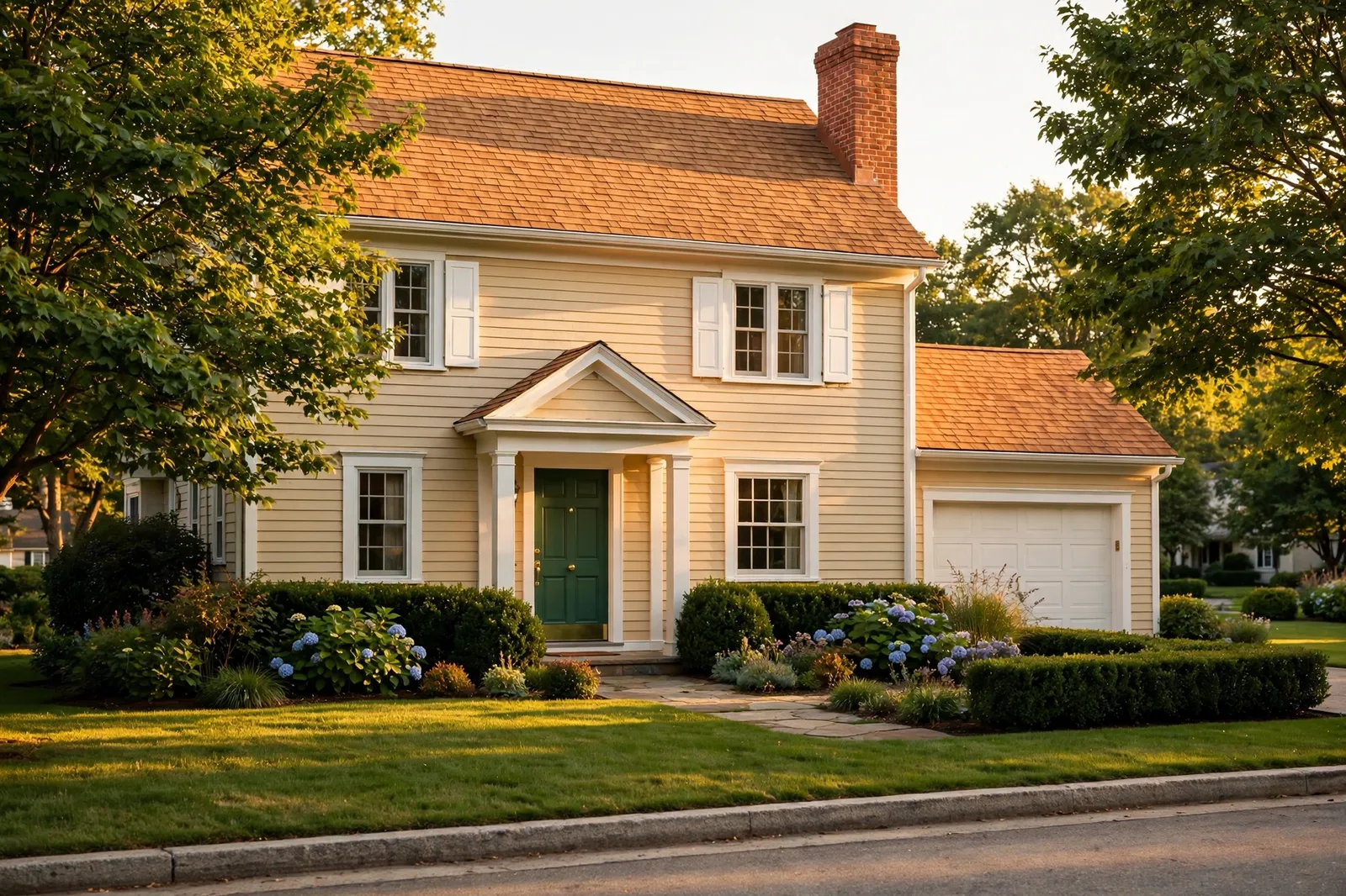
Choosing exterior house colors feels high-stakes because it is: the paint covers the largest surface you own, it has to survive weather and sun for a decade or more, and every neighbor sees the result. But the process gets dramatically easier when you flip the order most homeowners use. Don’t start with paint chips. Start with what you can’t change, your roof, your brick, your stone, your mortar, and let those fixed finishes tell you what the house wants. Exterior colors shift dramatically with sun, shade, and weather, so always test large physical samples on the house itself, viewed from the curb, in multiple lights, before committing, what looks right on a chip often surprises you at house scale. The Global Abode is an independent publication, not affiliated with or endorsed by Sherwin-Williams or Benjamin Moore; all color names and codes are referenced as widely-known designer examples.
Key takeaway: Exterior color is a reading exercise, not a picking exercise. Your roof, brick, stone, and mortar carry fixed undertones that paint must agree with, a warm brown roof argues with cool gray siding the same way a cool gray roof argues with warm beige. Once the fixed finishes are read, the palette is simple: a field color (siding or brick-tone partner), a trim color (the contrast decision), and one accent (the front door). Test large, test in all-day light, and judge from the curb, because exteriors read at fifty feet, not at arm’s length.
Start With What You Can’t Change: Reading Fixed Finishes
Every house exterior is a conversation between the things you choose and the things you inherited. The inherited ones, the roof, the brick or stone, the mortar, the driveway, the permanent hardscaping, are what designers call fixed finishes, and they are the starting point of every good exterior scheme. They are not changing, so the paint has to agree with them. This is the single discipline that separates exterior color schemes that look “designed” from ones that look like a coat of paint was applied to a house it doesn’t belong to.
Start with the roof, because the roof is the biggest fixed finish on the house and usually the most expensive one to replace. Read its temperature the way you would read any color: is it warm or cool? Warm-toned roofs, browns, weathered wood tones, terracotta or red tile, carry yellow, red, and orange undertones, and they ask for siding and trim palettes in the same temperature family: creams, warm greiges, khakis, sages, soft terracottas. Cool-toned roofs, grays with blue or green casts, ask for cool palettes: soft whites, dove grays, slate blues, true blacks. A dark roof (black or charcoal) is the forgiving middle ground, widely-reported designer experience says it gives you the most flexibility, because dark reads as neutral and lets both warm and cool palettes sit underneath it comfortably.
Then read the masonry. Brick is not one color, red brick can lean orange, brown, or even purple, and the undertone varies from brick to brick on the same wall. Designers consistently advise pulling siding and trim cues from the brick’s secondary tones and the mortar, not from the brick’s loudest color. A quiet beige pulled from the mortar, echoed in the trim, lets the brick remain the star without competition. Stone works the same way: find the color cast, the dominant tone in the mix, and choose siding that blends with it or sits in a clear, deliberate relationship to it. If your stone has a lot of gray, a warm tan siding will fight it; if your stone is warm and golden, a cool blue-gray siding will fight it.
The underlying rule is the one that governs interiors too: fixed finishes set the temperature, paint agrees with it. Fighting a fixed finish’s temperature is the most common exterior color mistake, and it is expensive, because you discover it at house scale. A warm roof with cool gray siding, or cool gray stone with warm beige siding, reads as two houses arguing, and no trim color can reconcile a field color that was wrong from the start. Listen to the house first; it is already telling you what it wants.
Tip: Take a close-up photo of your brick or stone and your roof on an overcast day, flat light reveals undertones honestly, the way harsh sun hides them. Zoom into the photo and look for the quietest colors in the mix: the mortar tone, the pale brick in the blend, the weathered edge of the shingles. Those quiet tones are your trim and siding cues; the loud tones are the house’s voice, not your palette’s.
The Exterior Palette Anatomy: Field, Trim, Accent
Once the fixed finishes are read, the exterior palette is almost always a three-part system: the field, the trim, and the accent. Understanding what each one does is what keeps a house from looking either flat or chaotic.
The field is the largest painted or pre-finished surface: the siding, the stucco, or the painted brick itself. It is the background tone of the whole house, and it should be the quietest of the three, it carries the temperature agreement with the roof and masonry, and it sets the mood from the curb. Most field colors are neutrals or muted colors for a reason: the field has to live at house scale, in full sun, for years. A color that charms on a chip can overwhelm across two stories, a subtle sage on the sample card becomes an army-green house, a cheerful blue becomes a loud one. Scale intensifies color, so the field should be one or two steps quieter than your instinct says.
The trim is the framing: fascia, soffits, window casings, corner boards, porch columns. Trim is the contrast decision, it defines the architecture and gives the eye something to read against the field. The classic question is how much contrast: crisp white trim against a colored field reads as traditional and crisp; tonal trim (a few shades lighter or darker than the field, same family) reads as modern and calm; dark trim against a light field reads as contemporary and graphic. There is no universally right answer, but there is a wrong one for each house, and it is usually the trim that fights either the field’s temperature or the architecture’s character.
The accent is the front door, and, optionally, the shutters. The accent is the one place on the exterior where a real color statement belongs. Because it is small, it can carry saturation the field never could: deep green, navy, rich red, warm black. The front door is the handshake of the house, it should have personality, but it should also relate to the scheme. A door color that pulls from the landscape (deep green against trees), from the brick’s secondary tones, or from a deliberate complement to the field reads as intentional. A door color that belongs to a different temperature family than everything else reads as a leftover.
The proportion matters too. Designers widely work with a rough visual split, the field dominates, the trim frames, the accent punctuates. When one element gets too loud for its job, a high-contrast field fighting a busy brick, or a bright accent repeated on shutters and trim and door until it is no longer an accent, the whole house feels unsettled. Give each part its role and keep it in it.
Siding Colors by Fixed-Finish Type
With the palette anatomy in place, here is how the field color resolves for the most common fixed-finish situations. In each case, the logic is the same: read the fixed finish’s temperature, then choose a field that agrees with it.
Red or orange brick. The most common masonry question, and the one with the most settled designer consensus. The safest field partners are creams, warm greiges, soft taupes, and warm whites pulled from the mortar, colors that agree with the brick’s warmth while staying quiet enough to let the brick be the star. For more contrast, muted sage greens are widely reported as a beautiful brick partner: green sits opposite red on the color wheel, so a dusty, grayed sage complements the brick’s warmth without shouting. Light grays can work if they lean warm; cool, blue-leaning grays tend to fight red brick’s warmth. And dark charcoals or deep greens on the siding with red brick are the dramatic direction, sophisticated, but they demand confident trim work to balance them.
Brown or yellow brick. Brown brick is the forgiving one, solidly neutral, so it pairs with almost anything as long as you decide how much the brick should stand out. Tonal, earthy fields (warm taupes, soft beiges, olive tones) let brown brick blend into a cohesive whole; bolder trim and door colors can then provide the interest. Yellow brick needs more care: it is lighter and more obviously warm, so the field should share its warmth or sit clearly apart from it. A soft warm gray that is neither lighter nor darker than the yellow brick helps the masonry recede; a darker, cooler contrast (charcoal trim, a deep door) can add crispness, but keep the field itself warm-family so nothing argues.
Gray stone or cool roof, no brick. This is the cool-family house: gray stone, blue-cast shingles, concrete or slate hardscaping. The field directions are soft whites, dove grays, warm-leaning light grays (not beige, stay in the cool-to-neutral lane), slate blues, and for the bold, deep charcoals or near-blacks. The key discipline: don’t let a warm beige field sneak in against cool stone. It reads as a different decade. If the stone has warm veining, treat the warmest stone tone as a secondary accent cue for the door or shutters, not as permission for a warm field.
Warm roof (brown, terracotta, weathered wood). The roof is doing the talking here. Warm roofs want warm fields: creams, khakis, warm greiges, soft terracottas, muted golds, sage greens. The mistake to avoid is the cool-gray field under a warm roof, it is the single most common exterior mismatch designers report, and it makes the roof look dirty and the siding look cold. When in doubt with a warm roof, go warmer than your instinct, not cooler.
No masonry at all (vinyl, fiber cement, or wood siding). With no brick or stone anchoring the scheme, the roof and the neighborhood do the anchoring. Read the roof’s temperature as above, and read the street: the most successful no-masonry exteriors sit comfortably in their neighborhood’s range while having one clear point of view, a slightly deeper field than the neighbors, a crisper trim, a more confident door. Without masonry, you also have the most freedom in the field color, which means the trim and door decisions carry more of the design weight.
| Fixed finish | Field (siding) direction | Trim direction |
|---|---|---|
| Red / orange brick | Cream, warm greige, soft taupe, muted sage | Warm white, cream, or charcoal for contrast |
| Brown / yellow brick | Warm taupe, soft beige, olive, tonal earth tones | Cream or deep charcoal; let trim add the crispness |
| Gray stone / cool roof | Soft white, dove gray, slate blue, deep charcoal | Crisp white or black; stay in the cool-to-neutral lane |
| Warm roof (brown, terracotta) | Cream, khaki, warm greige, soft terracotta | Warm white or bronze-dark; never cool gray |
| Dark roof (black, charcoal) | Maximum flexibility, warm whites, deep greens, navy, charcoal | Match the roof’s neutrality: white, black, or tonal |
| No masonry | Roof-temperature neutrals; one clear point of view | Trim and door carry the design, go crisper |
Watch out: Never choose the field color from a paint chip alone. Chips lie about scale, every color intensifies across a whole house, and undertones that are invisible on a two-inch chip become obvious across two stories. The field color must be sampled at house scale (see section 6) before you commit, because the cost of repainting an exterior is ten to twenty times the cost of repainting a room.
Trim, Shutters, and the Front Door: The Contrast Decisions
With the field settled, the remaining decisions are about contrast, how much the trim stands out from the field, and how much personality the door carries.
Trim: three contrast strategies. The crisp strategy, bright or warm white trim against a colored field, is the traditional default: it defines every architectural line, photographs beautifully, and suits Colonial, farmhouse, and traditional homes. But white is not the automatic answer designers once treated it as. Against warm brick, a stark bright white can read as harsh, widely-reported designer advice favors warm whites, creams, or ivory tones that agree with the brick’s warmth instead. The tonal strategy, trim a few shades lighter or darker than the field, in the same family, reads as calm and contemporary; it suits modern and transitional homes where the architecture should feel seamless rather than outlined. The dark strategy, charcoal or black trim against a light field, is the bold contemporary move: graphic, crisp, and unforgiving of sloppy paint lines, but striking when the architecture is clean.
Shutters: accent or trim-family. Shutters are small enough to carry the accent color, and on many homes they do, the classic black shutter, the deep green shutter, the navy shutter. The rule: shutters should relate to the door (same color or same family) or to the trim (tonal with it), not introduce a third unrelated color. A house with a green door, black shutters, and white trim has three colors and one too many stories. Also, size honesty matters: shutters should look like they could actually cover the window, undersized decorative shutters read as an afterthought no matter what color they are.
The front door: the one true accent. This is where the exterior gets its personality. Deep greens, navies, rich reds, warm blacks, and deep teals are the perennial door colors because they carry saturation at a scale that stays elegant. Choose the door color in relationship to the scheme, not in isolation: a door that pulls from the landscape’s greens, from the brick’s quiet secondary tones, or from a deliberate complement to the field color will always look more designed than a door chosen because the chip was pretty. And keep the door’s finish in mind, a front door in a satin or semi-gloss finish reads as polished and intentional; flat on a door reads as unfinished.
The garage door question. On most suburban homes, the garage door is the largest single element on the front elevation, and the most common mistake is painting it the accent color, which turns the garage into the focal point. Designers widely advise the opposite: the garage door should recede, painted the field color or the trim color, so the eye goes to the front door instead. The garage is the biggest door on the house; it should be the quietest one.
Light, Landscape, and the Neighborhood
Exterior color is judged in conditions no interior ever faces: full sun, deep shade, rain, snow, and the green cast of the landscape. These forces change how every color reads, and they have to be part of the decision.
Sun washes color out. In bright, direct sun, colors read lighter and less saturated than they do on the chip, the sun bleaches the read. This is why the field should go slightly deeper than your instinct: the color that looks perfect in the paint store will read one step lighter across a sunlit wall. South- and west-facing elevations take the most sun and wash out the most; north-facing elevations stay in shade and read deeper and cooler. If your house has dramatically different exposures, sample on each elevation, the same color can read as two different colors on the sunny side versus the shady side. Our guide to how light direction changes color covers the same exposure logic for interiors; outside, the effect is even stronger.
The landscape tints everything. Green lawns, trees, and shrubs throw a green cast onto nearby surfaces, a real, measurable shift that makes whites read slightly green and grays read slightly olive near heavy planting. Whites with a green undertone, which look clean on the chip, can go noticeably green against a lawn; this is why designers often steer exterior whites toward warm or neutral rather than cool-green. Similarly, red mulch beds and brick walkways throw warm casts. You are not choosing the color in a vacuum, you are choosing it inside its landscape.
The neighborhood sets the range. The most successful exterior schemes sit comfortably within their street’s range while having a clear point of view. A house that is dramatically lighter, darker, or more colorful than every neighbor reads as a mistake rather than a statement, not because boldness is wrong, but because exteriors are judged in context, at fifty feet, against the houses around them. Walk the street, note the range, and place your house inside it with intention. And check any HOA or historic-district rules before you fall in love with a color, many neighborhoods restrict the palette, and the restriction is real.
Weather and aging. Exterior paint lives outside. Dark colors fade faster in sun; light colors show dirt and mildew more in shade and humidity; horizontal surfaces weather faster than vertical ones. These are not reasons to avoid any color, they are reasons to choose quality exterior paint, to keep the sheen decision in mind (see our exterior sheen guidance: satin for siding, semi-gloss for trim and doors), and to accept that the south elevation will age differently than the north. A ten-year color decision should be made with ten-year weathering in mind.
Testing Exteriors: Large, All-Day, From the Curb
Everything in this guide converges on one non-negotiable step: test the colors on the house, at scale, in real light, judged from the distance they will actually be seen. Exterior testing is different from interior testing in three ways, and each one matters.
Test large. A paint chip is useless at house scale, it tells you the hue family and nothing about how the color behaves across forty feet of siding. Buy sample pots and paint swatches at least two feet square, ideally four, directly on the siding or on large boards mounted on the house. Two coats, fully dry. Anything smaller, and you are judging a rumor of the color, not the color.
Test in all-day light. Check the swatches in morning light, midday sun, afternoon shade, and evening, and on both a sunny day and an overcast one. Overcast light is the honest light: it reveals undertones without the sun’s bleaching. Morning east light is warm; evening west light is warmer still; midday is the bleaching light. A color that holds together across all four is a color you can trust. If it swings wildly, reading cream at noon and pink at dusk, it is telling you its undertone is unstable in your light, and you should choose a quieter color.
Judge from the curb. This is the step everyone skips and the one that matters most. Exteriors are read at fifty feet, not at arm’s length. Walk to the street, or better, across the street, and look at the swatches the way every visitor and neighbor will see them. Up close, a color’s texture and variation are visible; from the curb, only its overall read matters. The swatch that looks perfect at three feet and wrong at fifty is the wrong color. Take photos from the curb too, the camera flattens and distances the way the eye does at range, and it is brutally honest about whether the field, trim, and door read as one scheme.
Test the whole scheme together. Don’t test the field color alone and choose the trim later. Paint the field swatch, the trim swatch, and the door swatch side by side on the house, in the same light, from the same curb distance. The scheme is the product, not the individual colors, a field that is perfect alone can fail next to the wrong trim, and you want to discover that with sample pots, not with a painter’s invoice. Live with the swatches for several days, through different weather. Exterior paint is a decade-long commitment; a week of looking is cheap insurance.
Planning the whole house, inside and out?
The Whole Home Paint Guide is a complete, ready-to-use color system, anchor neutrals, trim and ceiling pairings, accent colors, all with undertones already coordinated, so your exterior’s field, trim, and door belong to the same temperature story as the rooms inside. And the Paint Color Workbook includes exterior worksheets for reading your fixed finishes and planning the full scheme before a single sample goes up.
Frequently asked questions
Three: a field color (siding or the dominant surface), a trim color (the contrast decision), and one accent (the front door, optionally repeated on shutters). Three colors give the eye enough to read the architecture without chaos. More than three, especially when the accent color spreads to shutters, trim, and door, starts to feel unsettled. If your house has brick or stone, that masonry counts as part of the palette, which makes restraint in the paint colors even more important.
Warm whites, creams, and ivory tones are the safest, they agree with red brick’s warmth where a stark bright white can read as harsh. For more contrast, charcoal or black trim against red brick is a sophisticated contemporary choice. A useful designer cue: pull the trim color from the mortar rather than the brick itself, a quiet beige from the mortar lets the brick stay the star. Always test trim samples against your actual brick, since brick undertones vary from orange-red to brown-red.
Treat the door as the exterior’s one true accent: it can carry saturation the field never could, deep green, navy, rich red, warm black. Choose it in relationship to the scheme, not in isolation: pull from the landscape’s greens, from the brick’s quiet secondary tones, or from a deliberate complement to the field color. Keep it in the same temperature family as the rest of the scheme, and use a satin or semi-gloss finish so it reads as polished and intentional.
Go slightly deeper than your instinct. Sun washes color out, a field color that looks perfect on the chip will read one step lighter across a sunlit wall, and scale intensifies whatever undertone is there. The classic exterior regret is a house that reads washed-out or brighter than intended. Choose the field one step deeper and one step quieter than the chip you love, then confirm it with large on-house samples judged from the curb.
Satin is the standard for siding, it sheds weather, resists dirt better than flat, and doesn’t spotlight imperfections the way gloss would. Semi-gloss is the workhorse for trim, shutters, and front doors: it reads as crisp and finished and stands up to handling and weather. Flat is occasionally used on siding for a soft, historic look, but it shows dirt and weathers faster. See our paint sheen decision guide for the full framework.
Paint large swatches, at least two feet square, two coats, directly on the house or on boards mounted on it, and test the full scheme (field, trim, door) together. Check them in morning, midday, afternoon, and evening light, on both sunny and overcast days. Judge from the curb or across the street, because exteriors are read at fifty feet. Live with the swatches for several days through different weather before you commit, a week of looking is cheap insurance on a decade-long decision.

