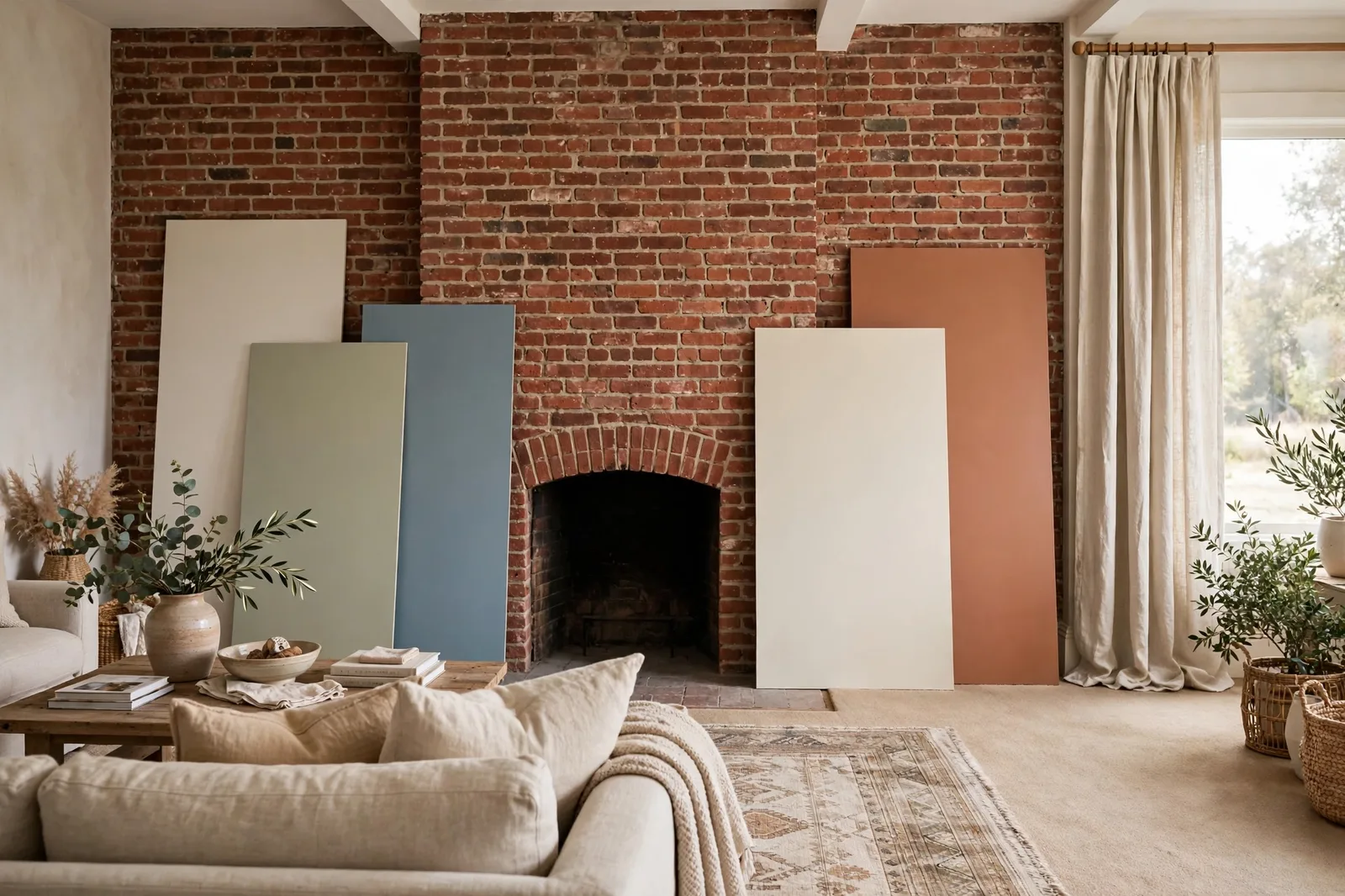
Every room already has a color story before you open a single paint can. The brick fireplace, the stone hearth, the beige carpet you didn’t choose, the curtains and rug that anchor the furniture, these finishes decided long ago what your walls are allowed to look like. Most paint regrets come from ignoring that fact: the wall color looked beautiful on the chip, but it was never auditioned against the finishes it has to live with. This guide walks through the fixed-finish method, reading brick, stone, carpet, curtains, and rugs in the right order, finding the undertone thread that connects them, and choosing a wall color that agrees with all of them at once. Paint colors shift with lighting, surface, and sheen, so always test a large physical sample in your own space, in your own light, before committing, screen swatches are approximations. The Global Abode is an independent publication, not affiliated with or endorsed by Sherwin-Williams or Benjamin Moore; all color names and codes are referenced as widely-known designer examples.
Key takeaway: Paint is the most flexible finish in the room, so it should be chosen last, after brick, stone, carpet, curtains, and rugs have been read for their undertones. The method: sort every surface by how hard it is to change, read them in that order, find the shared temperature, and choose a wall color that agrees with it. Curtains and rugs are your bridge layers, flexible enough to negotiate between finishes that disagree. Undertone notes below are widely-reported designer observations, not exact manufacturer specifications.
The Fixed-Finish Hierarchy: Who Decides First
Designers settle every paint dispute with the same question: which surface is hardest to change? The answer sets the order of decisions, and the order is what keeps a room from fighting itself. A brick fireplace cannot be repainted on a whim, or rather, it can, but painting brick is a commitment that changes its character permanently. Carpet is expensive to replace and disruptive to change. Curtains and rugs, by contrast, can be swapped in an afternoon. Paint is the most accommodating surface of all: a weekend, a few gallons, and it’s a different room.
So the hierarchy runs from least changeable to most changeable, and you read it in that direction:
1. Brick and stone. Fireplaces, exposed brick walls, stone hearths, masonry columns. These are the room’s permanent color anchors, heavy, textured, and full of undertone. They get the first vote.
2. Carpet. Wall-to-wall carpet covers the largest continuous surface in many rooms, and replacing it is a project. It gets the second vote, especially because carpet undertones are subtle and easy to misread.
3. Hardwood floors and cabinetry. The wood tones that run through the house, covered in our guide to matching paint with wood floors, outrank paint for the same reason: they’re expensive and permanent.
4. Curtains and rugs. The semi-flexible layer. Easier to change than carpet, harder than paint, which makes them the perfect mediators between stubborn finishes and the walls.
5. Paint. Last to be chosen, precisely because it’s the most forgiving. With thousands of mixable colors, paint can be tuned to agree with everything else, which is why choosing it first is backwards.
The logic is simple: you don’t ask the adjustable part to dictate terms to the permanent parts. When a room feels “off” and no one can say why, the cause is almost always a decision made in the wrong order, a wall color chosen at the store without the brick, the carpet, or the rug in the room. The fix is to rerun the hierarchy: read the fixed finishes first, and let the paint follow.
Brick and Stone: Reading the Room’s Strongest Voice
Brick and stone speak the loudest in any room they occupy, they have texture, variation, and color depth that flat paint can’t compete with. So the first reading is always the masonry.
Read the brick, not the idea of the brick. “Red brick” is not one color. Widely-reported designer observations note that brick’s undertones vary enormously: some red brick leans orange-red, some leans purple-red, some reads more brown. The mortar matters too, a light mortar line lightens and warms the whole field, while dark mortar makes the same brick read deeper and moodier. Look at your brick in daylight and name what you see: is it orange-red or brown-red? Is the mortar a warm gray or a cool one? Those two answers decide everything downstream.
Warm red and orange brick is the most common interior brick, the classic fireplace, the exposed wall in the converted loft, the kitchen accent. The designer consensus is consistent: warm brick wants warm or neutral company. Warm whites, warm greiges, soft taupes, creamy neutrals, and muted earthy colors (clay, sage, olive) all agree with red brick’s warmth. The classic mistake is pairing warm brick with a cool, blue-gray wall, the two temperatures argue, the brick looks harshly orange by contrast, and the wall looks cold and lifeless. If you want contrast rather than harmony, reach for a deep, muted color in the same temperature family, a warm charcoal, a deep olive, rather than jumping across the temperature line.
Stone is a palette, not a color. A stone fireplace or accent wall is usually a mosaic of tones, creams, grays, browns, sometimes rust or gold, and the wall color’s job is to agree with the dominant tone while staying quiet enough to let the stone be the star. Designers widely recommend pulling the wall color from the stone’s quietest, most neutral tone rather than its loudest one: the creamy limestone tone in the field, not the rust accent in one corner. A wall that matches the stone’s loudest color competes with it; a wall that matches its calmest tone frames it.
Don’t forget the sheen conversation. Brick and stone are matte, textured, and light-absorbing. Against them, a wall in flat or eggshell reads as calm and natural; a wall in satin or semi-gloss can look oddly shiny by comparison, like plastic next to earth. Keep walls matte or low-sheen near masonry, and let the stone carry the texture story.
What about painting the brick itself? It’s an option designers use, whitewashed, limewashed, or fully painted brick can modernize a dated fireplace, but it’s the last resort, not the first move. Painted brick is permanent in a way wall paint isn’t: stripping it is nearly impossible, and it changes the brick’s character forever. Try the wall color, the mantel styling, and the surrounding finishes first. Most “dated brick” complaints are really about the room around the brick, not the brick itself.
Tip: Photograph your brick or stone in daylight and look at the photo, not the wall. The camera compresses the variation and reveals the dominant undertone your eye adapts to in person, the warm orange cast you stopped noticing, or the cool gray in the mortar you never saw. Choose the wall color against the photo’s truth, not your eye’s habit.
Carpet: The Most Common Undertone Clash
If brick is the loudest finish, carpet is the sneakiest. It covers the largest area in many rooms, its undertone is subtle, and it causes more paint repaints than any other surface. The beige carpet you inherited or chose years ago has an opinion about your walls, and it will express it relentlessly.
Beige carpet is not beige. Beige carpets carry undertones that designers categorize into families: yellow-beige (warm, golden), pink-beige (soft, with a red or pink thread), green-beige or olive-beige (muted, earthy), and gray-beige or greige-beige (the most neutral). The undertone decides the wall color’s temperature. A yellow-beige carpet wants warm whites, warm greiges, and creamy neutrals that share its warmth. A pink-beige carpet, and many beige carpets have a pink thread owners never notice, clashes with yellow-based creams and sits happily with soft taupes and warm whites that carry a whisper of the same pink.
The gray wall trap. The single most common carpet clash, reported across designer forums and design columns for years: cool gray walls with warm beige carpet. Both are neutrals, both looked fine alone, and together they feel subtly, unfixably wrong, the carpet looks dirty against the gray, the gray looks cold against the carpet. The trap springs because “gray” and “beige” both read as safe neutrals at the store. The rule: never pair a cool gray wall with a warm beige carpet unless you have deliberately bridged them with textiles. If the carpet is warm, the wall must be warm. A warm greige, gray-beige in the wall color itself, is the peace treaty: it nods to the gray trend while agreeing with the carpet’s warmth.
Berber and textured carpet. Loop-pile berber and textured carpets add a complication: their flecks. A berber with cream, tan, and charcoal flecks is a mini-palette, and the wall color should agree with the fleck mix’s dominant temperature, not fight the darkest fleck. Berber’s texture also absorbs light, which makes walls look slightly darker and warmer by comparison, sample accordingly, and lean a touch lighter than you think.
Gray carpet has the same rules in reverse. Gray carpets carry blue, green, purple, or warm beige undertones, and the wall must match them. A blue-gray carpet with warm beige walls clashes exactly as badly as beige carpet with gray walls. Read the carpet’s undertone first, match the temperature, and the pairing takes care of itself. Muted greens are widely reported as the most forgiving wall color for tricky gray carpets: a soft sage or muted green-gray bridges warm and cool undertones more gracefully than any neutral.
Depth matters as much as temperature. Beyond undertone, keep the wall clearly lighter or clearly deeper than the carpet, never nearly identical. A wall that sits at the same depth as the carpet blurs into it, and the room loses all definition. The classic pairing is walls lighter than the carpet (airy, spacious) or walls substantially deeper (cozy, enveloping); the danger zone is the muddy middle where wall and carpet merge.
Watch out: The most expensive carpet mistake is painting before reading the carpet. A gallon of the wrong gray costs you a weekend; the right warm greige costs exactly the same. Always hold your paint chips against the actual carpet, in daylight, before buying a single gallon, and check the pairing at night under your lamps too, because carpet undertones shift under warm artificial light.
Curtains and Rugs: The Bridge Layers
Here’s the good news in the hierarchy: curtains and rugs are the negotiators. They’re substantial enough to influence the room’s color story, flexible enough to be changed, and positioned exactly where they can mediate between stubborn finishes and the walls.
Rugs are the room’s second floor. An area rug covers the visual center of the room, and unlike wall-to-wall carpet, you chose it, or you can. When the fixed finishes disagree, warm brick fireplace, cool gray sofa, beige carpet, the rug is the peace treaty. Designers consistently recommend choosing a rug that contains both temperatures: a pattern with warm terracotta and cool slate, a vintage-style rug with faded warm and cool tones, a natural jute or wool that reads as temperature-neutral. The rug doesn’t have to match everything; it has to contain the argument. A rug with both warm and cool threads gives the eye permission to accept the brick and the gray sofa in the same room.
Curtains are the vertical bridge. Curtains run floor to ceiling, which makes them the second-largest vertical surface after the walls, and they’re the easiest large surface to change. When walls and carpet disagree, curtains in a bridging color can absorb the tension: linen or warm white curtains soften a cool-wall/warm-carpet clash; a muted pattern that picks up both the wall and the rug ties the room together. The designer trick is to let curtains echo the rug rather than the wall, the two textiles talk to each other across the room, and the walls get to be the calm background.
The 60-30-10 of finishes. A useful proportion rule for the whole layer: let the fixed finishes dominate (roughly 60 percent of the visual field, walls, carpet, brick), the bridge textiles support (30 percent, rug, curtains, upholstery), and the accents punctuate (10 percent, pillows, art, decor). When the 60 percent disagrees, don’t repaint, rebalance the 30 percent. New curtains or a new rug is cheaper than repainting, faster than recarpeting, and often more effective than either, because the bridge layer is where temperature disagreements get resolved.
When to change the bridge instead of the paint. If your walls are right for the brick but wrong for the carpet, or right for the carpet but wrong for the rug, the answer is rarely a third wall color, it’s a different bridge. A rug that was chosen before the wall color was finalized is a prime suspect: swapping it for one that contains the wall’s temperature can fix a room that two gallons of paint couldn’t. Work the hierarchy in order, and let the flexible layers do the flexing.
| Finish | How hard to change | What to read | Wall color direction |
|---|---|---|---|
| Brick / stone | Permanent | Dominant undertone; mortar color; variation | Match the temperature; pull from the quietest tone |
| Carpet | Expensive | Beige family (yellow, pink, green, gray); flecks in berber | Same temperature; clearly lighter or deeper than the carpet |
| Wood floors / cabinets | Expensive | Wood undertone (warm oak vs cool ash) | Agree with the wood’s temperature |
| Curtains | Easy | Pattern’s temperatures; weight and texture | Bridge layer, echo the rug, calm the walls |
| Rugs | Easy | Pattern’s full palette | Bridge layer, contain both temperatures |
| Paint | Easiest | Everything above | Chosen last, tuned to agree with the consensus |
The Undertone Chain Method
With the hierarchy understood, here’s the method that turns it into a decision. The undertone chain is a simple sequence: read each finish in order, write down its temperature, and look for the consensus. The wall color then agrees with the consensus, not with any single finish.
Step 1: Inventory the room. Walk the room and list every significant surface: brick fireplace, carpet, wood floor, sofa fabric, curtains, rug, stone hearth, tile. Significant means visible, if it covers more than a throw pillow’s worth of the room, it votes.
Step 2: Read each one in daylight. For each surface, answer one question: warm or cool? Use the white-paper test from our undertones guide, hold a sheet of plain white paper against the surface in natural daylight and let the undertone announce itself. Brick: orange-red or brown-red? Carpet: yellow-beige, pink-beige, green-beige, or gray-beige? Curtains: warm linen or cool gray? Write each answer down. Memory lies; the list doesn’t.
Step 3: Find the consensus. Count the votes. If five of six surfaces read warm, the room is warm, and the wall color is warm, even if one cool element (a gray sofa, a chrome lamp) disagrees. The outlier doesn’t get to veto the consensus; it gets bridged by the textiles. If the vote is split, warm brick, cool carpet, warm rug, cool curtains, the room has no consensus, and that’s exactly what the bridge layers are for: choose a rug and curtains that lean toward one temperature, establish the consensus artificially, and paint to the consensus you built.
Step 4: Choose the wall’s depth. Temperature decides the family; depth decides the mood. With warm consensus and a dark brick fireplace, a light warm wall gives the room breathing room; a deep warm wall gives it drama. With a beige carpet, keep the wall clearly lighter or clearly deeper, never the muddy middle. The depth decision is where your taste enters; the temperature decision is where the finishes rule.
Step 5: Check the bridges. Before finalizing, confirm the curtains and rug can carry the consensus. If they can’t, a cool gray rug in a now-warm room, plan the textile swap as part of the project, not as an afterthought. The chain is only as strong as its most flexible link, and the flexible links are the ones you’re allowed to change.
The beauty of the chain is that it removes taste from the temperature question. You’re not deciding whether you “like” warm or cool, you’re counting votes. Taste enters at depth, at accent colors, at styling. The temperature is arithmetic, and arithmetic doesn’t argue.
The Sampling Protocol Against Real Finishes
The method fails without the protocol. Chips chosen at the store, against white card, under fluorescent light, have never met your brick or your carpet, and the meeting is the whole decision. Here’s how to run it.
1. Gather a range, not a favorite. Pull five to eight chips in the temperature family the consensus indicated, not one beloved color, a range. Include options lighter and deeper than your instinct, and include at least one you’d never have picked. The range protects you from anchoring on the first chip you liked.
2. Tape them to the finishes, not the wall. Tape candidate chips directly against the brick, the carpet edge, the rug, the curtain fabric, the actual surfaces, in the actual room. A chip that looks perfect against white card can swing visibly warm or cool against red brick; a chip that looked neutral in the store can turn pink against a pink-beige carpet. Eliminate ruthlessly: any chip that makes a fixed finish look dirty, or that looks dirty against a fixed finish, is out.
3. Judge in three lights. Morning daylight, afternoon daylight, evening lamplight. Brick undertones deepen under warm evening light; carpet undertones shift too, often reading warmer at night. A pairing chosen in daylight only can disappoint after dark, and you live in the room at night more than at noon. Our tile coordination guide covers the same three-light discipline for kitchens and baths; it applies to every finish in the house.
4. Paint large boards for the finalists. For the two or three survivors, paint large boards, poster-board size, two coats, fully dry, and prop them against each finish in turn. Move the board from the brick to the carpet to the rug. The winner is the one where every boundary feels calm: the board meets the brick without shouting, meets the carpet without clashing, meets the rug without competing. Calm at every boundary is the whole game.
5. Live with it for two days. Tape the finalist boards up and walk past them. Colors that thrill on day one sometimes fatigue by day three; colors that seemed quiet reveal themselves as exactly right. Two days of passive looking costs nothing and prevents the most expensive mistake in decorating: repainting a room because the color was chosen for the chip, not the finishes.
Coordinating the whole house, not just one room?
The Whole Home Paint Guide is a complete, ready-to-use color system, anchor neutrals, trim and ceiling pairings, accent colors, all with undertones already coordinated, so every room’s finishes, textiles, and walls belong to one temperature story. And the Paint Color Workbook includes a finish-inventory checklist for reading every surface in the room before a single sample goes up.
Frequently asked questions
Read the brick’s undertone first, orange-red, brown-red, or purple-red, plus the mortar color, then choose a wall in the same temperature family: warm whites, warm greiges, soft taupes, and muted earthy colors for warm brick. Avoid cool blue-grays against warm brick; the temperatures argue. Pull the wall color from the brick’s quietest tone rather than its loudest, and test chips directly against the brick in daylight before buying.
Match the carpet’s undertone: warm whites, warm greiges, and creamy neutrals for yellow-beige carpet; soft taupes and warm whites with a whisper of pink for pink-beige carpet. Keep the wall clearly lighter or deeper than the carpet, never nearly identical. And avoid cool gray walls with warm beige carpet: it’s the most common temperature clash in home decorating, and no amount of styling fully fixes it.
Warm neutrals are the safest: warm whites, warm greiges, soft taupes, and creamy beiges all agree with red brick’s warmth. For more presence, muted sage, olive, or clay tones work beautifully. If you want drama, a deep warm charcoal or deep olive in the same temperature family gives contrast without the temperature fight that cool grays create. Keep other walls quiet, the brick is the star, so the paint is the frame.
Echo the rug rather than the wall. Curtains and rugs are the room’s bridge textiles, when they talk to each other across the room, the walls get to be the calm background. Choose curtain fabric that picks up tones from the rug’s pattern (or shares its temperature), and let a patterned rug’s quietest tone guide a solid curtain color. Matching curtains to the wall exactly can make the room feel flat; letting them bridge wall and rug makes it feel layered.
Designers consistently advise against it, it’s the classic temperature clash. The gray makes the carpet look dirty and the carpet makes the gray look cold. If you’re committed to gray, choose a warm greige (gray-beige) instead: it nods to the gray you want while agreeing with the carpet’s warmth. Alternatively, bridge the gap with textiles, a rug and curtains that contain both temperatures, but the honest fix is a wall in the carpet’s temperature family.
Hold a sheet of plain white paper against the surface in natural daylight, the white gives your eye a neutral reference, and the undertone announces itself by comparison: the beige suddenly looks yellow, pink, or green; the gray suddenly looks blue or violet. Compare with known warm and cool references (a warm wood sample, a cool gray chip) to confirm. Our undertones guide walks through the full comparison method, and our whole-home palette guide shows how to connect the readings room to room.

