The gray you loved in the store looks blue on your wall. The beige the designer recommended flashes pink at sunset. This isn’t bad luck, it’s undertones: the quiet second color hiding inside every paint color. Once you learn to see them, choosing paint stops feeling like gambling.
What an undertone actually is
Every paint color has two layers. The first is the mass tone, the color you see at a glance, the “gray” or “beige” on the chip. The second is the undertone: the subtle secondary hue sitting beneath it, the direction the color leans. A gray that leans blue and a gray that leans violet can look nearly identical on a two-inch chip and completely different on your wall.
Undertones come from pigments. Paint manufacturers blend multiple pigments to create a single color, and those pigments carry their own biases. This is worth saying plainly because undertones get mystified: there is nothing mystical about them. An undertone is simply which way a color leans on the color wheel, measurable, repeatable, and visible once you know how to look. Color professionals often call this a color’s “bias” or “leaning”; “undertone” is the homeowner-friendly word for the same thing.
Undertones show up most in neutrals, whites, grays, beiges, greiges, taupes, because there’s so little dominant color to mask them. A saturated navy is obviously blue; a pale “greige” might be hiding yellow, green, or pink, and you won’t know which until it’s on four walls. That’s why undertone skill matters most exactly where people think color choice is safest: the neutrals.
One more essential truth: undertones are not fixed appearances, they respond to light. The same gray can read neutral at noon, blue in the evening, and faintly violet under warm lamps. The undertone is always there; the lighting decides how loudly it speaks. This is why testing in your own light, at different times of day, is non-negotiable, and why a color that looked perfect in the store can surprise you at home.
The four undertone families
Nearly every paint undertone falls into one of four families. Learn to recognize them and you can sort any wall of chips in minutes:
| Undertone family | Feels | Common in these neutrals | Watch out for |
|---|---|---|---|
| Pink / Red | Warm, soft, traditional | Beiges, tans, warm whites, some taupes | Can flash salmon or peachy in bright south-facing light |
| Yellow / Gold | Warm, sunny, welcoming | Creams, warm grays and greiges, tans | Can look dingy or muddy in cool north-facing light |
| Green | Fresh, or muddy, depending | Grays, greiges, sage-leaning neutrals | The “mystery” undertone: hardest to spot on the chip, obvious on the wall |
| Blue / Violet | Cool, crisp, modern | Grays, cool whites, some greiges | Violet can flash purple in afternoon light; blue can feel icy in dim rooms |
Pink and red undertones live in many beiges and warm whites. They’re the reason a “warm neutral” bedroom can suddenly read as a pink bedroom once it’s on all four walls, especially in bright, warm daylight that amplifies red pigments. If you’ve ever thought “this beige looked fine in the store, why does it look like a nursery now,” you met a pink undertone.
Yellow and gold undertones are the workhorses of cozy neutrals, creams, warm greiges, buttery whites. They glow beautifully in south- and west-facing rooms. Their weakness is cool, dim, north-facing light, where yellow undertones can turn a wall from “warm” to “dingy” because there’s no warm light to support them.
Green undertones are the sneakiest. Plenty of popular grays and greiges carry green, and it’s the undertone most people fail to spot on the chip, then can’t unsee on the wall. Green undertones can look fresh and organic next to plants and natural wood, or muddy and murky next to the wrong companions. When a gray looks “dirty” and you can’t explain why, check for green.
Blue and violet undertones define the cool grays and crisp whites. Blue reads clean and modern; violet is the one that ambushes people, a gray that looked perfectly neutral in the store develops a lavender cast in your living room at 4pm. Violet undertones are also the most light-sensitive of the four, shifting dramatically between daylight and lamplight.
A note on “true neutrals”: genuinely neutral colors, leaning nowhere, are rare in paint. Most neutrals lean somewhere; the skill is knowing where yours leans and choosing companions that lean the same way. Warm-leaning colors (pink/red, yellow/gold families) generally get along with each other; cool-leaning colors (green, blue/violet families) get along with each other. Crossing from warm to cool without intention is where rooms start feeling “off.”
How to test undertones: 6 methods that work
Undertones hide on small chips and reveal themselves in comparison. Run every finalist through these methods before you commit:
1. The white-paper test. Hold the swatch against a sheet of pure white paper, not cream, not off-white, in daylight. The white gives your eye a neutral reference, and the undertone jumps out by comparison: pink, yellow, green, or blue hints become suddenly visible. This single test catches more bad choices than any other.
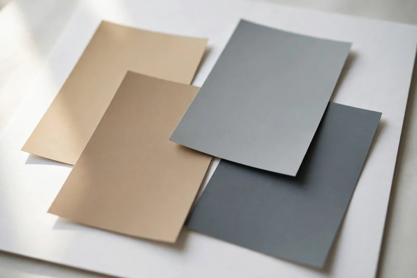
2. Line up the suspects. Gather three or four similar neutrals and lay them side by side. Undertones that were invisible alone become obvious in a lineup, you’ll see immediately which gray leans blue, which leans green, and which is the warm outlier. Comparison is the whole game; judging one chip in isolation is how undertones stay hidden.
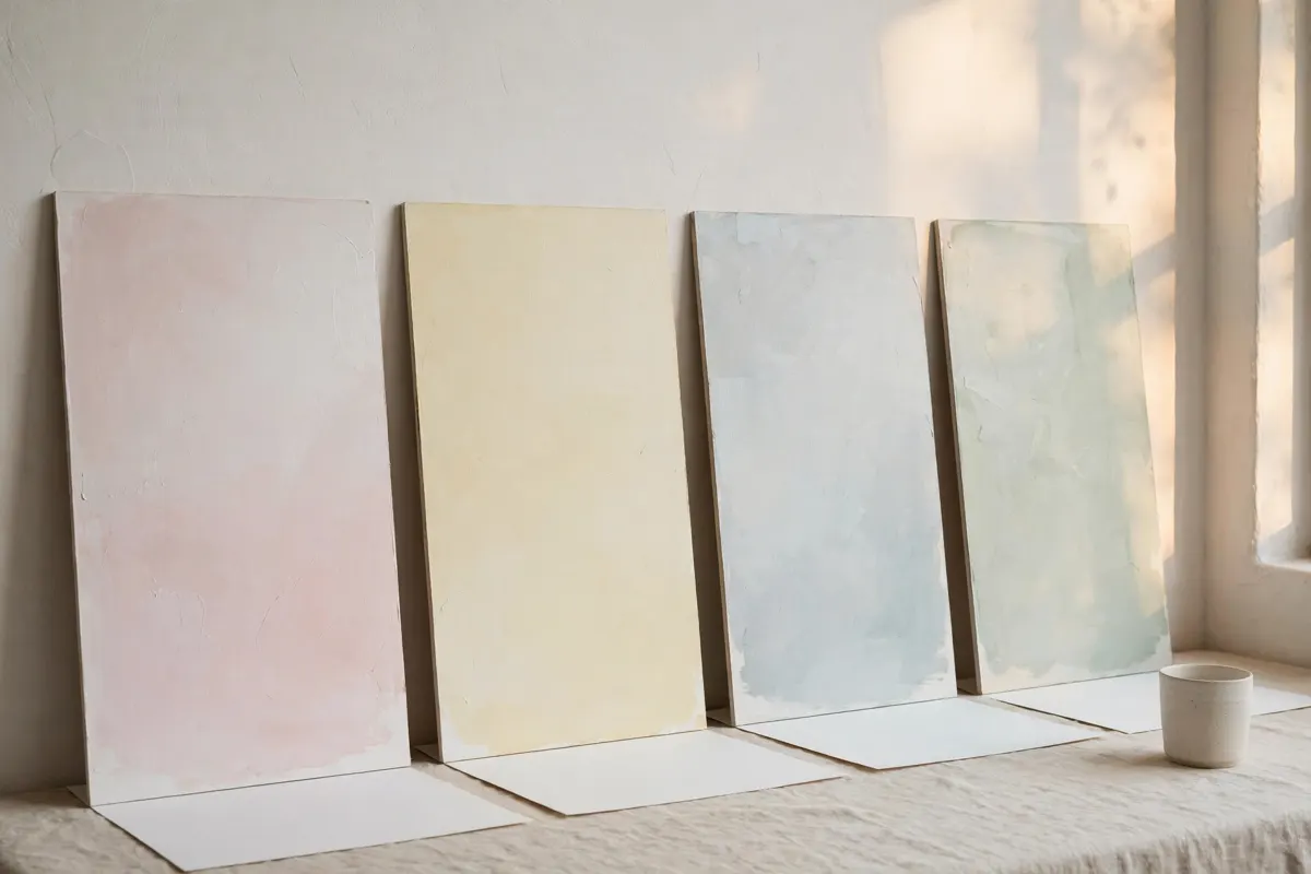
3. The thin-spread check. Undertones become more apparent as paint gets sheerer. Brush a thin wash of your sample on white poster board and let it dry, the undertone often reads more clearly in the thin coat than in the full-strength chip. (This is also why the edges of a painted swatch, where paint is thinnest, sometimes tell the truth first.)
4. Test in daylight AND lamplight. Check your samples in morning light, afternoon light, and under your evening lamps. Warm incandescent-style bulbs amplify yellow and pink undertones; cooler daylight LEDs let blue and green undertones speak up. A color has to survive all three to earn your walls.
5. Judge against your fixed finishes. Hold the sample next to your flooring, countertops, cabinets, and largest furniture pieces, not against other paint chips. The paint has to live next to those finishes for years. A gray with a violet undertone can look perfect alone and terrible next to warm oak floors; the floors get the deciding vote.
6. Check the manufacturer’s color data. Many brands publish RGB or similar color values for their paints. As a rough guide: if the red value runs highest, the color leans warm (yellow, pink, or orange undertones); if blue dominates, it leans cool (blue or green undertones); if the values sit close together, the color is relatively neutral. Treat this as a starting hypothesis, not a verdict, then confirm with the physical tests above.
Why undertones clash
Here’s the scenario we hear most: every color in the room was chosen carefully, each one pretty on its own, and the room still feels wrong. Nine times out of ten, the culprit is clashing undertones. Not bad colors. Incompatible families.
The classic clash is the pink-beige problem. A homeowner picks a warm beige for the walls (pink undertone, though they don’t know it), then brings in bedding or a sofa in a golden beige (yellow undertone). Separately, both are lovely. Together, the pink and yellow undertones fight, the eye registers the disagreement even when the brain can’t name it. The room feels “off” in a way that’s genuinely hard to diagnose without the undertone vocabulary.
The second classic is the trim-white trap. Someone chooses a beautiful warm white for the walls, then paints the trim in a cool, blue-leaning white “because white is white.” It isn’t. The cool trim makes the warm walls look dingy by comparison, and the warm walls make the cool trim look icy. One undertone family for trim and walls, or at least a deliberate, tested pairing, avoids the whole mess.
The third is fixed finishes fighting the paint. Oak floors, golden granite, warm brick, these all carry strong warm undertones, and they’re not moving. Painting a cool blue-gray over warm oak doesn’t create “contrast,” it creates conflict: the floor pulls warm, the walls pull cool, and nothing in the room agrees. The fix is never to fight the largest undertone in the room, it’s to join it, then add variety through depth and texture instead of temperature.
The underlying principle is simple: keep every color visible in one sightline inside the same undertone family. Warm with warm, cool with cool. You can vary depth (light to dark), you can vary saturation (muted to rich), you can vary the color itself, but the undertone family is the thread that holds it together. Break that thread accidentally and the room unravels; break it deliberately, in small contained doses, and it can be a design choice. The difference between a mistake and a statement is intention.
Matching undertones across brands
Sooner or later you’ll need to match a color across brands, your painter carries one line, your sample is from another, or you fell in love with a Benjamin Moore color but your whole system is Sherwin-Williams. There is no universal conversion formula, and anyone selling you one is guessing. But there is a reliable method:
1. Match the undertone family first. Forget the color name. Identify the undertone family of your reference color (pink/red, yellow/gold, green, blue/violet) using the white-paper test, then look only at candidates in the same family. A cross-brand “match” in the wrong family isn’t a match at all.
2. Match depth second. Hold candidates next to the reference in the same light. You’re looking for the same lightness/darkness, squint if it helps, since squinting strips away hue and lets you compare value. Depth mismatches are the second most common reason cross-brand matches fail.
3. Match temperature third. Within the same family and depth, pick the candidate whose warmth or coolness feels closest to the reference. This is the fine-tuning step, and it’s where side-by-side sampling on poster board earns its keep.
4. Confirm in the room’s light. Two colors that match under store lighting can diverge in your north-facing bedroom. The final check always happens in the room, morning and evening, next to the fixed finishes.
Two honest caveats. First, exact cross-brand matches are rare, different pigment formulations mean you’re usually finding the closest equivalent, not a twin. That’s fine for most purposes; walls don’t need laboratory precision, they need family agreement. Second, screen swatches are approximate: monitors shift color, and digital representations can’t show how pigments behave in real light. Use screens for shortlisting, physical samples for deciding, always.
We’re building a full cross-brand equivalent matrix, Sherwin-Williams to Benjamin Moore to Behr, organized by undertone family, as one of this site’s signature resources. Until it ships, the four-step method above will get you there.
The shortcut: start from a finished palette
Learning to read undertones is a genuine skill, and it’s worth having. But applying it across an entire house, every room, every fixed finish, two brands of paint, is where most people stall. The alternative is to start from colors whose undertones have already been coordinated for you.
Want the undertones already worked out?
The Whole Home Paint Guide is a complete color system with undertones coordinated across every room, no guessing which gray leans where. And the Paint Color Workbook walks you through testing and matching undertones yourself, step by step, with side-by-side worksheets.
Frequently asked questions
They’re real, but the word is casual shorthand. What professionals call a color’s “bias” or “leaning” (which direction it sits on the color wheel) is what homeowners call its undertone. It’s measurable from the paint’s formulation and visible in comparison tests. The myth part is treating undertones as mysterious; they’re simply the secondary hue every color carries.
Your gray has a blue undertone, and your lighting is letting it speak. Cool, dim light, especially north-facing daylight and cool-white LEDs, amplifies blue undertones. Test the swatch against pure white paper to confirm, then check it at different times of day. If the blue bothers you, look for a gray in the green or violet family instead, or warm up the room’s lighting.
Many beiges carry pink or red undertones that stay quiet on the chip and amplify on four walls, especially in bright, warm daylight. Hold the swatch against pure white paper: if you see even a hint of pink, it will be stronger on the wall. To avoid it, choose beiges in the yellow/gold family and verify them in your room’s actual light before committing.
Most whites lean warm with yellow undertones, and warm lighting makes it stronger. If you wanted a crisp white, you likely need one from the blue-leaning family, or at least a whiter white. Compare your white against a pure white reference in daylight: the yellow will be obvious. Also check your bulbs, warm-white bulbs (2700K) yellow everything they touch.
Three options before you reach for the roller. First, change the lighting, warmer bulbs soften cool undertones, cooler bulbs calm warm ones. Second, dress the room in the same undertone family: textiles, rugs, and art that share the wall’s undertone make it look intentional instead of accidental. Third, if the clash is with one element (a sofa, the trim), change the smaller offender, repainting one wall or swapping a rug beats repainting the room.
Yes, deliberately. Keep one dominant temperature across each sightline, and use the other in small, contained doses: a cool gray bedroom off a warm hallway works when the trim white ties them together. What fails is accidental mixing, a warm beige wall against a cool gray sofa with no plan. Intention is the difference between a mistake and a design choice.

