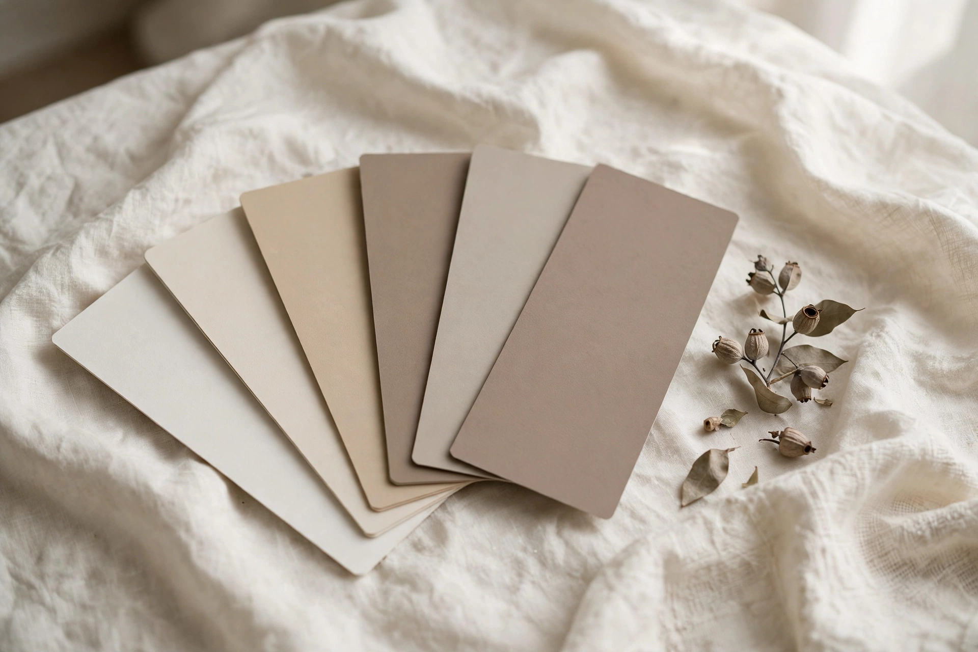
The reason most houses feel disjointed isn’t bad taste, it’s bad sequencing. People choose paint one room at a time, and by the third room the undertones are fighting. The fix is to choose the palette once, for the whole house, then assign colors room by room.
Why choosing room by room fails
Walk into any paint store and you’ll see the trap: a wall of 2,000 chips and no structure. Most people grab the prettiest chip for the living room, a different pretty chip for the bedroom, and something bold for the dining room because a photo inspired them. Each choice is defensible alone. Together, they’re a mess, because nobody checked whether the undertones agree.
A whole-home palette flips the order. You decide the family of colors first, which neutrals, which temperature, which depth range, and only then assign individual colors to rooms. Every later decision gets easier because the boundaries are already set.
How many paint colors does a whole house need?
Most experienced designers land on 3–5 main wall colors for the whole house. More than that and rooms start feeling disconnected as you move through them; fewer and the house feels flat. On top of those, you need two supporting roles:
| Role | How many | What it covers |
|---|---|---|
| Main neutrals | 1–2 | Most walls, living areas, hallways, the spaces that connect everything |
| Supporting colors | 2–3 | Bedrooms, offices, secondary spaces, same undertone family, varied depth |
| Trim & ceiling white | 1 | Every trim, door, and ceiling in the house, the quiet thread that ties it all together |
| Deep accents | 1–2 | Powder room, dining room, front door, or built-ins, contained doses of drama |
That single trim white doing the same job in every room is the highest-leverage decision in the palette. It creates continuity even when wall colors change, which is exactly why it should be chosen deliberately, not defaulted.
The 5-step palette method
Step 1, Start with what you can’t change
Before looking at a single paint chip, inventory your fixed finishes: floors, cabinets, countertops, tile, brick, stone. These have undertones too, oak floors lean warm and golden, Carrara marble leans cool and gray, and your paint has to live next to them for years.
Identify the dominant undertone among your largest fixed surfaces. That undertone becomes your palette’s home base. A house full of warm oak will fight a cool blue-gray wall color no matter how pretty the chip looked; the same gray sings next to cool concrete or gray-washed floors.
Step 2, Choose your anchor neutral
Your anchor is the color on most of your walls, usually the main living area and hallways. Pick it against your fixed finishes, not against other paint chips. Hold large swatches next to your flooring in daylight and again at night under your lamps.
One practical rule: in north-facing rooms with cool, dim light, lean your anchor slightly warm so it doesn’t go flat. In bright south-facing rooms, you can go cooler or crisper without the color washing out.
Step 3, Add supporting colors in the same undertone family
Now choose 2–3 supporting colors for bedrooms, offices, and secondary spaces. The constraint that keeps the house cohesive: every color must share the anchor’s undertone family. A warm greige anchor pairs with warm beiges, warm whites, and warm taupes, not with a cool blue-gray, however tempting.
Step 4, Add one or two deep colors (in contained doses)
Depth keeps a neutral palette from feeling bland. But placement matters more than the color itself: put deep, saturated colors where they’re contained, a powder room, a dining room with doors that close, a home office, built-in bookshelves, or the front door. Containment lets you take a real risk without it clashing with the broader palette as you move through the house.
Step 5, Lock one trim and ceiling white
Choose a single white for all trim, interior doors, and ceilings, and use it everywhere without exception. Keeping it consistent is what lets your wall colors vary room to room while the house still feels like one home. When choosing it, compare it directly against your anchor neutral, you want enough contrast to read as trim, not so much that it looks stark.
Making it flow: the connection rules
You don’t need the same color in every room, you need repetition with variation. Four rules handle nearly every house:
1. Let sightlines decide. Stand in your hallway or main living area. Every wall color visible from that one spot must get along. If two colors clash in the same sightline, one of them has to change, no matter how much you love it alone.
2. Give hallways the anchor neutral. Hallways touch nearly every room, so they’re the worst place for a statement color. Your main neutral in connecting spaces creates calm transitions and gives the eye a place to rest.
3. Treat open plans as one room. In open-concept spaces, carry the anchor across the whole open area and shift only slightly lighter or darker between zones, never jump to an unrelated color where there’s no wall to separate them.
4. Separate floors can breathe. If there’s a true separation between upstairs and downstairs, a stairwell with a door, a distinct landing, you can shift the mood between floors while keeping the trim white and undertone family constant.
How to test paint colors before you commit
Small chips lie; walls don’t. Here’s the testing method that actually prevents repaints:
1. Buy sample pots of your finalists, never decide from a 2-inch chip.
2. Paint large poster boards, two coats, not the wall, so you can move them around the room.
3. Live with them for 48 hours. Check morning light, afternoon light, and lamplight. Undertones shift dramatically between a north-facing bedroom at 9am and the same room at 9pm.
4. Judge them next to your fixed finishes, flooring, countertops, sofa, cabinets. The paint has to get along with everything you aren’t changing.
5. When stuck between two, pick the one that looks best in the room’s worst light. A color that survives dim evening light will thrive everywhere else.
The shortcut: start from a finished palette
Building a palette from scratch is satisfying, but it’s also where most people stall, weeks of swatches, three sample pots deep, still unsure. If you’d rather start from colors that have already been tested to work together, that’s exactly what a done-for-you system is for.
Want the palette without the guesswork?
The Whole Home Paint Guide gives you a complete Sherwin-Williams color system, every room mapped, trim and ceiling pairings included, undertones already coordinated. And the Paint Color Workbook walks you through testing and committing to any palette, step by step.
Frequently asked questions
Not necessarily, but every room visible from the same spot must work together. The safest approach is one anchor neutral across the whole open area, shifting only slightly lighter or darker between zones, with deeper colors reserved for enclosed rooms off of it.
Your trim and ceiling white. Keeping one consistent white on every trim, door, and ceiling creates a quiet thread that ties the whole home together, even as wall colors change room to room.
In a contained space: a powder room, a dining room with doors, a home office, or on built-ins and the front door. Containment lets a saturated color shine without fighting the palette in adjacent rooms.
No, use your main anchor neutral in hallways. They’re the connective tissue of the house, and a separate color there usually adds visual noise rather than personality.
You can, but keep it deliberate: one dominant temperature with small, intentional accents of the other. Accidental mixing, a warm greige wall next to a cool gray trim, is what makes rooms feel “off.”
Hold the swatch against a pure white sheet of paper in daylight, pink, yellow, green, or blue hints become obvious by comparison. Then check again at night under your lamps, since artificial light shifts how undertones read.

